
 Everyone has an opinion about book covers: what sells, what kids will never pick up, what kids will pick up but their parents would never buy for them, what trends are in danger of oversaturation. Booksellers especially have opinions, because we see first-hand, all day long, how book covers (even their spines) affect how people select and reject books.
Because we see SO MANY COVERS coming and going, we have a lot of comparative data. We spot design trends quickly, and note which ones work and which ones fall flat. Covers affect our bottom lines as much as they affect a publisher’s, so we’re all invested in the same outcome: a cover that perfectly suits its book. Easy, huh? Not so much.
(I’m especially talking here about middle grade and teen novels and nonfiction. Picture book covers, by and large, tend to be pretty good. I think we’re in another golden age of book design, much of the credit for which can be attributed to picture books.)
In trying to nail down why some images draw in readers so much better than others, I came to the realization that a good front cover needs to accomplish three main goals:
- to visually express something compelling and accurate about the story and its theme;
- to suggest STORY; to draw the reader in with the implication that something interesting, mysterious, exciting, funny, original, and/or emotionally resonant will happen in the book;
- to present art appropriate to the book’s subject matter and the age range of the intended audience.

 On top of those three imperatives, a great cover manages to look strikingly original without losing the universal markers that indicate who the book is for and what genre / interest category it fits into. Originality is a tough achievement in a field where tens of thousands of books are published each year. And there are marketing pressures that come to bear on book design decisions, which create challenges for the original cover. Certain tried-and-true visual formulas sell books — even when they annoy us.
For example, most booksellers I know are sick of photos of kids on covers, especially photos of half faces, of the legs/socks/shoes trend, of those wistful girls in gowns in the woods endemic to fantasy novels, of bold Hunger Games-esque symbols or insignias dominating the center of a cover. In general, this is true — we are sick of seeing so many knockoff covers — but it’s also true that many of these covers DO work, and are appealing, and even manage to feel original, even next to other book covers with similar images. So what’s the difference between the successful and unsuccessful cover? That can be as elusive as that old definition of pornography: you know it when you see it.
Here’s one problem: book designers work hard, often on several covers simultaneously, and generally don’t have the luxury of reading every book they design. They must rely on what the editorial and marketing staff convey to them about a book. Some publishers provide very vague marketing blurbs, and sometimes designers receive conflicting directives. As a designer commented in a 2010 ShelfTalker blog post, What You Wish They Knew (a conversation among authors, publishing folks, and booksellers): “Rich information = rich and compelling jacket art. Vague information = bland cover art.”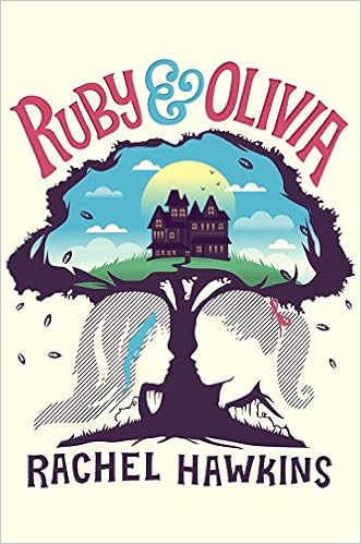
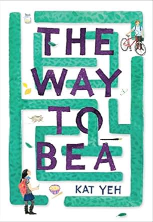
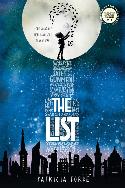
I’ve noticed that good cover art often raises a question, involving a reader’s participation in the story before even opening the book. Someone looks at an image and wonders, WHY is that hippo floating belly up? Hey, what’s that kid about to do with that spear? Who is the shadowy figure standing behind the three kids on the edge of the cliff? Why is one of those dogs so far away from the others? Why do that girl and that pig look so worried gazing at a spider?
Note: I think this “image that raises a question” factor is the missing ingredient from most nonfiction jackets published for middle grade and teen readers. Famous people’s faces stare out at kids, whose eyes bounce off the page back at themselves. It’s a done deal, the story is finished, there’s no mystery or invitation suggested by those covers. But publishers should remember that, for the child reader, this is likely to be brand new information; that book is unfolding a fascinating STORY for the reader, one that happens to be true, and therefore is potentially even more amazing than fiction! The covers of those books should reflect that, enticing a reader in just as enthusiastically as a novel.
 A great cover also needs great flap copy. Kids always, always read the back cover of a book (or, if they know to look for it, the inside flap) when they are choosing among titles. They are also always surprised to learn that authors aren’t usually the people who write that back copy; they think what they’re reading is a foretaste of the book itself, so it’s especially important to get that part right. They want to read that copy and know what the story’s about and whether it’s likely to be lively.
Series designers have the added tasks of creating cohesive, harmonious design among titles, and of clearly labeling the series order on front and spine.
I am in awe of the work that designers and artists do. Being creative on command, with several projects in progress simultaneously, involving so many people to please — it’s daunting and brilliant work.
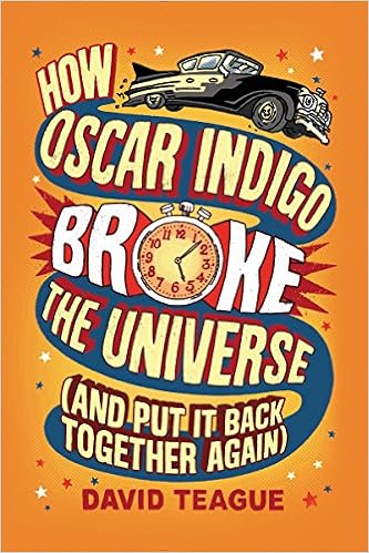
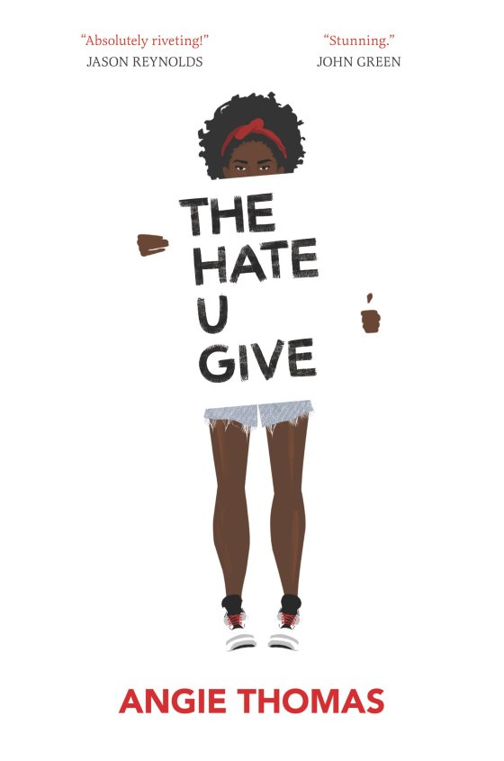
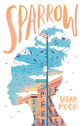
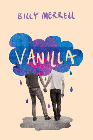
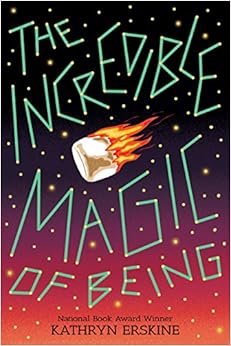
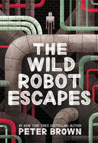
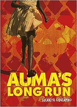
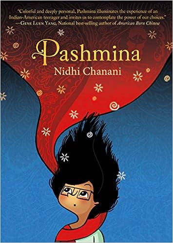
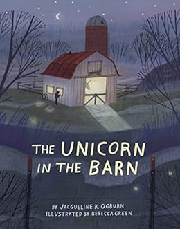
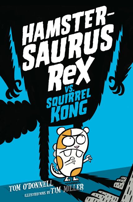
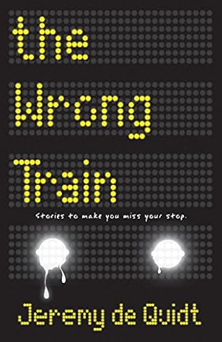
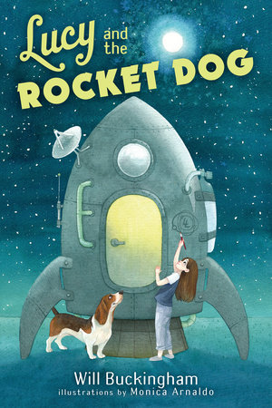
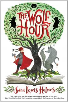
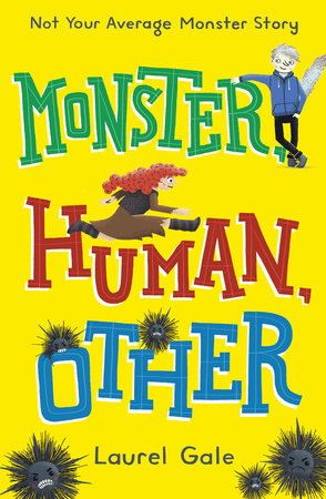
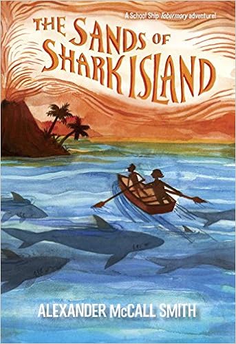
Readers, what are some of your favorite MG and teen covers so far this year? Some of mine are sprinkled throughout this post and below. My personal taste shows – I love clean covers, graphic covers, interesting font use, smooth design. Would that I had space for all of the covers I love, but here are a few more of my favorites. Some are beautiful, some are striking, some make a statement, and some are simply pleasing — but they all do (or will when published) stand out on a face-out shelf:


I also really liked this cover:
until I saw and loved this (presumably non-U.S.) one:

Now I can’t tell which I like better.
What are your favorites this year?
On a hardcover book, they not covers, they are jackets. The jackets are over the cover whIch is usually pasted over board…it forms the binding which holds the pages together. A paperback does not have a jacket, it has a cover…Wish book lovers would use jacket when it is appropriate. From…a former chIldren’s book publisher.