Monthly Archives: June 2008

A Model High School Summer Reading List


Alison Morris - June 30, 2008

I see summer reading lists for many, MANY schools float through our store every summer. We keep notebooks at both of our point of sale counters that contain the summer reading lists for ALL local schools of interest to our customers, public and private, because every year they come in having left their copies at home. If a customer comes in and says "Do you have the summer reading list for _____?" we then open the notebook, flip to that school’s list, and make that customer’s day a lot easier. In the process, we make the sale.

Of all the school lists I’ve seen in recent years, the one that impresses me most is the one that’s produced by the English Department at Weston High School in Weston, Mass. I love this school list — not so much for the actual books it includes (though I do think it’s a rather diverse and interesting mix, especially compared to those of most high schools), but for the WAY it’s compiled and formatted. The list is available on the school’s website, so you can download a copy and see just what I’m talking about. (Click on the "W" beside download.com and it’ll open the list as a Word document.)

The Weston High School list begins with this introductory statement:

We English teachers believe that reading should be a pleasurable pastime as well as a source of intellectual growth. Anticipating the summer, we’ve been talking about the books we look forward to reading and the ones we highly recommend. Below, you’ll find the courses that will be offered in the fall of 2008 and books required.

Last summer, in response to student, parent, and teacher input, the department reduced required summer reading and in a number of cases collaborated with the history department to assign shared titles. This reduction in required reading should not downplay the importance of reading; it should amplify the importance of allowing students to have more control over what they choose to read. Statistics show that active readers practice important thinking skills.

Below the required reading you will find a lengthy list of books we heartily recommend but no longer require for any particular course. We have provided brief descriptions to help you make satisfying choices. We’re confident you’ll be drawn to many of them. 

The list of Required Reading books is an interesting mix, but what really wows me about Weston is the way they choose to present their recommended (not required!) summer reading choices. Each teacher in the department selects a handful of books to recommend then explains what each book is about and WHY they’re recommending it. Their entries are insightful, personal, and interesting. The books they’ve selected are a truly interesting mix.

I love the personable feel of a list like this and the potential avenues for discussion it could open up between students and their teachers, not to mention the potential for increasing students’ respect for the folks who stand at the front of their classrooms every day. Maybe Mr. So-and-So doesn’t give the best lectures but he has fantastic taste in fiction. Maybe Ms. Such-and-Such’s interests are a lot more complex than anyone would have guessed. The best thing about this list, though, is the message it sends to students, on the teachers’ behalf: WE READ BOOKS AND WE ENJOY THEM. I can’t imagine a more effective behavior for English teachers to model than that.

Shelving Books and Kissing Bees


Alison Morris - June 26, 2008

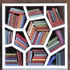
Is your decorating style more haphazard than orderly? If so, why not confine your literary clutter to the oddly-shaped chambers of the Opus Shelving System from Design Within Reach. (You decide whether or not the price is within reach too.) The unit is made from recycled expanded polypropylene, "the same material chosen for motorcycle helmets due to its light weight and durability." This means your Opus bookcase will withstand the elements if you want to use it outside. As for what such treatment will do to your books, though, that’s another matter…

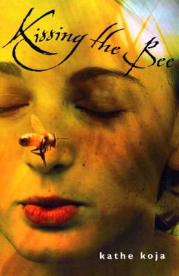
While only a drunken bee would construct a hive this uneven, the honeycomb-like pattern of this bookcase nevertheless reminds of those fuzzy fliers and now also the young adult novel Kissing the Bee by Kathe Koja (Farrar, Straus and Giroux), which I finally read two weeks ago.

I wasn’t intending to read this book at the time. In fact what I was trying to do was weed my overgrown stack of galleys at home, to make room for all the incoming ones. When I got to Kissing the Bee and asked myself the "stay or go?" question, I decided to read the first few pages as a means of settling the debate. If I was drawn in by them, the book would maintain its in-the-pile position for a while longer (at least until I’m forced to weed again). If not? Donation City.

Of course you can guess what happened. I read the first few pages and in rapid fashion finished the entire book, which I thoroughly enjoyed and have thought about quite a bit in the days since. I love that its open-faced, honest tone makes for such compulsive reading, and I love the intriguing parallels it draws between the world of fiction and non.

The narrator of Kissing the Bee is a high school girl named Dana, who has been slowly awakening to the fact that her best friend Avra isn’t actually all that good to her or for her. As if that’s not difficult enough, the situation is further complicated by the fact that Dana is deeply in love with Avra’s boyfriend, Emil — the only person who seems truly in tune with Dana’s interests and emotions, the one soul who is truly paying attention.

While this complicated triangle is unfolding, Dana is working on a project for a science unit on "cooperative societies." As she explains it, "I was tired of human beings by that point, so I decided to do bees." Notes from her bee studies appear in italics throughout the novel, enabling the reader to make clear connections between the behavior of bees and the behavior of human beings. In Dana’s life, for example, Avra is very much the Queen Bee.

I absolutely loved all the bee bits in this book. Not only did they teach me a great deal about apiculture (a word that was new to me), they served as thought-provoking metaphors for what was happening the story, and dramatic ones too. Drama? With BEES? Yep. Here’s a taste (and a lesson) of what good old Mother Nature has to offer, as explained by the talented Kathe Koja:

The creation of a new queen is extremely important to the hive — without the queen, there will be no honey, no colony, nothing at all — so anywhere from two to twelve queen cells might be constructed. As the new queens are about to emerge, half the colony may leave with the old queen, massing and waiting on a nearby tree or bush while the scouts find a safe location. Then the swarm follows her to their new home.

At the old hive, as the first of the proto-queens, or "virgins," comes out of her cell, she makes a sharp high-pitched noise that the others, still in their cells, hear and answer with little cries of their own. She moves through the hive, looking for her sisters, tracking them by that noise, and kills every one of them, unless one of them kills her first. Sometimes all the virgins die from their battle injuries. But the battle is necessary. There can be only one queen in the hive.

This is a beautiful novel about relationships — not just the romantic type, but the friends-for-reasons-neither-entirely-understands type too. It would be a great choice for high school-aged girls who are growing up, moving on, and opting out of unfullfilling friendships (you know — the kind that sting).

Two Gold Stars for Good Design


Alison Morris - June 25, 2008

I’ve got TWO gold stars to hand out this week, both for excellence in design. The first goes to a book cover.

As may have become apparent in my recent post about silhouettes and boring stock photos, I’m picky about my book covers — both because I like to see books get their just deserts, design-wise, and because a good cover makes my job INFINITELY easier. (It’s so painful to have to say to a customer, "No, really! It’s great! Ignore the terrible cover and just listen to what I’m telling you….") I am constantly, then, judging book covers and expressing my opinions on them to my poor unfortunate sales reps, for whom I frequently have less than positive cover feedback. My beloved Simon and Schuster rep, Katie McGarry, though, was no doubt pleased that I said nothing but great things about one particular cover on the S&S fall list.


Chains
by Laurie Halse Anderson will be featuring this beautiful and intriguing design when it lands on bookstore and library shelves this October. I love the power of this seemingly simple image, the subtle hints it provides about the plot of this book (look closely at those birds) and the way the fonts, which appear to be hand-drawn, play beautifully with the image itself. The front of the jacket is arresting and so is the spine, making it likely that customers will pick up this book even when it isn’t turned face-out on the shelf (though in most stores in most stores it probably will be for quite some time).

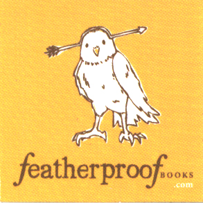
This week’s second gold star goes to a logo, though I’m a bit surprised to be giving it to such. It’s not often that a publisher or imprint logo elicits a particularly strong reaction from me, but the logo for Featherproof Books is a different matter.

To quote from their website, Featherproof Books "is a young indie publisher based in Chicago, dedicated to the small-press ideals of finding fresh, urban voices. We publish perfect-bound, full-length works of fiction and downloadable mini-books." One of these full-length works of fiction is  This Will Go Down on Your Permanent Record, a young adult novel by Susannah Felts published this past March that is being distributed by PGW.

I haven’t read this book, so I can’t yet comment on its quality, but I will say that when I picked up my galley and the cuter-than-cute sticker that’s pictured here fell out of it, I sat up and took notice. To me this logo says "smart, quirky and fun" — three qualities I appreciate both in a book and in a publisher. I look forward to eventually reading some of Featherproof Books’ fare to see if the books they produce are half as appealing as the drawing they’re using to promote them.

Have you seen any gold-star-worthy designs of late (covers, logos, or otherwise)? If so, why not rave about them here, with the hopes that their designers’ might catch wind and whip up more of that same fabulousness.

Making Reading Appear Fashionable


Alison Morris - June 24, 2008

While I don’t exactly live on an Anthropologie-friendly budget, I do sometimes browse the sale rack of the retailer known for its off-beat, elegant clothing inspired by vintage wear, and I do thumb through their mail order catalog whenever one arrives. Their May catalog took me by surprise this year because several pages of it had a "Summer Classics" theme in which EVERY photo showed a female model doing what? READING! And one page in each of five reading-themed spreads includes a quote from some famous work of literature (Breakfast at Tiffany’s, The Awakening, Mrs. Dalloway, Wuthering Heights, Ethan Frome).

I think it’s refreshing to see a clothing retailer showing reading in such a fashionable, sexy light, let alone showing reading at all. (I also thought it couldn’t hurt the reputation of models to be seen doing such a thing…) I wish more print ads, television commercials, music videos, mail order catalogs and the like would show MORE images of people with a book in their hands.

From the standpoint of someone wanting to promote the "coolness" of reading, this could only be a good thing. And for publishers these avenues seem like a potential gold mine for product placement.

I know, I know… Those music video and feature film spots are probably only affordable to companies with advertisting budgets the size of Coca-Cola’s, and devoted only to books with print runs in the millions. But surely some clever marketing guru could finagle a way to sneak in a superb book by a midlist author every now and again?

In any case, this Anthropologie catalog strikes me as a missed opportunity for some publisher, as the book this model is reading in every photo is one called The Color of Green. (I can just make out the words in the photo at the bottom of page 24.) Written by Lenard Kaufman and published in 1956, it’s a crime novel that’s now long out of print. But, hey? If any of you used or rare book sellers out there have noticed a sudden interest in this title, this could just be the reason for that.

In-Store Pets


Alison Morris - June 23, 2008

Rivendell Books in Montpelier, Vt., has a REAL LIVE tortoise (not a giant one!) making its home in the bookstore. How cool is that? If you walk to the children’s section, at the back of the store, you’ll find Veruca under the "Vermont Authors" section, with a sign above him explaining the following:

Veruca
Rivendell Mascot
Russian Desert Tortoise
Central Asia
He’s a male

You can spot Veruca’s bin on the bottom shelf of the bookcase below.

I don’t know Veruca’s history at Rivendell or how long he’s put up with the curious stares and over-eager hands of Montpelier’s children and adults, but each time I’ve popped in to take a peek at the guy, he’s been surprisingly lively. I’m amazed at the speed he can pick up as he crosses the sandy gravel that lines his plastic bin!

When I first started working at Wellesley Booksmith over seven years ago, our store had been in existence just a year and a half. In its previous life the space had been a bookstore that was part of the Lauriat’s chain AND at one time or another it had been home to a cat. Frequently customers coming into our reinvented store space would ask if the cat was still there. "Alas," I would tell them, as I secretly thanked my lucky stars that I didn’t have to break out in hives at work each day. I love cats, but I’m highly allergic to them, so the presence of a store cat would be bad news for yours truly.

I do love the idea, though, of a store pet (who may or may not also be the store’s mascot). A store dog would be especially welcome in our space! We allow dogs to come into the store with their owners and have many a shaggy visitor stopping in on a VERY frequent basis, knowing full well that at either point-of-sale counter they can (and do) receive a biscuit from one of our booksellers. (Talk about a clever way to get your customers in the door — this way their dogs literally DRAG them in anytime they’re walking around the neighborhood.)

Of course having a few furry friends traipse through our store on short visits doesn’t even begin to put us in the same animal-loving camp as Wild Rumpus in Minneapolis, which is home to an impressive menagerie of critters, both of the furry and feathered variety. Their newest co-workers are two chickens named Pimento and Olive!

Have you been in/worked in/known about a store that had a living critter or two on staff (though presumably not on the payroll)? If so, please enlighten us readers as to what you thought of that arrangement. And/or tell us whether or not YOU would want to bring your pets with you to work.

Wall Scrawl: Whose Writing Could Seduce You?


Alison Morris - June 18, 2008

I am not usually one who engages in delinquent behavior, but…. well…. my job has turned me into a graffiti writer. Seriously. Here is how it all began:

The women’s restroom at our store has three stalls. One of the stalls was, for quite some time, without an adequate toilet paper roll holder. The prongs that stick out from the wall were there, but there was no "crossbar" on which to slide the roll so that it would be suspended between the prongs. For a long time, we ladies would suffice with the toilet paper roll either awkwardly rolling, perpendicularly, on one of the prongs, or sitting on the toilet tank behind us. Since our bathroom isn’t open to the public, there was no real need to resolve this inconvenience, and we just got used to it, annoying though it was.

But that all changed the day some genius came up with the idea to use a PENCIL as the crossbar! It was perfect! A new pencil, already sharpened, turned out to be just the right length to be suspended between the two prongs. Problem solved!

Except that that pencil began calling to me. I would see it every day. Right there. Deprived of the opportunity to be used for its intended purpose. I would look at our yellowed stall walls, marred with shoe smudges here, scotch tape there, and see the same boring signs (do not flush paper towels) and posters (Bridget Jones’s Diary) that I’d been looking at for almost four years. I was suffering from stall monotony, as was the stall itself! I could hear it, calling out for change, just as that suspended pencil called out for use — for a pencil adventure! So one day, I brought the two together. I answered their twin calls with a call-related message of my own.

Giving a nod to traditional bathroom graffiti, I (it’s true) scrawled the following message on the bathroom wall: FOR A GOOD READ CALL (781) 431-1160. (The number being, of course, our store’s phone number.)

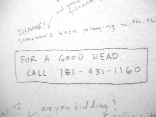
It took less than 12 hours for another note to appear alongside mine, this one a bold statement of the obvious: "Someone’s been playing with the toilet paper holder!" But wait! I recognized that handwriting — our assistant manager had written that note!! If SHE could get away with it, well…? That decided it. It was open season for graffiti in Wellesley Booksmith’s Women’s Restroom, Stall #1.

One bookseller wrote a question on the wall, asking which booksellers considered themselves feminists. (A heady topic for stall chatter, I thought.) As several stall users weighed in with their responses, the anonymous arguments got a little heated. I began wondering why we were having this debate in a bookstore bathroom stall, of all places. BOOKSTORE bathroom graffiti should be BOOK-related, I thought, so I wrote a book-related question that seemed, again, to give a nod to traditional bathroom graffiti topics: If there was a direct correlation between quality of writing and sex appeal, what authors (male or female) would you want to sleep with?

The response was great! The suggestions were hysterical! Clever! Such entertaining bathroom reading! They touched off a spate of bathroom graffiti that hummed along as we bookselling gals shared our entertaining opinions in anonymous fashion while putting that toilet roll holder to good use. We had to replace the pencil many times, because once you’d sharpened it a time or two it no longer suited its roll-holding function. But if you didn’t sharpen it, you couldn’t write on the walls, so…? We kept spare pencils on hand to suit either purpose, and the spare pencils could usually be found on the toilet tank. Where the toilet roll USED to be.

UNTIL THE DAY THE UNTHINKABLE HAPPENED. Someone installed an ACTUAL, proper toilet paper roll holder. And, I tell ya, the magic died. There are still spaces in that stall that are uncovered with bookseller scrawl, but the motivation to fill them has, well… vanished.

Which is why I am turning to you, dear ShelfTalker readers. Many of you have embraced my previous calls to sound off anonymously about book-related topics near and dear to your heart. Now I am asking you to sound off on the very same questions that have appeared (for several years now) on the walls of Wellesley Booksmith’s Women’s Restroom, Stall #1. Help us relive the glory days, would you? Remind us why we turned to such delinquent behavior in the first place.

We’ll begin with my first stall question — the one cited above:

If there was a direct correlation between quality of writing and sex appeal, what authors (male or female) would you want to sleep with?

OR, for those of you who’d prefer to take the author/reader relationship more slowly, here’s another variation:

If there was a direct correlation between quality of writing and sex appeal, what authors (male or female) would you want to flirt with shamelessly?

(Better?)

Ladies and gentlemen, start your pencils. As always you have the option of commenting anonymously.

Dropping Everything for Jellicoe Road


Alison Morris - June 17, 2008

Each time I think I know ABSOLUTELY what book or ARC I’m going to read next, another one comes along that is irresistible to me at that moment and replaces another at the top of my "READ THIS NEXT" pile. It’s a deadly cycle. Deadly, in that some of the books that were once my reading pile frontrunners eventually drop so far down as to never surface again.

What I rarely do, though, is stop reading one book in the middle in order to pick up another. I don’t do well with reading multiple books at a time. I like to give each one my undivided attention, from the first page to the last.

But every now and again, maybe once or twice a year, a book comes along that is just TOO irresistible — one that I just have to read RIGHT NOW. And today it’s the ARC for Jellicoe Road by Melina Marchetta (HarperTeen, August 2008), which was just hand-delivered to me by my Harper rep. I’m stopping halfway through the adult book I’ve been reading (Stalking Irish Madness), because I JUST CAN’T WAIT to start this one!!

If you haven’t read Saving Francesca, you might not understand my unbridled Marchetta enthusiasm, If you have read it (or even Looking for Alibrandi), then you’re probably salivating with envy right now, wishing you could get your hands on Jellicoe Road too.

As soon as our lovely Harper rep, Anne DeCourcey, handed off the galley to me I opened it, read the first few sentences of the prologue, stopped, shook my head, made Anne and Lorna pause in their sales call, then read the prologue out loud to them. AND NOW… I’m going to share it with you. After reading it I’m betting you’ll want to read this book too.

My father took one hundred and thirty two minutes to die.

I counted.

It happened on the Jellicoe Road. The prettiest road I’d ever seen, where trees made breezy canopies like a tunnel to Shangri-La. We were going to the ocean, hundreds of miles away, because I wanted to see the ocean and my father said that it was about time the four of us made that journey. I remember asking, “What’s the difference between a trip and a journey?” and my father said, “Narnie, my love, when we get there, you’ll understand,” and that was the last thing he ever said.

We heard her almost straightaway. In the other car, wedged into ours so deep that you couldn’t tell where one began and the other ended. She told us her name was Tate and then she squeezed through the glass and the steel and climbed over her own dead – just to be with Webb and me; to give us her hand so we could clutch it with all our might. And then a kid called Fitz came riding by on a stolen bike and saved our lives.

Someone asked us later, “Didn’t you wonder why no one came across you sooner?”

Did I wonder?

When you see your parents zipped up in black body bags on the Jellicoe Road like they’re some kind of garbage, don’t you know?

Wonder dies.

Want to read more? The first half of Chapter One (which appears to be the entirety of Chapter One in the Australian edition of the book, called On the Jellicoe Road) has been posted at Insideadog.

Not Silhouetted by Alabama Moonlight


Alison Morris - June 16, 2008

Last week in my post about the trend of using silhouettes and uninteresting stock photos (as opposed to interesting ones!) on book covers, I posted what I thought was the final cover for the paperback edition of Alabama Moon, which is being published by Square Fish this September. My assumption seemed safe, as the cover appeared both in the catalog AND in numerous places on the Internet. But as often happens in publishing, the word I took as "final" was anything but!

Having read my post last week, Liz Szabla, editor-in-chief of Feiwel and Friends, wrote me a VERY nice message with the happy news that the silhouette cover had NOT, in fact, been the final cover for the book. She attached the revised cover image to her message, and I am posting it here.

Those of you who have read Alabama Moon will hopefully agree with me that this is a definite improvement over the running silhouette cover image. And those of you who have NOT read Alabama Moon should be sure to do so, be it with this cover or any other. I’ve posted my original review of the book on ShelfTalker once before, but (once again), here are my still-true thoughts, as they first appeared in our store’s newsletter back in 2006:

There are some books that have all the right ingredients, all the right characters, and all the right outcomes: This is one of them. With the writing of his first novel Watt Key has softened the pluck and spirit of Huckleberry Finn, slipped them into the bones of a 21st century boy, and in so doing, arrived. Filled with spunk and fever and a wild, sweet goodness, Alabama Moon is a soul-satisfying, kid-centric story staged with pecan trees, pine logs, and a cast of characters you can’t help but love. Will kids like it? Oh, good heavens, yes. Scout’s honor. I predict that wilderness skills will soon be en vogue again and suggest that a special Moon badge be awarded to every kid who reads this book.

Eclipse Special Edition Invites Illicit Readings


Alison Morris - June 13, 2008

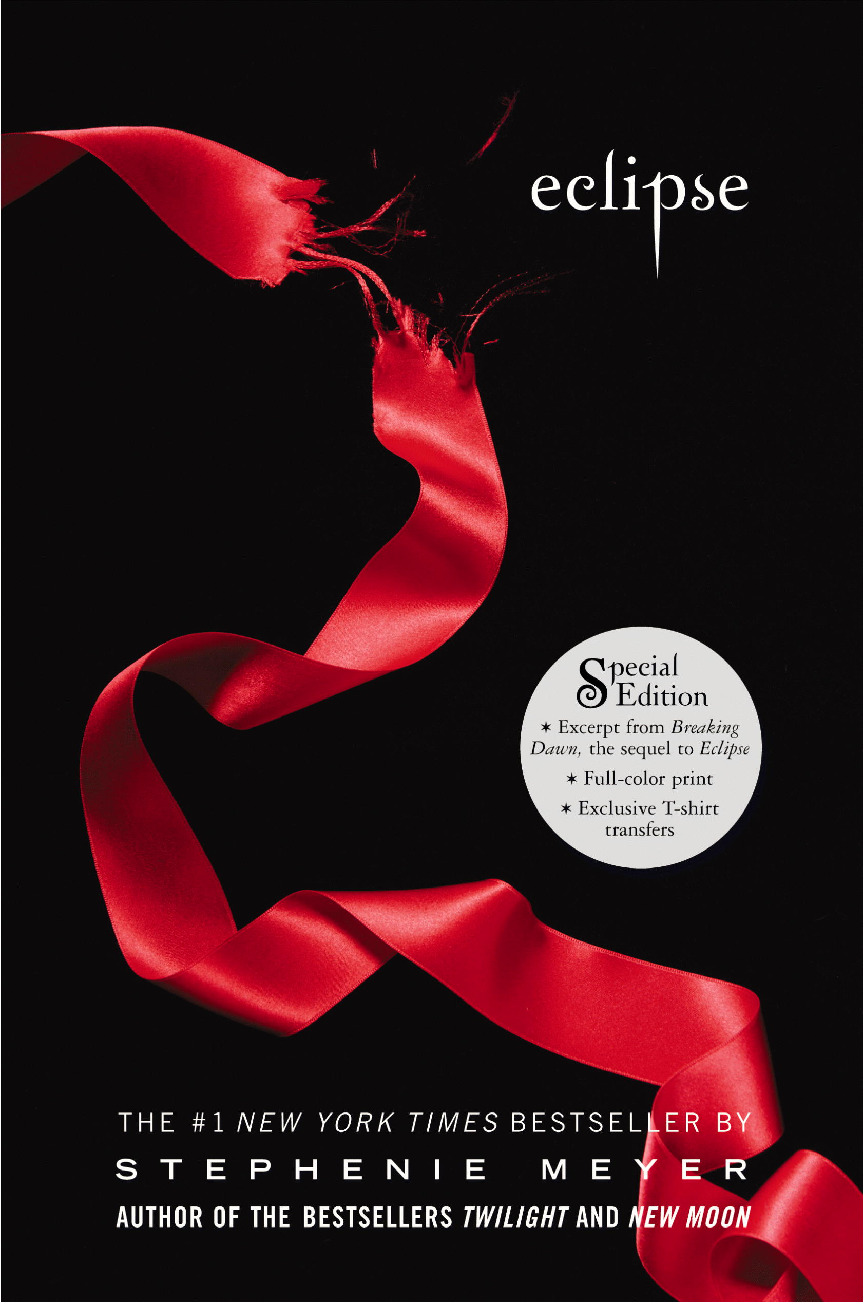
Keen-eyed Pat Pereira is one of the booksellers who keeps watch over all the goings-on in our store’s children’s section. Today she shared with me a rather interesting (and I think entertaining) phenomenon on the Stephenie Meyer front. Little, Brown recently published a hardcover "Special Edition" of Eclipse (the third book in Meyer’s wildly popular series) that includes bonus materials not available in the original edition, though (to Little, Brown’s credit) at the same price as the original, $19.99. The bonus materials include a full-color poster (printed on the back of the book’s dust jacket), two iron-ons, and the first chapter of the long-awaited Breaking Dawn, which won’t be released until August. Pat’s report to me today was that teenage girls are coming in to the store, picking up the new Special Edition of Eclipse, reading the first chapter of Breaking Dawn at the back of the book, then putting it back on the shelf and leaving.

My reaction: Who can blame them?? If you’re a Stephenie Meyer fan who already owns Eclipse in hardcover, how fair is it to expect you to buy it AGAIN, just so that you can get a glimpse of what’s coming in August? I personally believe it’s rather unfair. If Little, Brown (or Stephenie Meyer) wanted to insist on making money off Breaking Dawn’s sneak preview, I’d have preferred to see them put it on a secure website and charge readers some nominal amount of cash to access it. What I really would have liked to see, though, is everyone embracing the fact that teenagers are so OVERJOYED by this series of books as to just post that first chapter online for them to read FOR FREE. As for how that would affect the flow of cash into publisher/author coffers, I think the buzz that would have followed everyone’s free access to that first chapter would have sold enough additional copies of Breaking Dawn to more than make up for the "loss" of not having published its first chapter at the back of a "Special Edition" of the previous book.

I suppose this is very un-retailer-like attitude, but what can I say? I hate the idea of such enthusiastic readers (especially YOUNG enthusiastic readers) having to cough up the cash twice and walk away with little more than two copies of the same book.

I suppose that’s why I’m having a hard time mustering any discontent with the teenagers coming into our store and treating it (for brief stretches of time) like their own Stephenie Meyer Reading Room. If you’re an Edward- or Bella- or Jacob-loving teen without the available resources to purchase Eclipse a second time (or convince a parent to purchase it for you), AND the first chapter isn’t available for you to read online, AND all the new edition copies have been checked out of the library, well…? What’s a teen to do?

Bookstores to the rescue! I wondered if anyone had actually confessed online to this illicit in-store chapter-reading and, lo and behold, I found many, many Meyer fans who mention having done so. What’s pasted below is just a sampling.

When I read this one I had to wonder about the definition of "obscure bookstore" (hopefully not any independent bookstore that I know):

"I managed to find a copy of the Special Edition Eclipse in an obscure bookstore and I read the first chapter of BD while the person wasn’t looking =) that way I don’t have to buy it."

And here we have an argument against having comfy chairs in your store:

"So my sis in law TJ and I decided to go to Hastings and have some hot chocolate and grab a copy of the special edition of Eclipse that has the first chapter of Breaking Dawn at the end of it, and sit down in their comfy chairs and read it."

We’re going to assume this next blogger doesn’t live anywhere NEAR any independent bookstores:

"I really want to go into the Barnes and Noble there so I can read the 1st chapter of Breaking Dawn in the special edition of Eclipse."

The same goes for this one:

"While he was looking for a hat, me, Mom, Chantel and Ashley went across to the Books-A-Million to read the first chapter of Breaking Dawn in the special edition of Eclipse."

But this is the post that really summed up my thoughts:

"Yes, I sneaked a look at the Breaking Dawn preview inside the new "special edition!" of Eclipse – which is wrapped in plastic to prevent people from reading the preview without buying the book, but I did find one that wasn’t shrink-wrapped.

"That is a bad, bad thing to do to a devoted fanbase, especially a devoted teenage fanbase. Hardcovers are expensive enough without having to buy a book twice over, and Breaking Dawn may be coming out in August but since when are fangirls known for delayed gratification?"

Too true!

If you aren’t familiar enough with the Stephenie Meyer fanbase to fully appreciate the level of their enthusiasm, please do yourself the favor of watching this completely charming video on YouTube, in which a teenage girl who has just had a GLIMPSE of Breaking Dawn‘s cover proceeds to speculate about everything the cover image could possibly suggest. You go, fangirl.