Much has been written (and reviewed in bookseller training seminars) about the value of signage in the bookstore. Helping customers navigate the visual overload of all those sections, all those face-outs, and all those reading options requires clear, large, legible, and easy-to-see signage in every part of our stores. In a children’s store, we must also take into account that some of our customers are young readers, who may not have the vocabulary (yet) to discern “Non-Fiction” from “Biography,” or “Graphics” from “Middle Grade.” The caregivers and chauffeurs of those young readers may be distracted by younger siblings, lots of requests for impulse toys, and trying to locate the nearest bathroom, so they benefit from lots of signs, too. From the moment they enter (is there a sign large enough to get customers to glance at their watch or smartphone for the time when we clearly have been trying to close for 20 minutes?) to the inevitable request for a changing table (“do you see the BATHROOM sign over there in Middle Grade? It’s in there”) to the politely worded “STROLLER PARKING AREA” in our story time space, there’s just no font size or lighted placard large enough to make sure that all visitors see and read them.
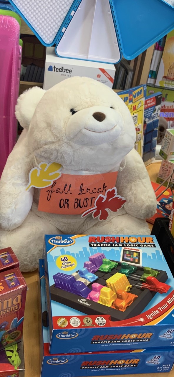
When my staffers create a new seasonal display or themed table, I often remind them to incorporate a sign into the design. While it may seem obvious to US that all those LGBTQ titles and the rainbow flag over them celebrate National Coming Out Day, or that the collection of travel toys and activity books were gathered on a tabletop in preparation for Fall Break, our browsing customers are coming upon those items in the middle of a crowded shop with lots of things competing for their attention. Also, they may be talking on their phones, which means that we have to be especially clear. In addition, they are already looking for signs that never move: here’s the Young Adult section, here’s where New Baby books are, and over here are the nonfiction titles about animals. All of those sections are pretty stationary, and yet we direct customers daily by pointing out the big signs that hang from our light fixtures, and their duplicates that line the shelves.
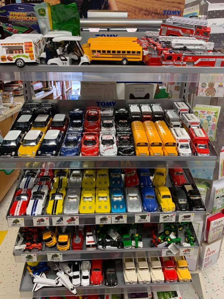
In spite of every internal protest (usually after I have cleaned up the rack of cars and trucks for the zillionth time on a Monday) I try to avoid signs that direct customer behavior through saying “no.” Specifically, signs that begin with “Please don’t….” are just nagging that will not be heeded by the offender, and will make the shopkeeper feel even worse when they are ignored. Consequently, I have removed the “please be kind to the toys” signs, and just resigned myself to a constant hourly straightening.
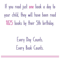
My favorite signs are those that are funny and gently encourage, rather than admonish. Our picture book sales always increase for the week that I put this little graphic out in its frame:
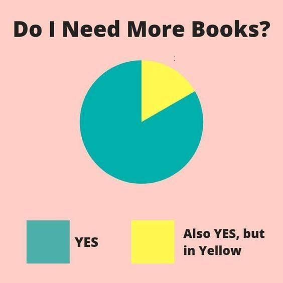
And this one always brings smiles (and an indulgent nod to the child who wants just one more graphic novel) at the register:
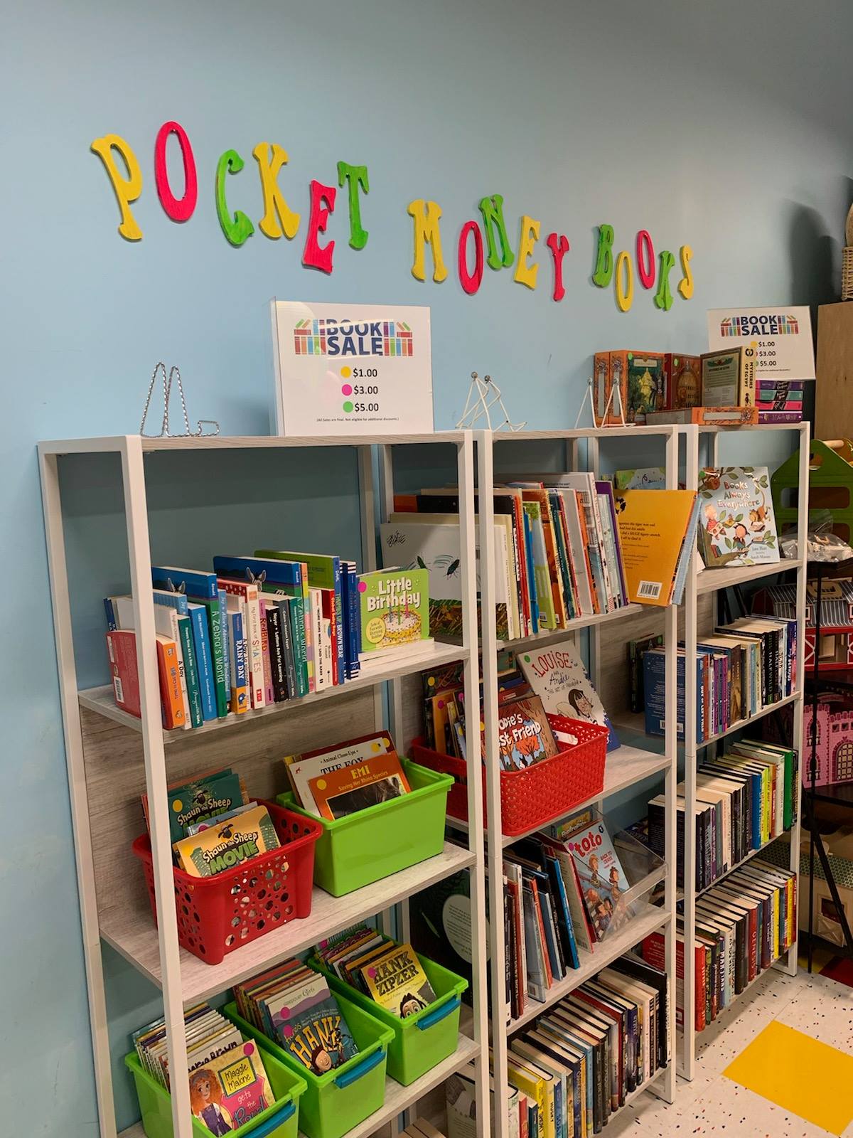
While I don’t personally care for permanent “CLEARANCE” sections in stores, and really would rather avoid training our customers to look for “sale” signage, this little section has been very popular. Rather than put slightly damaged, unreturnable books on clearance, we created a “Pocket Money Books” section for children to be able to spend their own money in our shop. Of course, lots of teachers, grandparents, and bibliophile parents take advantage of this section, too, but the invitation for kids to shop for themselves feels more positive and enabling to me – this is signage that says “yes, this is for you.”
Even the most obvious signs, of course, may be ignored. Here’s the entrance to our store:
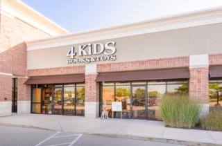
This afternoon, a customer came in, and walked up to the cash wrap, with his phone out and extended. “Hi, can you help me?”
“Sure! What do you need?”
“I’m looking for a children’s bookstore. It’s right here on Google Maps.”
“You found it. Welcome. How can we help you today, or would you just like to rummage?”
“No, this one is called “For Books” something….. it’s a kids’ store. See, here’s the reviews.”
I walked around the counter, handed him my 4 Kids Books business card, and offered my hand. “Hi, I’m Cynthia. Maybe I can help. What are you looking for today?”
“I need a gift card. My niece sent me a list of books she wants, but I don’t know how I’d ever be able to find them in here. You have a lot of stuff.”
“Absolutely. Will that be a credit card purchase? How much would you like for me to load onto the card?”
Sometimes, not just customers need to be able to read the signs.

I never knew that the caregivers and chauffeurs of those young readers may be distracted by younger siblings, lots of requests for impulse toys, and trying to locate the nearest bathroom, so they benefit from lots of signs, too. I never thought that it would be like this, it is an intriguing article to read and I will also share this with my aunt. Thank you for the information about Signs.