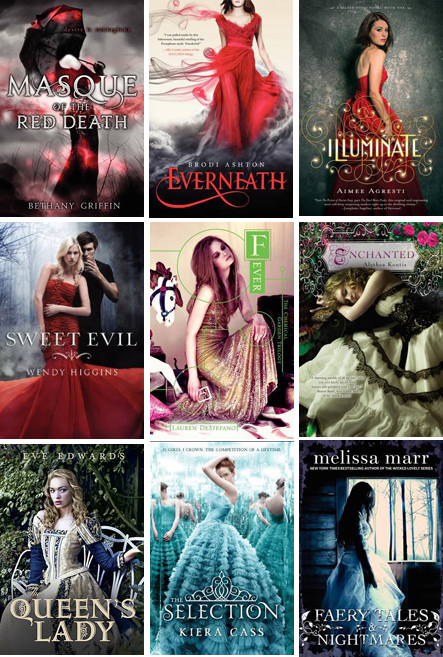
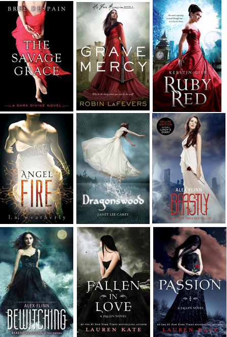
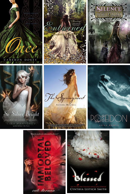
Hi, designers and alert readers. It’s time to do another round-up of YA book cover trends. Last year, we saw lots of big close-ups of flowers, interlocked hands, silhouettes, faces covered by blowing hair, giant keys, and more (gathered in this post: The Season of Windblown Hair). (Last year also saw scads of black-and-white, and predominantly black/blue, covers, but I lost the cover art downloads in a tragic laptop incident before finishing that post, so you’ll have to trust me on that.) Finally, last year, there were girls in gowns. Lots of them. Lots and lots of girls and gowns, ballgowns and Sex in the City-esque dresses and period costumes. Regardless of the time period of the books, almost all of the models looked extremely modern, which we are certain was deliberately done to telegraph to skeptical contemporary readers that, while a book may be set in the past, it is still “relevant” to 21st-century girls.
Sales of those titles must have been incredible, because this year, guess what? There are lots and lots of girls in gowns. I am a little gowned out. It’s not that the book covers aren’t attractive; so help me, they can be quite beautiful. Some of them are almost extraordinary. But the sea of similarity becomes daunting. Are readers going to bother to distinguish between those titles — the books are all so varied inside the covers, so interesting and different and worthy of individual distinction — to find which ones might resonate with them?
Since the girls-in-gowns trend shows little sign of abating, I am assuming these jackets must be effective with many readers. In our store, the teen girls complain about the sameness of covers. They often don’t like photos of models on book jackets, primarily because they don’t look like the character they imagine from reading the book. Crystal clear, close-up photos do work against the reader’s imagination. And the age of the models can be an issue. “She looks 25!” a girl might snort. But if they like the author, or the cover strikes them as beautiful, they’ll give the book a chance.
Below are some of this winter/spring’s gown covers. Major props and thanks go to Sandy First, a Flying Pig bookseller who noticed and pulled out nine of these ARCs from our galley boxes, spurring this post.
Some of these jackets are more distinctive, intriguing, effective than others.


Readers, what do YOU think?
Do covers that fall into this kind of trend or pattern serve you, by telegraphing their genre and likely audience via photographic shorthand? And if so, what does and doesn’t work for you about them? Do you care about the actual dress? The model? Can a small thing turn you off, or are you willing to overlook a glitch in the cover to peruse the actual story? (One example for me from this group was the cover for Lauren DeStefano’s Fever. The first book in this series, Wither, featured a girl/gown cover that was striking, unusual in color and composition, and I really liked it. But Fever‘s cover image strikes me as very modern, a party girl caught on a bad night. I didn’t realize the two were even from the same series until I noticed the title design treatment.)
Conversely*, can a small thing also make a trendy book stand out from the crowd for you? For instance, I keep coming back to the treatment of the font on the cover of Aimee Agresti’s Illuminate (see below), with the little filigree of lights surrounding the title. I just love it. (*This is not strictly a converse statement, for those of you who care about such things. I know it and you know it, but let’s let it go for the moment? It’s getting late. Thanks.)
Are you harder or easier on book covers that fall into genre groupings? Do you judge the book more or less by its cover in this circumstance?

I’d much rather see a “Girl in fatigues” or “Girls in armor” trend, but that said, I’ve read some of the books.
I like them, but it’s overdone. Especially since sometimes the cover doesn’t match the tone of the story. Paranormalcy for instance, the cover is pretty, but the character, although fashionable, is always in action and is only wearing a dress briefly toward the end.
Some of those covers above are excellent, I really like Everneath. Faery Tales & Nightmares is a little different, more haunting. The Springsweet is historical so I get it. A nice trend to get bored with, at least they aren’t ugly covers!
I’ve noticed this trend ad naseum, and was especially sorry to see the final cover of Grave Mercy…the ARC cover and overall packaging was so cryptic and intriguing, I couldn’t wait to dive into it. I wasn’t disappointed, what a wonderful read! I often wonder if publishers deliberately make their ARC cover different to market it to savvy readers/reviewers and the final cover to appeal to the lowest common denominator. Perhaps I’m just being cynical.
I happen to find the girls in gowns trend bland simply because it’s so over done. But I’ve actually taken it a step further in the YA blog I write with two others. I think the trend goes so far as to be WHITE girls in gowns, even for PoC books. This trend is ridiculously overused.
My article (http://www.yaketyyaks.com/2011/12/feeling-grinchy-about-book-cover-trends/) is a bit cranky about it, but I’m pleased to see someone else out there is noticing this trend! Maybe this trend, and perhaps the tired vampire love stories trend, will retire soon!
Pingback: artist abbreviated: christopher silas neal |
I do like most of the covers myself, but I have to say I liked the original
“plain” cover art of Alex Flinn’s Beastly.
I am attracted to books that show an interesting setting, that reveal a little about the problem the character faces. Those gown covers tell us nothing except that she is wearing a gown…one debutante after another… Of course, some covers are still showing shoes and socks…what does that say?
I’m attracted to covers that show something about the setting or the problems faced by the character. I think the young readers to whom I sell books are too. What does a gown say? debutante? Of course there are still plenty of shoes and socks covers. What’s with that? How about showing the dark city street or the old house perched on the cliff in Maine or the character driving the tractor or perched on the fence with the handsome dude?
Wow! After looking at all the covers above, I see what you mean. I don’t read this type of book so I would tend to lump them all together by looking at their cover, which is sad, because I’m sure they’re all very unique stories. The cover jacket for my debut middle grade, “A Smidgen of Sky,” has just been finalized. It’s a bright blue background with a cute font for the title, bright sunflowers on the bottom and a bright glider plane above. While I like it, I’m not quite sure it’s exciting enough to catch the eye of a young reader. The design group at Harcourt, including my editor, really seem to love it. They call it “iconic.” I guess we’ll see.
As a librarian, I may not be overly influenced by the cover but my high schoolers are very much affected. Also, my high school is primarily Afro-American, so the covers you’ve shown here would definitely turn them off. Historical fiction is a hard sell anyway for me and rich white girls in fancy dresses is not appealing. They do want to read about girls who face real problems and this won’t entice them into even looking at the book at all. I loved the original cover of Beastly because it didn’t have a character depicted. Why do publishers insist on this?
The trend of bland pretty girls in gowns bothers me (love Gabrielle’s suggestion!), but what bothers me just as much is the continued use of PHOTOS on covers. Other than So Silver Bright (is that Jason Chan’s lovely artwork?), they all seem to use photos. Whatever happened to hiring artists to do artwork on covers? Is that too last-century? Too expensive? The Hunger Games managed it. And there’s not even a sketch of Katniss, so you can use your imagination.
At least the girls in your photo montage (nice job, btw) don’t all have their backs turned! Hated that trend. At one point we had no less than four YA novels faced out of the same shelf with the backs of girls in red sweaters! Look at You Have Seven Messages and you’ll see what I mean. Also hated the trend of cutting off their heads, which I notice a few of these still do.
And I’m really glad I read Grave Mercy before I saw this cover!
Curiously absent, but with a twist: DITCHED by Robin Mellom.