I’m so curious about how book-jacket trends develop. It’s probably just something in the zeitgeist that brings a whole season of, say, close-ups of hands or stripey socks and tennis shoes or flowers illuminated as if shot on a lightbox. Or close-ups of girls’ faces, or face parts, or the backs of teenagers’ heads, or blue-jeaned hips. Or, for that matter, entire herds of dustcovers with photos of dramatically lit girls framed by dark foliage or fabric.
But I like to imagine a sort of book-cover Bryant Park fashion show, setting the trends for an upcoming season. It would go something like this:
Welcome, designers! So good to see you. We’re excited about the shape of book fashion these days; there are so many striking covers, gorgeous images, playful fonts. Let’s get started. Bring out the models!
This year, we’re seeing a lot of florals:
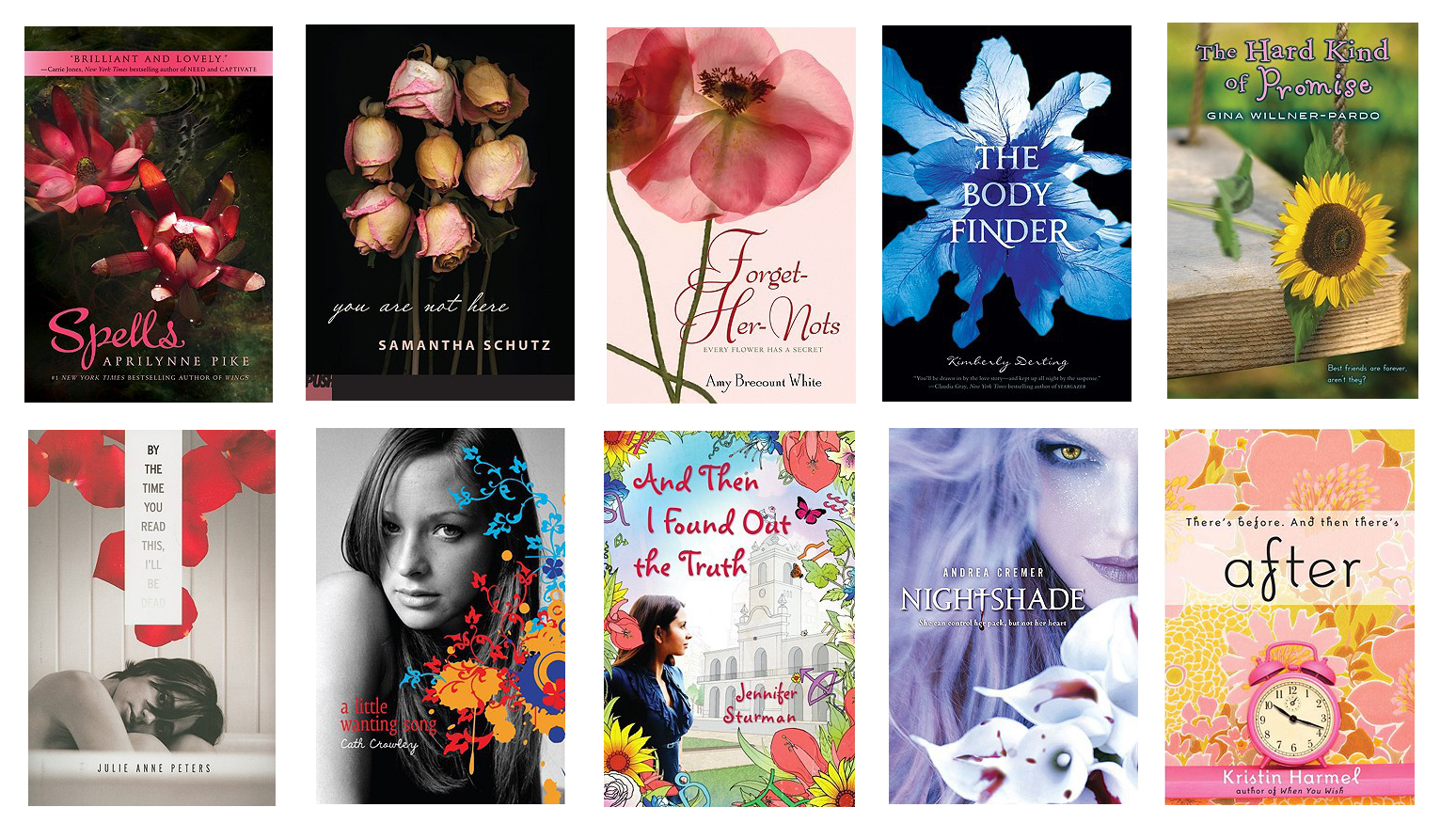
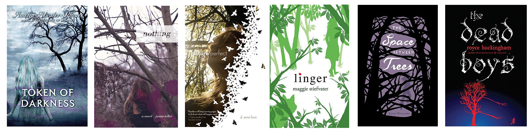
Speaking of foliage, covers are really branching out:
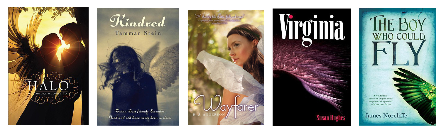
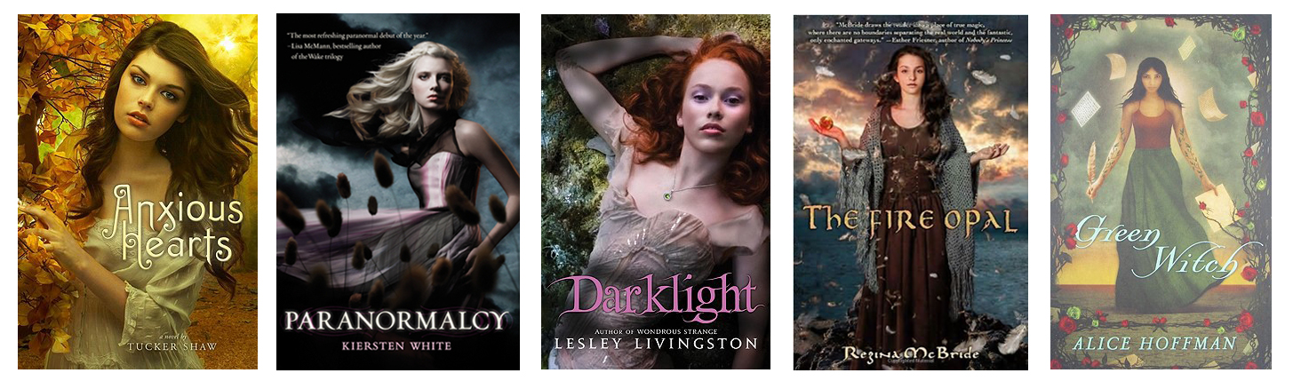
Wings are not walking the runway as often this season as they were last fall, but they’re still making a bold statement:
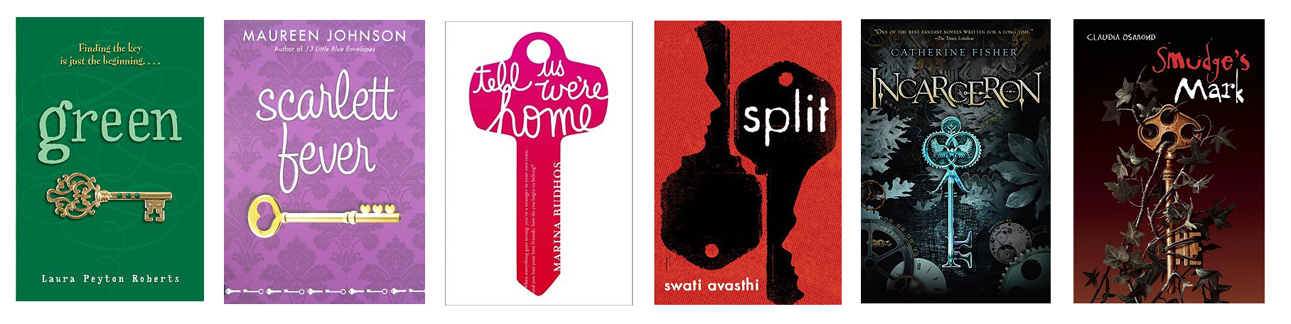
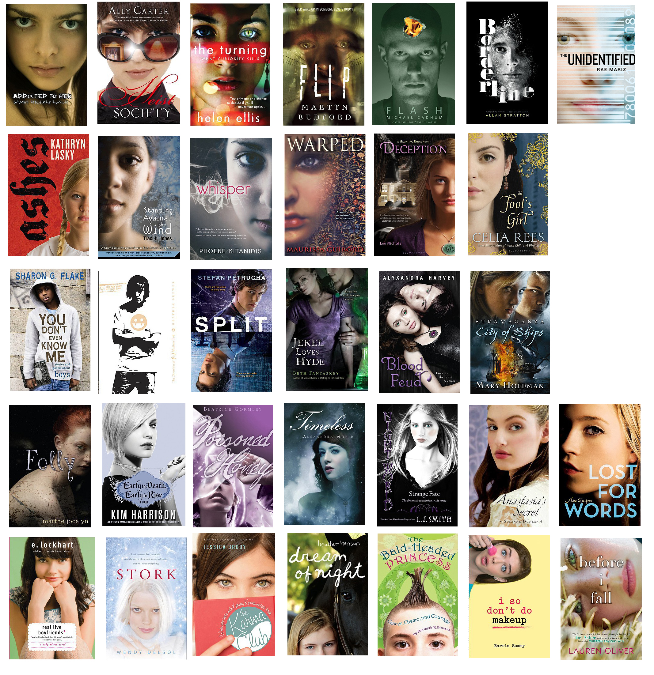
Ladies and gentlemen, if you’re trying to find the true key to your readers’ hearts, look no further:
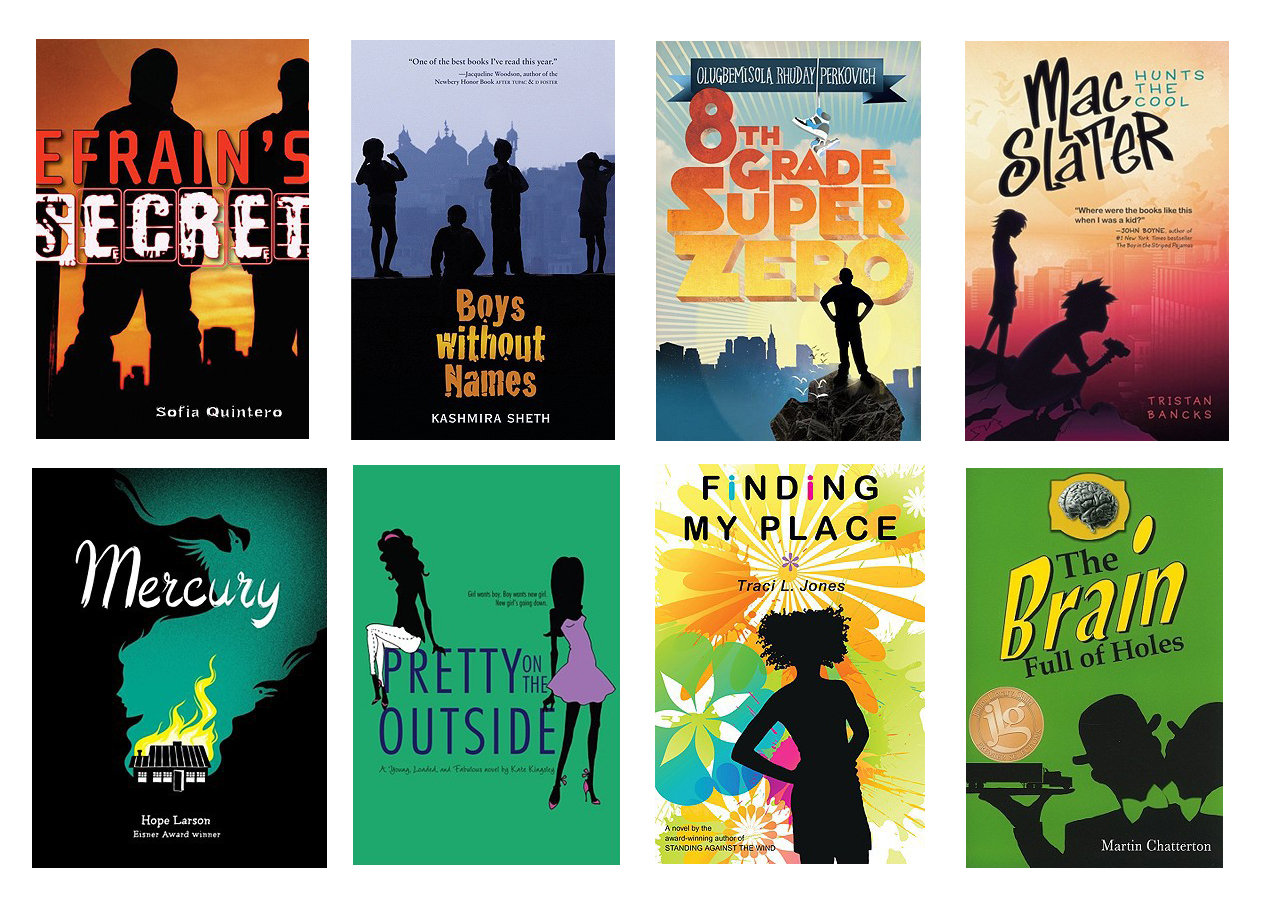
The male silhouette is enjoying a renaissance not seen since the 1970s. To a lesser degree, women and two-headed butlers try on this style. It’s catching on like a house afire. It’s always chic to flaunt a bold silhouette.
Also on the runway: photographs of modern girls in period costume. It’s a trend that’s gaining momentum.
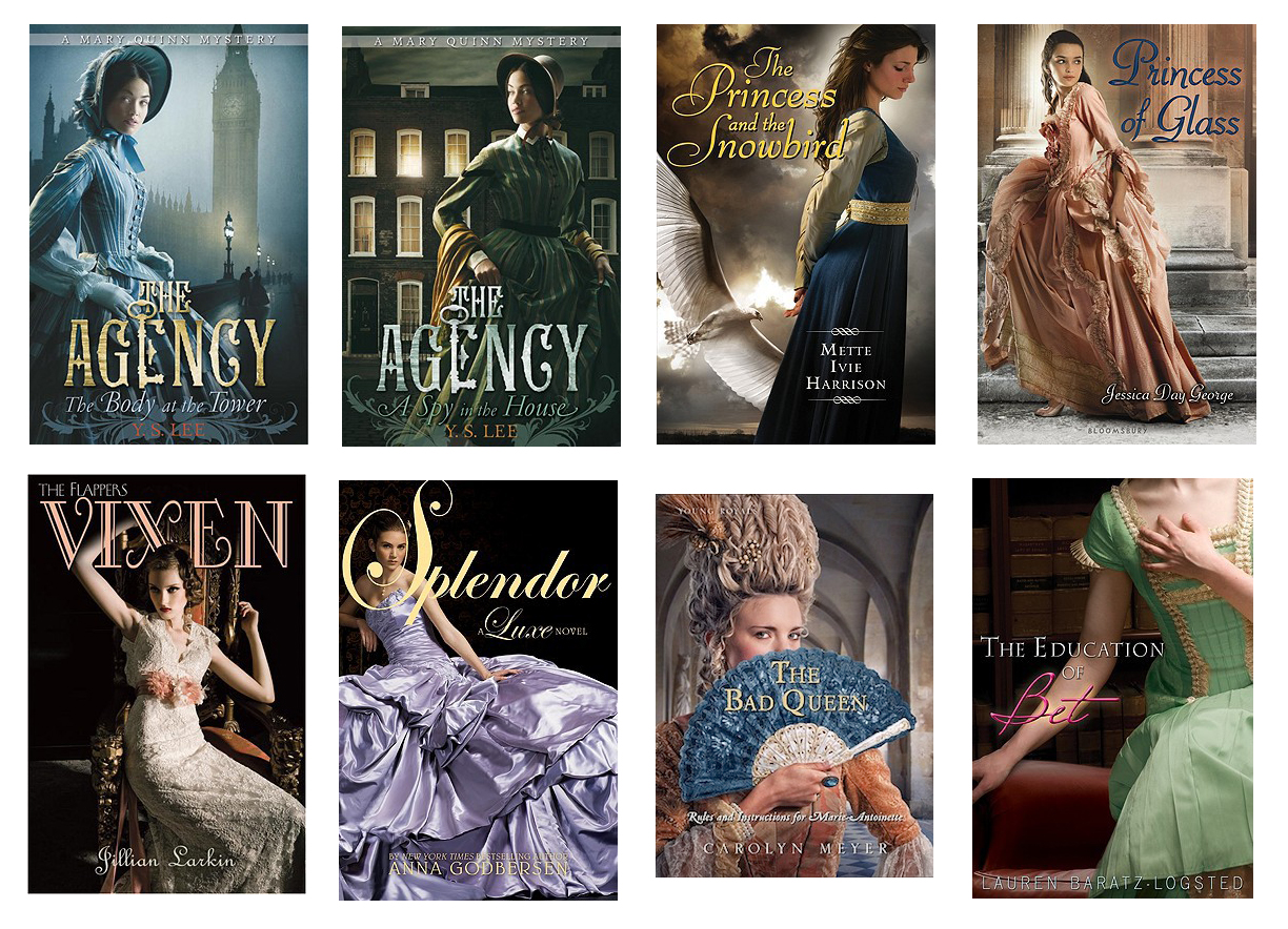
No matter what century, gowns are always a la mode. They look particularly fetching against a natural background:
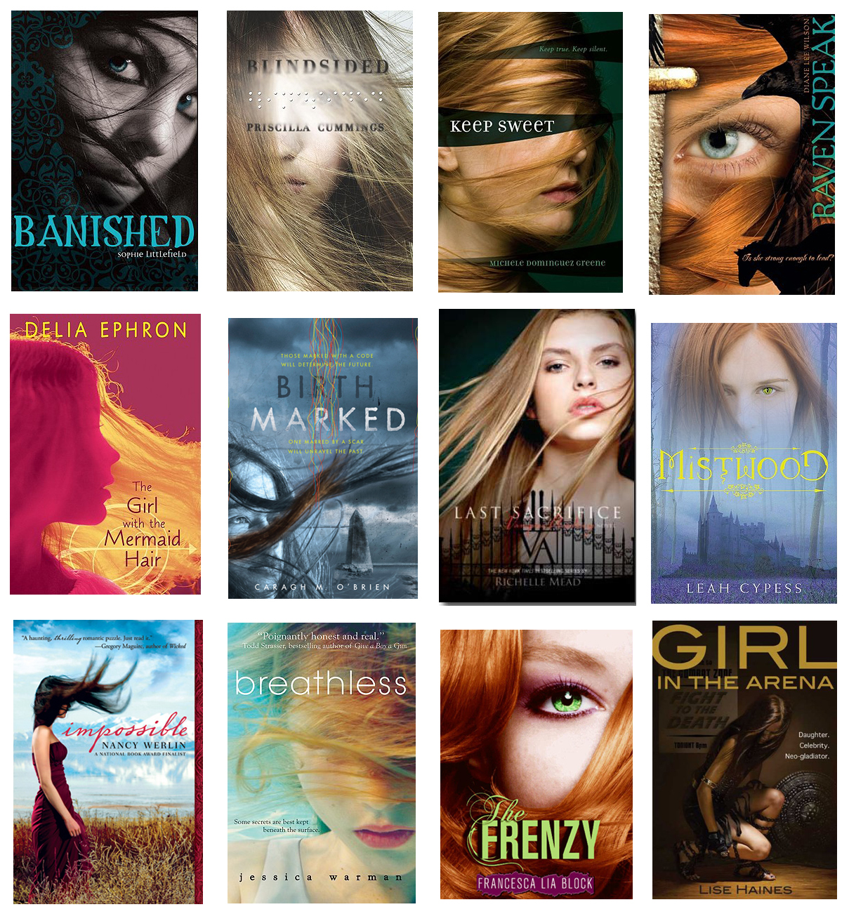
A hair tip for you ladies: girls these days are wearing it straight, long, and across their faces. (Edited to add some examples pointed out to us by alert reader Kelly Jensen, whose book-related blog is called Stacked.)
Sometimes, a girl finds herself alone out in the big wild world. Once in a while, she has someone to share it with.
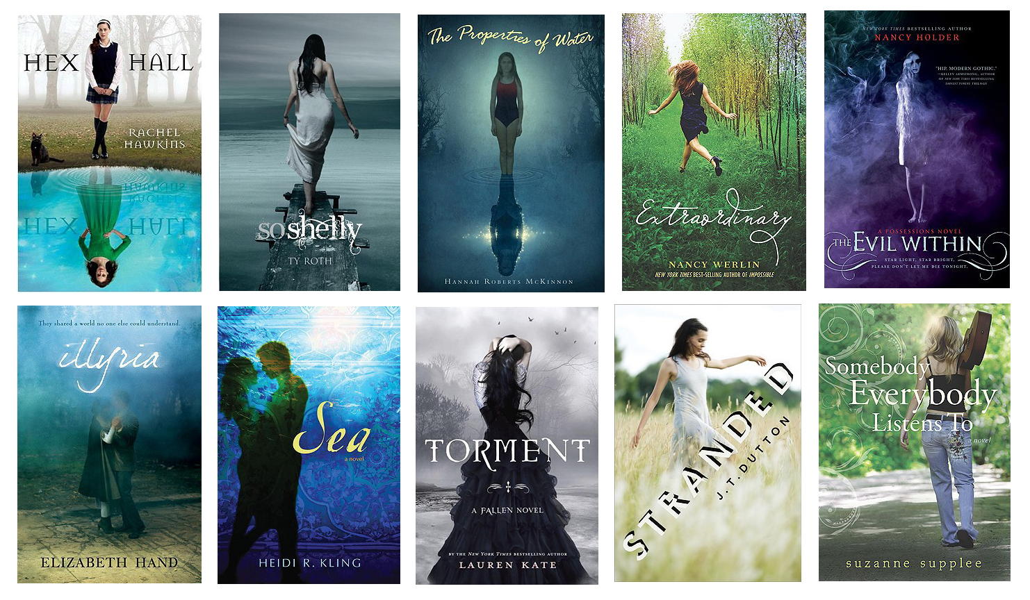
Speaking of couples, hands are in favor this season. lovers holding hands, almost holding hands, holding hands behind their girlfriends’ backs, hands forming hearts and stars, holding objects, hiding things…. Well, you get the picture.

Do you have a face prepared to meet the faces you will meet? Below is just a sampling of the year’s models. Here’s looking at you, kid!
Tell me, fashionistas: what trends have you spotted? And what do you predict for next year?

Ha! Well done.
And then there’s when it’s not just the same theme or motif… take a look at that Kindred cover (wings) and then look back at the first Maximum Ride title from a couple years ago:
https://yareviews.wikispaces.com/file/view/maximum_ride.jpg/64963692/maximum_ride.jpg
Different background, same girl.
Nice work! I like to try to spot color trends, also–usually among adult books. There have been months when our “new releases” table is a blaze of red or yellow, then there are the seasons where everything is being printed in sepia tones and I do anything for a little color.
I thought that Kindred cover looked familiar!
Love the fashion show. Definitely a similarity in how trends move.
And to think that I’ve worried for years about what became of all those severed body parts. Thank you for demonstrating that they’re successfully recycled into other jacket designs.
Thanks for the show!
I guess for this age group, the trend’s the thing–no matter what the trend, as long as it’s a recognizable trend.
Me, I keep hoping for a full swing back to highly graphic non-photo covers.
As a book designer of primarily non-fiction (not by choice) this is an enlightening post. What I see mostly is fear driven design. Lemmings. Nice design true but awfully imitative. Marketing says to designer, do as cover like “____” and the good designer, who wants to remain living inside and eating regularly does just that. Me too, a lot of the time. Nevertheless, hat’s off to some very, very pretty covers. It’s very hard to deduce whether these really reflect what’s on the inside of the book, but then in the world of make it look like that other bestseller, that’s not really relevant.
Two things really stand out about the groups as a whole, not one of them looks like a book a boy would want to be seen carrying (and it could just be the selection) but by and large they are all very feminine. It’s true that women make up the overwhelming majority of book buyers, but is that because we read the most or because we aren’t making products boys want? Chicken or egg. And important because male readers are getting older and they are not being replaced.
The other things is all of these covers are awfully “white and Hollywood beautiful”. Are there no pictures of people with other than anglo-European features? None that are not so beautiful could be on the cover of Vogue? Publishers seem to think that if you put a picture of someone who isn’t “white” on the cover that automatically makes it look “ethnic” and the white buying public will shy away. Nonsense. Have you ever not bought a book because the person on front wasn’t white?
For the record I’m white, but nobody would ever put me on the cover of any magazine. Again, I think what we see here is a selection skewed by the theme of this article, and that’s a great theme. There are trends that get followed—and that’s the problem.
I agree that boy-appeal is underrepresented here and it’s a problem, but I don’t think it’s true that NONE of them have boy appeal—You Don’t Even Know Me, Split, and the one between them; Flip and Flash; Accomplish; the first four and the last of the silhouette ones; the last three key ones.
The pretty white thing is definitely true, and a BIG problem!
Vlad Tod doesn’t look like a book a boy would pick up? Accomplice? Incarceron? Smudges Mark? Split? Star on the Hollywood Walk of Fame? You Don’t Even Know Me?
Frankly, a good portion of the covers of the other books are not books geared toward boys–I see a lot of YA romances, paranormal or other, which (for good or ill) are generally not considered “boy” appealing books.
I think the chick-lit habit of close-up faces has started to infiltrate the guys’ market, but only a bit. Remember that this was a post about trends in book covers, and not a representative sampling of teen lit. Part of the reason there aren’t more “boy books” in the post is that their designs tend to be more varied (in general). I wonder if this is because designers have more freedom with those covers.
This is just brilliant and must have been hard work to pull together.
Once upon a long time ago, we were in a meeting with M.E. Kerr. Someone in the audience explained that one of her covers simply didn’t pull in the readers. It was all text and no picture of any kind. (I’m thinking it was Dinky Hocker Shoots Smack.) Kerr was surprised by this; had always assumed that text was preferred over a picture. Mind you, this was probably 30 years ago. And here we are in a world of fashion-forward covers.
Thanks for putting into words and pictures what so many of us notice, but don’t take the time to express.
Great photo essay! Loved seeing some of my fellow debut authors (who I think have lovely covers, too) represented. Very interesting trends we’re seeing. I have to wonder how much is subliminal and how much intentional…
~Shannon
Ah, and then there are my covers. No faces. No hair. No hands. No foliage. Just beautiful art.
A friend of mine loved the cover of her debut novel– a girl, looking shy, to go with the theme of the book. Then, in leafing thru a magazine, she saw the EXACT SAME photo as an ad for something. Stock photos. Yeesh!
This is great fun! I’ve got my own little trend going, too–see today’s (7/22) news entry:
http://emliterary.com/news.php
How did I miss BLOOD AND FLOWERS in my floral roundup? And yes, pink is definitely in! (BTW, have you read Immortal Beloved yet? It’s so funny and good and smart. I do wish the title weren’t so vaguely epic, and the cover matched/reflected the tone of the narrative a little better. But it’s a great addition to the genre.)
Oh, thank you for the lovely comments on IMMORTAL BELOVED! I absolutely love Nasty, the main character.
I think a large part of the problem is not having the budgets (or the time) to actually commission artwork for covers much anymore. As designers we’re using the same 3 or 4 resources for stock imagery–though it’s always good to blame the sales and marketing guys, too!
I’m fascinated by cover design and was just last week emailed the designer for Girl, Stolen to tell him how much I loved the cover. He shared with me some other comps he had come up with. It was fun to get a peak behind the scenes.
So often I see what looks like the same photo or piece of art. Like the guitar on the cover of Will by Maria Boyd looks like the same guitar on A Visit from the Goon Squad by Jennifer Egan. Different audiences, different books, different ways – so maybe it doesn’t matter.
Elizabeth,
Fun post!
Cheers!
kellye
Great post Elizabeth! And obviously a lot of work to pull together. I thoroughly enjoyed it! 🙂 e
I just posted the hair-in-the-face on my blog this week, too, but another big one? ORANGE covers: http://stackedbooks.blogspot.com/2010/07/orange-is-new-black.html
Ooh, Kelly, you found so many hair examples I didn’t find!! Shoot, now I want to go back in and revise. Love the orange covers post, too. Very true. Colors absolutely go through phases.
What’s hard for booksellers is that when all of these books gather on our shelves, they all begin to look the same to customers. One windswept hairdo on each publisher’s list means a whole lotta blowing tresses to sort out….
I wouldn’t pick up any of those books based on the covers.
Where are all the tech gadgets? I would think social networking would begin to influence cover designs whether with words or icons …no?
While I agree that we need more artists doing book covers rather than designers, I also think that designers using stock images can combine two or more images together and try to create something more unique. This would take more effort but since we are not going to get publishers springing for original photography or art anytime soon, some real creativity may be called for. I design book covers and many times I am force by budget constraints to use stock images, but I would never use a single stock image out-of-the-box – there is always the tiniest chance that two books with the same cover image will come out at the same time.
I’ve noticed a disturbing trend of bare-chested headless men on romance novels, usually with a single nipple that seems, Mona Lisa-like, to follow you wherever you go. I will refrain from giving examples for the sake of your readers.
Rose, hahahahahahaha! Now I won’t be able to get that following-nipple-eye image out of my head all day. Thanks a lot. ; )
A cover with a bare-chested man and his nipples on it is a sure-fire way to get me NOT to read the book. I just know there’s going to be lots of throbbing manhoods and buds of womanhood type slush inside!
Finding a way to communicate the unique quality of the book is key. One thing that struck me while gathering all these covers was that some of them do a fantastic job of showing something specific and individual to the story within, while others could be any cover on any book in the genre.
Loved the show – thanks for bringing a little levity with your insight to my day. Although, that whole male nipple thing is really disturbing…
Taking observant and thorough to a whole new level! And I can only imagine how long it took to compile all those thumbnail sketches on your site.
I guess I’m curious about the editorial component of this article–do you think these images become cliche when they are repeated? Or do you think they appeal to YA readers because they’re tapping into a trend that those readers appreciate?
As a writer, I want a cover that stands out, but cover designs are done so far in advance of book releases that it might be hard to know whether a design is repetitive. Do you think there’s anything authors can do to avoid having their book fall into this trap?
Thanks again for compiling. So informative!
Hi, Jessica. Thanks. You’re right that my text pretty much reserved comment; I thought I’d let the covers speak for themselves (and each other). Many of them are beautifully photographed and/or designed, but yes, this much similarity has two effects: 1) on the plus side, they do target their intended readers pretty directly, if unoriginally, and so are good for impulse buys; 2) on the negative side, how can teens tell if they’ve already read that book if it looks exactly like another? if nothing stands out, title or cover, from a slew of other books, well, that can doom a book to obscurity.
Teens see the cover of Adam Rex’s FAT VAMPIRE and know they haven’t read it yet (and that they really, really want to). Fourth- and fifth-graders take one look at THE STRANGE CASE OF ORIGAMI YODA by Tom Angleberger and buy it immediately. In hardcover. With their own allowance.
Take a title like Libba Bray’s GOING BOVINE, or John Green’s AN ABUNDANCE OF KATHERINES, or E. Lockhart’s THE DISREPUTABLE HISTORY OF FRANKIE LANDAU BANKS; readers and teachers and librarians remember those. Vague or interchangeable titles get lost; customer can’t remember them, and they end up asking for “that book with the girl and a flower on the cover.” Which describes 16 books in the last six months, so….
So while I understand genre-tagging, it’s a pretty lazy way to try to make some sales. The best of the covers above reveal and invite you into some aspect of the story. I’m particularly tired of girls lying down, usually shot from above. Not only is this image wildly overused by now, but it’s also really passive. With face photos, here’s nothing to hook you except the girls’ faces, and frankly, that’s usually not enough. We hear teens complain all the time about these models who don’t look anything like themselves or their friends, and don’t resemble the characters in the books, either. Bring in the story! For example, THE AGENCY covers above (in the period-costume section of the fashion show) show the girls against a background that telegraphs mystery, foggy London streets at night. They’re active. The fantasy cover for THE PRINCESS AND THE SNOWBIRD is a striking image, but there’s something odd about seeing a photographed model on a fantasy novel. I think designers and publishers need to be careful about using photos on covers; a photograph is so specific, so unavoidably contemporary, that they make the suspension of disbelief harder. Whew, I’ve gone on too long. Clearly, I have opinions….
Thanks so much for replying; I was glad to hear your thoughts. I’m also curious whether you think that unoriginal covers correlate at all to a lack of distinctiveness in the stories (with no offense meant to any of the titles featured!) or whether design choice is more a feature of the publisher’s team.
KATHERINES, FRANKIE L-B et al feature quirky protagonists, which might have sparked originality in the minds of the designer; on the other hands, both books are written by high-profile, extremely talented authors who probably get a top-notch design team!
In a way, this question may go back to one of mine above–What’s an author to do?–with the possible answer being, Write a distinctive character! But maybe this is one of many aspects of the publication process that is out of the author’s control. Do you have any insights here?
Wow, this is a great gathering of covers! I remember a customer once coming in and asking for that book with the blue cover and the girl in the white dress… “you know which one I mean?” Argh!
Great article–I’d like to point out the sharp-eyed blog, Jacket Knack, that addresses children’s/YA book jackets: http://jacketknack.blogspot.com/
The latest post is on fantasy jackets that stand out because they don’t use cliched images of bodies, body parts, or dragons: http://jacketknack.blogspot.com/2010/07/unexpected-ordinary.html
Pingback: Saturday Grab Bag: New This Month & Mashup « Let The Words Flow
Nice work! Very well done. I wouldn’t have really spot that only if it was noticeable, but the covers you chose were really pretty, I might add.
What I’m notiing is an almost total absence of anything but pretty vacuous white faces on covers. Is that because the books are all about those characters, or your sampling is skewed, or the books with black or brown or Asian or heavy or older faces don’t follow these same patterns?
Or everyone is pulling a Bloomsbury?
Jane
Jane, to address your questions in order: 1) pretty much (for example, there is a virtual drought of main characters of color in the fantasy world); 2) my sampling is skewed toward book covers whose designs are similar; it’s not representative of ALL teen literature, although it’s a pretty big percentage; 3) books with black or brown or Asian or heavy faces on books marketed to a mainstream audience are on the rare side, and when they do exist, they are often dealt with in a variety of ways cynically devised to not ‘scare away’ white readers (e.g., figures seen from the back, or portrayed in shadow so that skin color isn’t obvious, or outlined in silhouette). For a really great list of teen/YA books that do feature main characters of color (who are often on the cover), readers can check out my LibraryThing collection of more than 500 books with this purpose: books featuring kids of color where race isn’t the driving issue of the story. The library is sortable by all kinds of tags, age ranges and genres. http://www.librarything.com/shelftalker/catalog
This link is not working. Can you resupply?
Great post. I always get a kick out of all the copycat covers that flood the market after a particular book becomes a big hit.
Originality is becoming a rarity, which is why I think something new and creative tends to start a fad in the book-jacket world…which sends originality on vacation again.
Pingback: Weekly Reader « Word Love by Randy Susan Meyers
Here’s what I’ve been wondering: are writers of color’s covers different? Of course it is hard to tell and this is a sample, but it seems to me that the majority of writers of color have designs that are graphic images rather than photographs, even if their characters are white. And the one white writer I see here who is writing about people of color has a photographic cover. It seems to me that because publishers are “afraid” to put people of color on the cover, that illustrated designs and silhouettes are used more commonly. I just wonder if there has been some slippage now between writers of color (again even when their characters are white) and this desire not to “scare off” white readers.
Sorry if this is a repeated post…
I am wondering about whether there is a difference between the covers for writers of color and white writers, regardless of whether they are writing about white characters or people of color. Based this sampling (which is really fun, BTW) and from what I can see without knowing the racial identity of the authors but guessing based on names, it seems that writers of color get covers that have silhouettes/illustrations, etc, not photographs, again even when they are writing about white people. I know that the easy argument is that the publishing industry doesn’t want to “scare off” white readers so they won’t put photographs of people of color. But, Heather Tomlison, the one white writer on this list who I know is write and writing about people of color, (there may be more; it’s the only one I know of for sure) received a photographic cover. I noticed the same thing about Sold by Patricia McCormick — again a white writer who is writing about someone of color and who received a cover with a photograph on it of a person of color. So somehow there is some slippage here.
When you consider that, at least according to one B&N representative, photographic covers sell better, this tendency makes me a little nervous.
Cool post!!! I wanted to chime in that book covers matter so much less to people who read e-books. I’ve read exclusively e-books for a couple years now, and it’s allowed me to read stuff that I never would have bought based on the cover. I guess I’ve learned that you really can’t judge a book by its cover!
Cheers!
I loved this post about covers! Everyone wants to copy someone else’s success . Just last week I was noticing how many of our juvenile and teen books featured covers with girls upper halves hanging on to horses’ manes!
I really enjoyed this covers post! Last week I was noticing how many of our teen and juvenile titles had covers featuring girls’ upper bodies hanging on to horses’ manes!
Nice work, Elizabeth, though a bit depressing to see how inside-the-box book covers are for teens compared to covers for adult list books. Slap a photo on and call it design – that’s the feeling I get from these. Without photography, where would covers be for YA fiction?
For those of you trying to link to Elizabeth’s great catalog of books but getting a error message, try this slightly revised link which worked for me:
http://www.librarything.com/catalog/shelftalker
Glorious post – but so depressing to see such lack of confidence and imagination. And for every copycat that follows a blockbuster, the sales figures take one more step downwards.
The sheer number of hand-related covers astounds me! Very astute. I read a lot of YA fiction, but can’t say I’ve paid much attention to trends. Now, I’ll probably start!
Pingback: kids Book » The View from the Club House
Pingback: kidsBookSite.com » The View from the Club House
Hey! really cool work! I actually came to this page by looking for ideas for my own book cover, now I know how repetitive teen book covers are and i’ll try finding something more original for my own, although this gave me some pretty good thoughts on how to start!… it’s just a work in progress that i began when i was like, 11, (i’m 15 now, and it has progressed a lot in these years, I think), but I just love going on the web and google pictures and photos for it…! so, thanks a lot for the help! and, please, if anyone out there is willing to give me some tips on how to organize my ideas and how to structure well a book, you’re more than welcome!
Pingback: behind the design: sammy yuen & hunger |
Pingback: Thoughts on Book Covers « Young and Writerly
Thanks for going to so much trouble to collect and group the book covers – great work, insights and comment.
I found this site through “Chica Writer” blog by Kathy Murillo-Cano. I suppose it’s true what they say, you can’t judge a book by it’s cover!! I must comment on one of the cover, the book, “Possessed” by Cate Cann, it’s almost identical to the cover of Dean Koontz, “False Memory.” There are slight differences, such as, the woman’s head is faced the other direction of Koontz’s cover.
Is this a trend, that is, to modify someone else book cover for their own? Just asking.
Pingback: What is it with kids on book covers? | CraftyChica.com | Official site of award-winnning artist and novelist, Kathy Cano-Murillo.