
In mid-December I managed to escape the retail frenzy just long enough to spend a few pre-Christmas days with family. My cousin Morgan graduated Dec. 15th from a doctorate program in physical therapy at East Tennessee State University, and I wouldn’t have missed seeing her meet this monumental milestone. The bonus of a weekend at ETSU was its proximity to beautiful Asheville, N.C., home of Vanderbilt’s Biltmore House and the wonderful 25 year-old Malaprop’s Bookstore/Café, which I visited twice — once on Sunday night and once (during daylight hours) on Monday. While I didn’t get to meet their children’s buyer or spend as much time there as I’d have liked, I was in the store long to snap some photos and observe a few of the finer details that makes them the unique and wonderful store that they are!
Publishers Weekly‘s "Bookseller of the Year" in 2000, Malaprops was featured last year in a "Bookselling This Week" article that detailed many of the goings-on that make them such an integral part of their community. While I didn’t get to observe any of their many events or programs, I did enjoy browsing the shelves in their homey space, which sports a number of cozy nooks, lots of entertaining posters, some rather inventive signs, and the sort of quirky details that makes a store both unique and lovable. The result is a space that’s anything but stale or stuffy — two traits that also appear to be lacking in the personalities of their booksellers, thank goodness.
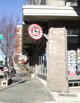
Here’s how Malaprop’s looks as you approach it from the opposite side of the street:
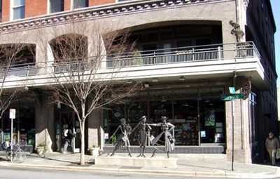
Below is a shot of its eye-catching corner sign, which is barely visible behind the street signs in the photo above:
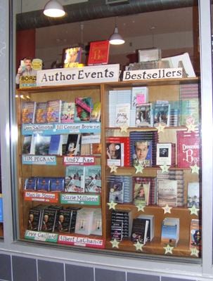
Malaprop’s upcoming author events (and books by those authors) are prominently displayed alongside their bestsellers in the store’s front window:
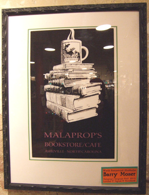
You know you’re making friends when talents like Barry Moser are willing to create a poster for your store. You can purchase prints of this one:
Yes, there is actually a bookseller behind the point of sale counter in this photo! He’s unfortunately obscured by the postcard rack in the foreground, but I swear he’s there, ably answering the questions of the customer in the long black coat.
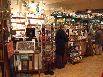
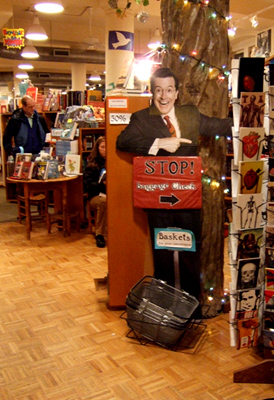
Look at the far left-hand side of the photo above. See the cardboard cutout of a man pointing to his left? That’s Stephen Colbert, instructing customers on where to leave their bags while they’re browsing. (The sign reads "Stop! Baggage Check.") A brilliant use of a cardboard standee, if you ask me! There’s a better photo of it below:
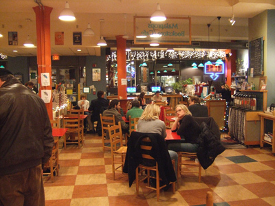
Here’s a shot of the store cafe, which is on the opposite side of the store from the point of sale counter, facing the street.
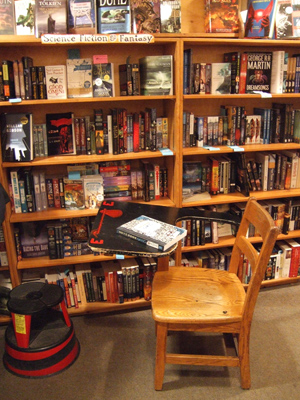
It’s hard to find clever, affordable seating for your customers to utilize while browsing. I love the classic school desk idea, as captured here:
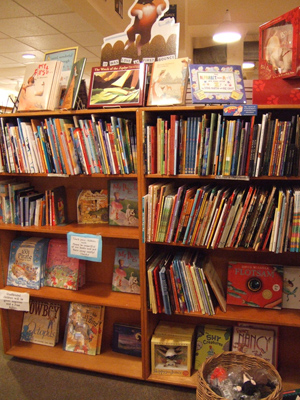
Here’s a shot of the YA section, behind a mixed display of YA and middle grade. I like that the section looks wonderfully full but still features a number of face-outs — a must-have if you ask me:
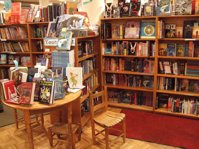
Below are, of course, the picture books:
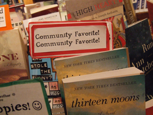
Look at the lower left-hand corner of the photo above. The sign closest to it is the one captured much larger below:
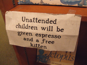
It strikes a slightly-more-threatening tone than the sign that appears one shelf above it and a bit to the right. Here’s what it says:
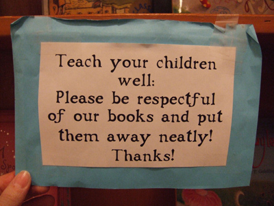
I wonder if Candlewick Press ever thought they’d be spawning a phenomenon that would require the creation of signs like this one:
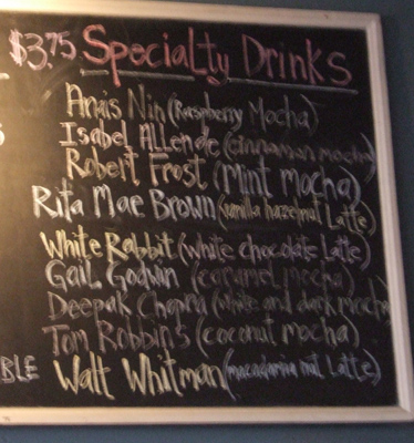
Also on the topic of signs, I love the sign that lists the Malaprop’s café’s list of Specialty Drinks. My photo came out awfully blurry, but if you can see through the fuzz you’ll be able to read their list of offerings, which includes the Anais Nin (raspberry mocha), the Isabel Allende (cinnamon mocha), the Robert Frost (mint mocha), the Rita Mae Brown (vanilla hazelnut latte), the White Rabbit (white chocolate latte), the Gail Godwin (caramel mocha), the Deepak Chopra (white and dark mocha), the Tom Robbins (coconut mocha), and the Walt Whitman (macadamia nut latte). Since seeing this sign I have spent far too much time considering what drinks I would assign to different authors’ names. Anyone have suggestions?
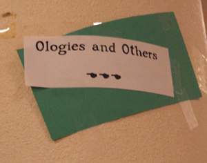
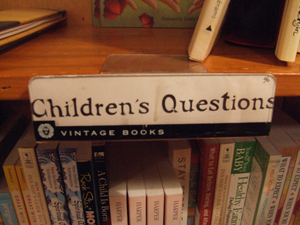
I’m always intrigued by how stores choose to label their sections. Our assortment of books on topics like divorce, adoption, new siblings, death & dying is labeled and referred to by our staff as "Family Issues." I think we might be better off adopting Malaprop’s much more positive-sounding label for these books, which appears below:
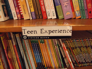
I also like this Malaprop’s label better than "Teen Issues" which is what our teen non-fiction section has historically been called:
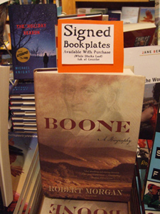
I also like to see stores using clever and informative bookmarks to keep their customers in the know. When we’re given signed bookplates I often go back and forth on whether or not we should actually stick them into the books, and if we do, whether or not those books then quality for a "signed copy" sticker. Perhaps we should just go this route and include a "Signed Bookplates Available with Purchase (while supplies last)" bookmark like this one:
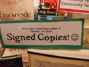
And doesn’t it make you feel like you’re part of a special place if you pick up a book that announces itself this way?
In case you can’t read this one it says, "Sorry you missed this author (frowny face). Happily, we have SIGNED COPIES! (smiley face)":
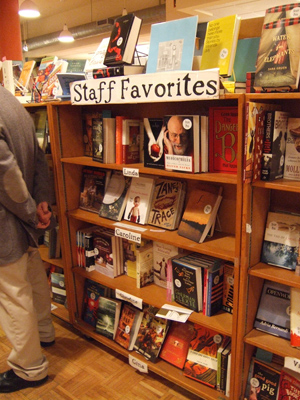
When you first walk into Malaprop’s you are greeted by a "Staff Favorites" section that fills three entire b
oo
kcases. If that doesn’t send the "WE READ BOOKS" message, I’m not sure what does. Here’s a shot of one of those three cases:
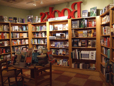
This store is home to one of the largest (and best) "regional" sections I’ve ever seen in a store. Theirs includes local guides, local authors, local history, Southern writers, and more. It fills the entirety of the space you see below, at the back of the store’s café:
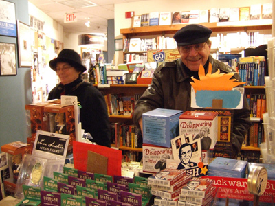
In addition to a great selection of books, Malaprop’s offers plenty of entertaining and gift-worthy "non-book" items to fill out your purchase or add to someone’s stocking. Here’s a customer (my dad) laughing at one of the many items of merchandise on display, while another customer (my mom) gazes at another:
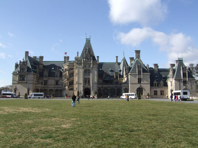
So, the next time you’re heading down to North Carolina with a plan of seeing this place (Vanderbilt’s summer estate):
Be sure to stop by this place as well:
Thanks Alison – now I have to make a trip to Asheville to get me a sip of Walt Whitman! Wait a great store – Alan
Very valuable information and photos for bookstores hoping to improve sales. Thanks for the visual treat. (I’d better check to see if they are carrying my books!)
That’s my local bookstore! Great article 🙂 I never even noticed some of that stuff until you pointed it out, and I go there all the time.
Nice article, and good to see the publicity for a great store. If you get to Asheville again, I hope you’ll visit the city’s *other* general independent bookstore — Accent on Books. We are located in North Asheville and are also beginning our 25th year in business. Patrick Covington Accent on Books Inc
Patrick, Clearly I didn’t do my pre-travel homework well enough! I’m sorry I missed your store on this past visit and will certainly make a point to stop by Accent on Books if/when I’m there again. Happy 25th anniversary to your store! I love hearing about such impressive bookselling milestones.
I was in Malaprops the day it opened. Glad to see they are continuing with such success.
Wonder why it’s called Malaprop’s, since Mrs. Malaprop used words so badly. Thanks, though for a great entry with lots of good pix!
We check Malaprops newsletter frequently for author’s talks. Next stop for you: Hendersonville, 17 miles south for another great bookstore on Main Street. From another converted flatlander living in the South.