
“Why are these two covers so drastically different?” You see, I had asked one of our customers for her opinion on the hardcover versus the paperback edition of Gertie’s Leap to Greatness and got a question in return.

It was a good question. Another related question is why had I asked for her opinion in the first place? Fair enough. When I first saw the new cover that was to be used for the paperback edition of Gertie I had a visceral reaction. Why was this happening was my first thought. Gertie is a wonderful book and a store favorite featuring a strong-minded character, completely immersed in her own persona. She has no artifice to speak of, no degree of identity separation. Impulsive, creative, with a warm heart and feelings that run hot, she is deeply likable but also trouble for herself. It is a story with a terrific lesson about mistakes not being the end of the world, and the enduring value of truth to self. Gertie is also immensely relatable to her audience of 7 to 11 year old readers.
I just love the hardcover cover illustration. It perfectly captures the character of the book and conveys its unmistakably classic feel while maintaining a sense of resolution and immediacy within a comfortable backdrop. Why would anyone change such a perfect cover, I wondered, especially since the book had won awards and sold well? The new cover seemed to have plucked minor details from the story, the frog and the Twinkie, without conveying anything at all of the book’s character and quality.
Time heals all wounds, I have heard, but intermittently so. I had put the matter from my mind until yesterday when Karin shrieked one word “Why?” I grabbed my camera to capture the moment. She continued to make exclamations.
 “The other one was so great.”
“It has lost its distinctiveness.”
“Where’s Gertie?”
“What were they thinking?”
I felt her shock and pain. When the paperback edition went on sale today we asked our great new young staffer Claire what she thought. Claire replied that the new cover looked more modern and kid-friendly, while the old cover appealed more to adults. That was an interesting observation indeed. We responded by first acknowledging that our up in arms perspective was affected by having read and loved the book already. During the ensuing discussion Karin pointed out that though we sometimes had the chance to sell Gertie to young readers directly. most of the many copies we had sold were pitched to grandparents and parents. I ventured the opinion that the old cover did have kid appeal too, but that its most important quality was that it accurately rendered the qualities of the story. Still, Claire’s observation was eye-opening.
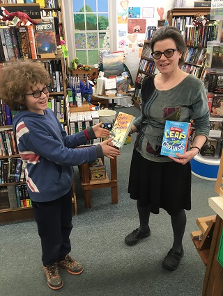
Karen’s son Evan, a big Gertie fan, making his cover choice!
Getting back to our customer whose opinion I had sought. After I gave her a little background she made a comment similar to Claire’s. “Well, the old cover has a classic feel, the new cover looks modern. I like the old one better.” She is an adult which hardly undermines Claire’s perspective.
My position is that the old cover tells the reader that a rare and wonderful story lies within its pages, and because it delivers on that promise the readers’ expectations are elevated appropriately. The new cover may have kid appeal but it is nondescript; the book could be any new book with a bright blue kid-appeal cover. Most of all, Gertie’s Leap to Greatness is about the importance of being exactly who you are no matter what. The original cover embodies that principle. The child I see on the old cover is Gertie to me, just as I see her in my mind. Still I’m an older reader and am biased from having read and loved the book already. Is this really simply a case of kid appeal versus adult appeal, or is the accurate conveyance of the book’s essence important? What do you think?
Of course. Otherwise what’s the point? Just have the name on the cover in Times New Roman and be done with it.
I loved this book but have to admit that I felt the cover looked dated and was not very appealing to kids. I’m a children’s librarian in a public library and felt a different cover might have helped me get kids to take this book home. It’s a beautiful story and more kids should read it.
I can understand why they updated the cover but I agree that Gertie should still be on it!
Is Gertie a frog? That’s what the new cover suggests
Speaking as someone who works in children’s publishing, the main reason publishers change covers is because a book is not selling the way they want it to. Gertie has lots of fans, but the Bookscan sales are not very high considering how much money the company put into the book, and it didn’t win any major awards so doesn’t have a sales boost from that. I love the original cover too, but if a new cover approach can help get this book into more readers’ hands, I can see why they made the decision to change it.
I do appreciate the reasons and desire for change being stimulated by weaker than desirable sales. Given a change though I do feel that the desired effect of the paperback cover would have been augmented by evoking the actual story into its expression.
Hi
I am the art director and designer of the original hardcover book, so this conversation is very interesting to me. I fell in LOVE with the manuscript for Gertie’s Leap to Greatness before many people had read it, and wanted to convey that this new author had created something timeless and special. The fact that it has an old-fashioned quality is not an accident. The limited palette and the very direct illustrative style, as opposed to something graphic or iconic, does harken back to many children’s book classics. I’ll be honest, the foil was not my idea, but I’m still proud of the cover.
I think that the paperback version, which was handled by our wonderful paperback design team, is doing what rds describes. It is attempting to reach a broader, and perhaps a different, audience. The sale of this wonderful book and the encouragement of this first-time author is paramount. I am just grateful I got the chance to work on it. Thanks for the lovely comments.
AD
As an adult I find the hardcover design attractive (though the foil is incongruous) and the paperback downright ugly. BUT the hardcover design telegraphs to us that this is about a girl age 5 to 8 who’s somewhere out in a rural setting. It doesn’t communicate “adventure” or narrative tension in any fashion other than the little girl’s determined facial express-on. The paperback gives away almost nothing except that this is a book with a frog, probably Gertie., which or who might be male or female. both frog and typeface imply action without much precision: probably more broadly appealing to boys as well as girls, looking for exertion and adventure.
I’m an elementary school librarian and I could not get the first book to move off my shelves unless I book talked it or personally handed it to a child. The second one looks a lot more like a book my students would grab from the shelf and try without encouragement.
The new art for Gertie’s Leap gives the impression that Gertie is a frog and its reward for greatness might be a twinkie. If this cover does appeal to a child I bet that is what he/she will believe the story is about. Even though I think the book is a good one, it is possible that its premise may have more to do with poor sales than the original cover art. It is clearly beautiful and you do have some idea of what the book is about. I just read The Journey of Little Charlie by Christopher Paul Curtis. The cover art depicts a large image of a white boy and a black boy. It includes a very tiny figure of a sinister man in the background and another tiny image of a boy running away from him. I believed the book was about the boys trying to escape from the sinister man. However, at least 85% of the book is about the white boy and the sinister man traveling together. I felt completely duped by the cover. If sales increase for Gertie’s Leap it is because the kids were hoodwinked. Not cool at all.
A bit off topic, but I am wondering why the illustration on p. 20 shows Mary Sue Spivey to have dark hair and even suggests she is African American, while the text on p.30 says she has yellow hair. In unsolicited truth, I am not sure I really like either girl, Gertie or Mary Sue, but I certainly do have more sympathy for Gertie. I’m not done reading yet, however.
Actually Mary Sue is sitting down in the front desk on page 20. The African American character walking toward Gertie and holding a pencil is Gertie’s friend Jean, not Mary Sue. “‘If Gertie moves,’ said Jean. ‘then we move too.’ She snatched up her number twos.”