“Art and Design” is the theme of today’s post — my fourth round-up in this, my final week on ShelfTalker.
*****
 The movie I’m the most sorry I didn’t manage to catch when it was still in theaters this year is The Secret of Kells. Did you see it? It’s an animated, fictional film about the creation of the Book of Kells (which is housed in the Old Library at Trinity College Dublin, where I spent my junior year of college). Watch the trailer and tell me this doesn’t look like a beautiful film. I’m hopeful that the DVD will soon be headed to my house via Netflix.
The Secret Of Kells – Promotional Trailer from Cartoon Saloon on Vimeo.
*****
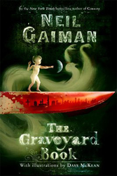
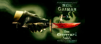
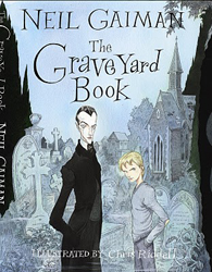 While we were in London Gareth and I enjoyed noting the differences between U.K. jackets and U.S. jackets for some of our favorite books. Did you know that in the U.K. there’s an edition of The Graveyard Book that features Dave McKean’s illustrations, just like the one we’ve got here, but also one featuring a cover and interior illustrations by the amazing Chris Riddell? (You can see some of Riddell’s interior art for the book on Forbidden Planet’s blog.) It’s so interesting to see both covers side by side and realize that they are the SAME book. You can see how they’d each appeal to completely different audiences. AND you can see how the cover image at right and below, created by Dave McKean for the U.K.’s adult edition, would probably NOT appeal to most people browsing in the children’s section. (EEK!) It’s especially creepy when you see the full jacket. Creepy and beautiful, though — the ghost bit especially.
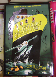
Here are three more jackets we found interesting. (The first one is The Mysterious Benedict Society and the Perilous Journey, in case you can’t see past the reflection of my flash bulb.)
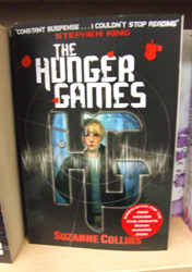
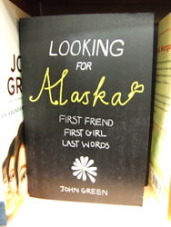
Can you believe how young and girly Looking for Alaska looks with that cover? Ick. I think Alaska herself would NOT approve.
The cover for The Hunger Games is just one of two variations available in the U.K. The one you see here is the Peeta version, but there’s also one that features Katniss. Several other countries show Katniss on their book covers too. (The Swedish one is just plain CREEPY!)
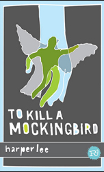
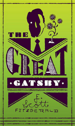
For his graphic design thesis project at Kent State, the very talented Mikey Burton designed “an integrated branding campaign based around the illustrative reinterpretation of classic book covers directed toward junior high school students.” I stumbled across it a couple of months ago and fell in love. Why? These books look so… modern. And hip. And clean and edgy and interesting. WHICH they are! But in most cases their actual, current covers don’t suggest those qualities, sadly.
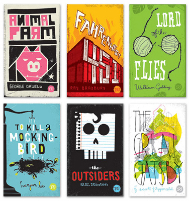
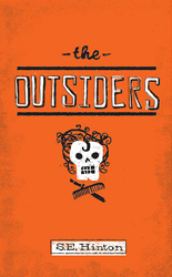
If ONLY the publishers with the rights to each of the books Mikey Burton has “re-imagined” would reissue them with Mikey’s designs, and use all the promotional materials he’s created to go with them, too. In the meantime, I’ve had to content myself with the poster I bought from Mikey, featuring his cover design for The Outsiders. (Note that you can also purchase the one printed with glow-in-the-dark ink.) I think Ponyboy would approve, don’t you?
When you look through the Flickr pool of photos from Mikey’s thesis project, be sure to also look at the designs he didn’t use as his “finished” covers. I like some of the discards just as much as those he settled on in the end.

*****
While we’re on the topic of appealing book covers… Mikey Burton (mentioned above) is one of many, many young designers who has furthered his career, in part, by creating gig posters for music concerts (including a very bookish one he created for Wilco).
For the past couple of years I’ve been admiring gig posters (mostly via gigposters.com) and wondering why publishers aren’t hiring more of these hip, creative, often young designers to come up with cover art for young adult novels (and middle grade ones, for that matter), or at least taking more inspiration from their offerings. So often when I peruse gig poster designs I see intelligent, interesting, and eye-catching work (like the Spoon poster at right). I wish I felt that way more often when I look through publishers’ catalogs.
I think the real problem is that I am just so, so tired of seeing covers sporting uninteresting stock photos and the results of bland photo shoots. I’m tired of half the books in the YA section looking interchangeable and uninspiring. I want to see more illustration! I want to see creative, original pieces of art that make me wonder about the stories that spawned them.
I know design budgets and cover deadlines are often tight. And I know that my desire for illustrateed covers does not play to the fact that a certain major retailer frequently demands photos of teens on the covers of teen novels (a demand I believe has had a terrible homogenizing effect on the appearance of today’s YA offerings, to the detriment of sales for everyone). But I also know that teens are very design-conscious nowadays. Stores like Urban Outfitters and ModCloth, which was itself started by a couple when they were in high school, are catering to the tastes of design-conscious teens, but the teen book world is, by and large, NOT yet doing so.
I know that there’s a difference between a poster and a book, and illustrations for one don’t always work for the other. The image on a book’s cover has to make you curious about the story on its pages — at its best, it should entice you to actually OPEN the book, or it serves purely as eye candy. But a lot of the gig posters I see have a very illustrative quality to them — a quality that says, “there’s a story here.” In other words, just because they’re printed on flat paper does not mean these are flat designs. I would argue that many of the book jacket designs I see nowadays are much, much flatter. And they always leave me wondering if the stories those books contain aren’t too.
For more gig posters, see the “poster of the day” posts at tbpdesign’s blog. If you want to add some to your walls, check out the offerings at postercabaret.com or click on the “classifieds” section of gigposters.com.

Great post! I don’t tend to comment much, but when a post sends me clicking off to all the links, I have to jump up and cheer. Graphics is/could be the answer to lots of the questions surrounding genre and audience these days.
The buyers at b&n are dictating photographic covers for the YA book market. Illustration in general is deemed ‘uncommercial’ resulting in the homogenous stock photo covers flooding book shelves.
I can’t believe that someone insists on specific covers for the YA market, why box in your readers. I’m happy enough to read YA, and in some cases have found the writing superior to ‘adult’ title – especially Philip Pullman. PP and JKR have widened the scope of who reads what, and booksellers should capatilise on this.
I also find it really interesting to check out my favourite books when I’m abroad. Below are 2 covers, HP7 and girl with dragon tattoo, from germany and france. I’m not sure about other readers, but I’m really not sure I’d have picked these books up, would you?
http://www.amazon.fr/Harry-Potter-Reliques-Mort/dp/2070615375/ref=sr_1_2?s=books&ie=UTF8&qid=1283509420&sr=1-2
http://www.amazon.fr/Mill%C3%A9nium-hommes-qui-naimaient-femmes/dp/2742761578/ref=sr_1_1?s=books&ie=UTF8&qid=1283509463&sr=1-1
http://www.amazon.de/Verblendung-1-Roman-Stieg-Larsson/dp/3453432452/ref=sr_1_1?s=books&ie=UTF8&qid=1283509549&sr=1-1
http://www.amazon.de/Harry-Potter-Heiligt%C3%BCmer-Todes-Band/dp/3551577773/ref=sr_1_2?s=books&ie=UTF8&qid=1283509588&sr=1-2
I know… How about if B&N pays a premium to have the bland photo cover they (and only they) want on a book, while the rest of us get a book jacket that will actually help us sell the book? Are pubs taking into consideration how many thousands of copies of these books they design just for B&N are being returned to them unsold–by B&N?
Great post! And thanks for the links, Sue — interesting to see those. I don’t think there’s anything that would have kept me from buying the HP books, but I am not as fond of those covers, either. There are books (like HP, and the Hunger Games series) where it wouldn’t matter what was on the cover, but when I am just browsing, it matters. I am generally not interested in ones with faces on the cover, or someone in a billowy dress. Basically, “no” to photos, “yes” to art and type.