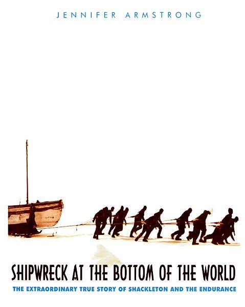
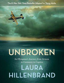
Sometimes, when I see new juvenile nonfiction titles, I feel as though they’re covered in dust already. I almost feel as though I’M covered in dust. And if I—an adult who loves nonfiction—react that way, I can only imagine how a 10- or 12-year-old would feel.
Some publishers make the argument that these books aren’t for bookstores. They’re for the school and library market. And my reply is, “Exactly.” I’m not sure why we would want to create books that have the most amazing true stories inside look dull and lifeless on the outside. Are we trying to make kids dread report writing as much as humanly possible? Are we trying to discourage their interest in the past, in other human beings, times, and places?
Good book covers of any kind engage readers by inviting them into the wonders within. They might portray an exciting moment of action, or pose a visual question the reader wants to answer, or simply present exciting graphic design that gives a reader confidence that whatever lies within will be interesting and worth their time.
I can sell great nonfiction to kids. Anywhere between 1/5 to 1/3 of the kids who come into the store prefer facts and true stories for their pleasure reading. Let’s give them books they will reach toward rather than shrink away from. I’m not talking about fake-y “Heeeeeyyy!” kinds of covers. I’m talking about smart, contemporary design that respects and admires the material in the book and the ultimate audience it’s aimed at. A book that lures kids into story is golden.
I’ve always felt that great fiction feels true, and great nonfiction reads like the most riveting story. And even kids who don’t think of themselves as enjoying nonfiction actually love it when it sparks their interest. How many times have you told a story to kids and had them on the edges of their seats, and afterward, they say, “Is that true?! Did that really happen??!” They want to know because it makes the story even better for those avid listeners if it’s true. If it really happened, that incredible tale of survival and endurance, that unlikely triumph, that small idea leading to a great innovation — well, that’s a tale that satisfies any reader.
And I think the sales department will reinforce that books that get read, get re-ordered, sell more copies, and live longer in your backlist.
Here are some examples of covers that I think are really successful at drawing kids in:


I’ve noticed that books adapted from adult nonfiction seem to already know the secret of offering covers that grab readers. Books designed with schools and libraries in mind should be just as lively and exciting for kids as books destined for bookstore shelves. Trust librarians to be savvy handsellers. They don’t want dry covers any more than booksellers do. Librarians want the books to appeal to kids! A great cover will give the worthy content inside the best possible shot at being eagerly picked up and perused.
And while we’re at it, make sure your page margins inside those books have enough air that readers don’t feel smothered by the content, especially kids who struggle with reading.
Thanks for listening. Librarians, what say you?

Librarians say, “Amen, sister!” It’s hard enough to get some kids to wander into the non-fiction section. A drab cover confirms their suspicions that non-fiction is a synonym for boring.
The worst are the ones that only have words on the cover. News flash, if they look like text books, kids won’t want to read them!
PREACH!!!
So. Much. Bad. Out. There.
Bright spots: Nathan Hale’s Hazardous Tales books have great covers. I love the cover of A Nation’s Hope: The Story of Boxing Legent Joe Louis (Matt de la Pena, ill Kadir Nelson). The Good, the Bad and the Barbie (Tanya Lee Stone). How They Croaked (who does not love a skeleton? NO ONE, THAT’S WHO). The Nazi Hunters (which fits your rule about books that started as grown-up books). I’m sure there are more but…uh, yeah. (At least I can think of a ton of non-fiction picture books with great covers?)