I haven’t ranted in a bit, so the time felt right for a fresh bit of ire. Let’s talk about book covers for a minute, and publishers’ need to keep changing them. I understand sometimes the need for shifting a book’s image once the paperback comes out, but the re-doing of covers of books that have been out for years in paperback often leaves me flat or just plain scratching my head. Here’s the thing: I could no more design a book cover than I could perform surgery. It’s a complex process that requires infinite skill and artistry and I’m in awe of what book designers can do. And so often, I’m stunned by the genius in the covers. But as a bookseller who has to field question after question about why a beloved cover has changed, not being able to offer an explanation is maddening.
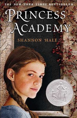 Take for instance Princess Academy by Shannon Hale, a book that I adore and sell well at my store. The old cover is on the left. I looked up the age range for this edition of the book and it says ages 9-11, which strikes me as young, since the protagonist is 14. However, the font is mature, and fitting for a fantasy about princesses and an academy, even a makeshift one. It all seems very real and somewhat serious, and the girl looks intelligent and seems like she can take care of herself. She doesn’t look like a 14-year-old, though, which was my only complaint about this cover.
When I heard they were redesigning the 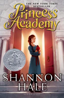 cover, I was expecting something that looked even older. Instead, the new cover is even younger. The font is almost cartoonish and Miri looks even younger. Certainly she doesn’t look like a 14-year-old, more like a 10-year-old. And the light coming from behind the her, illuminating the seemingly hallowed halls of the Academy, somehow remind me of Harry Potter and Hogwarts. I looked up the age range on this new cover, fully expecting it to be the same as the other cover and was very surprised to see that it’s listed as actually older, for 10- to 14-year-olds. This doesn’t make sense to me; everything about this cover skews younger. I understand why things need to be updated, but sometimes I wish publishers would ask booksellers’ opinion before they change covers.
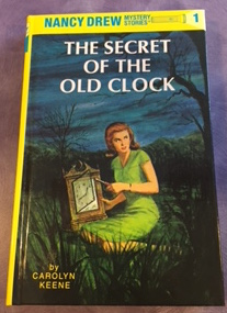 While the changes in Princess Academy are relatively minor, sometimes there’s a massive change in covers that I just don’t grasp. I loved the Nancy Drew books when I was a child. The iconic yellow and blue paper over board covers, with their slight sheen, always had me excited for the next mystery adventure. It never occurred to me that these covers would change, but change they did. Gone is the bright yellow and the deep blue, to be replaced with muted russets and murky blues. In the old cover, Nancy is taking a clock apart. She looks active and smart. She looks like someone who is capable and somewhat fearless.
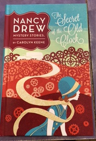 The new cover shows Nancy’s face in profile with her long scarf leading down the road to the motor home. This imagery has led more than one customer to comment that it looks like her scarf is wound up in the vehicle thus possibly replicating an Isodora Duncan-like possible death. This new Nancy looks like she needs help to cross the road, let alone being able to solve a complex mystery. She’s not dressed for mystery, she looks like she’s ready to hop in a convertible and go for a spin on her way to the flapper dance hall.
In my very non-scientific poll, not one customer, young or old, has liked the new cover. Some of that is nostalgia, of course, but the reactions are pretty visceral. The new cover with its cursive title, doesn’t match the interior font, which has not changed. As one customer said, “The title font isn’t having a conversation with the rest of the book.” But the thing that’s making people nuts is the passivity of the new cover and the lack of focus.
So readers, what do you think of the cover changes? And, has any cover redesign left you bereft for the old book?

The Princess Academy covers make me VERY ANGRY but not surprised, because that’s what all the Bloomsbury princess books look like now. Princess Academy now slots right in with The Frog Princess and The Wide-Awake Princess looks-wise, even though it is NOT THE SAME KIND OF SERIES. This does not surprise me, though, because I find myself hating more Bloomsbury covers than those of any other publisher.
The cover change that has killed me are the two paperback editions of Revolution by Jennifer Donnelly. First there was the making-out-with-the-key cover: http://www.jenniferdonnelly.com/Images/Rev_paperback_US.jpg which I hated; I had to cover it with my hand to handsell the book (and this was after I’d sold dozens in hardcover).
And then they changed that one to a cover I can’t find a link to, but that has a girl basically on fire on a dull white background with a dull font and a tag line on the cover: “From the privileged streets of Brooklyn to the heart of the French Revolution.” What does that even mean?
That Nancy Drew cover is truly horrible. The covers I hate the most are those that have been changed to show the movie version characters. I won’t purchase a book that has one of those covers on it.
I agree about covers with movie characters on them! It takes away the power and imagination of the reader to decide for themselves what that character looks like. It’s always so disappointing to see a beloved book come out with a new movie star cover, an image that doesn’t at all jive with the image of that character created in my mind as I read the book.
As much as I hate movie poster book covers, I have discovered a new subcategory of poster covers I detest even more. When the book and movie are based on a real person and they use the actor for the new book cover, I just cringe. American Sniper and Lone Survivor especially!
Don’t get me started. I am most annoyed with the new covers to Tamora Pierce’s “Song of the Lioness” quartet. It went from strong, young, soon-to-be knight to looking like your standard teen romance (with a sword).
In my opinion, you didn’t go back far enough when it comes to the Princess Academy books. The true original cover? The one with all the girls on Mt. Eskel? THAT’S the real perfect cover. I’ve disliked everything else that’s come after.
Yes, I loved that cover, too!
I love the original style of Shannon Hale’s covers. I don’t know why they had to redesign them – they were all so beautiful! The same thing happened when Gail Carson Levine’s books were repackaged – the covers were changed from illustrations to photograph-based, and it just doesn’t make sense. The illustrated covers seem more fitting to the books.
I find books are easier to sell when the cover reflects something about the story and location. The covers for Serafina (Hartman) and True Blue Scouts of Sugar Man Swamp (Appelt), for example, truly reflect something of what is in store for the reader. I too like the older covers for Nancy Drew. They reflect a mood of mystery and beckon the reader inside. Sue Carita
I think sometimes art departments forget about story. Especially where MG books are concerned, what draws kids to a jacket is a sense of story. Good covers convey a sense of mystery, adventure, fantasy, or humor — in other words, each book’s primary magic. Great covers ask a question potential readers can’t resist pursuing.