We can probably all agree that packaging a blender in a box that is labeled as being for a toaster is not a good marketing decision. If attractively designed and reasonably priced these boxes will move off retail shelves as people who want to purchase a toaster buy them, it is true. One can easily see, however, that difficulties will ensue after the box is opened. This clear principle does not appear to commend itself uniformly to books, however, particularly for children’s fiction, where the nature of both the content and audience is very precise indeed.
Unfortunately, one often finds books whose covers are successfully designed to appeal to a set of customers other than the customers who would want to read their contents. While it will perhaps take a bit longer to determine the discrepancy than it would for the toaster purchaser who unpacks a blender, it won’t take that much longer and the result is much more insidious, because it is more far-reaching. The end result of the customer’s dissatisfaction will not result in a simple return but rather bad word-of-mouth and diminished long-term sales which negatively effect the author and the publisher, and a bad customer service experience that harms the bookstores relationship with its customers.
Here are two examples. Six Feet Over It, a delightful debut novel by Jennifer Longo. Let us look at the cover for a moment.

Here are the issues. The protagonist of the book is 15, not 23. She always wears the same pair of jeans and never wears anything else throughout the book. The book has a reader range of 11-15 and is humorous and snarky in tone, not angsty and dramatic. In short, the cover is designed to appeal to an entirely different audience in terms of both age and temperament than the story does.
Our second example is Donna Gephardt’s Death by Toilet Paper.
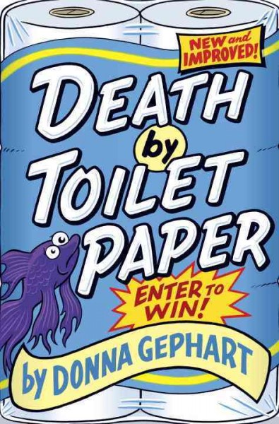
This cover would have been well designed if the book were a book of potty humor hijinks for 7 to 10 year olds. It is a good design for that. Though the book is humorous it also has a lot of depth and deals with a serious issue: the impact of economic downsizing on a middle grader, for whom the cheap toilet paper at home is emblematic of tough changes in the family fortunes. It’s an absolutely charming book and very painful to imagine it disappointing eight-year-olds who had been expecting to experience what the cover promised.
We feature both these titles at DDG and I can say that the charm of explaining to customers that the cover misrepresents the contents and why – which must be done every time we handsell the book – fades rapidly.
There is an easy fix for this. If the illustrator, or someone else integral to the cover art process, does what the covers are asking buyers to do – read and take the book to heart – this particularly unfortunate brand of failed cover art would likely disappear.

It is always so disheartening to me when I make comments like this to a sales rep and they tell me how the sales team argued with the creative team but no changes were made. And then, inevitably, the paperback is published with an entirely different cover.
(This reminds me that there’s a Penguin YA book coming out in the spring whose title I forget where the main character has had her hands cut off for trying to escape from the cult she’s in. The book cover? Two female hands cupping what appears to be a prayer book. Do they think the readers aren’t going to notice?)
I love Libba Bray’s Great and Terrible Beauty; but have, over the years, been frustrated by the cover. The girl’s torso in a corset makes a customer think she’s looking at a Victorian “bodice ripper.” The story is really fantasy. On the other hand, the covers for the series His Fair Assassins are super. A bit exotic and romantic, they show young women who look just the way the characters are presented in the books. Easy peasey for me to give the customer a sense of what the story is. The old adage “You can’t judge a book by it’s cover” is wrong in the sense that it is exactly how readers get their first impression. That cover has to tell someone in a couple seconds who/what the book is. Like Kenny says, a blender in a toaster box does a disservice to the customer.