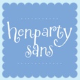
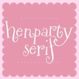
 While I don’t know that I qualify as a bona fide "font junkie," it is true that I’ve got a thing for typography. I’m considerably irked by book covers or ads that sport poorly chosen type, and am considerably warmed by sightings of good type, well-chosen and carefully placed.
For the past year or so I’ve been charmed by frequent sightings of Henparty, a playful font family of two created by Tart Workshop (a collaboration by artist/illustrator Crystal Kluge and type designer Stuart Sandler). It includes Henparty Sans and Henparty Serif and warrants a mention here because recent book sightings have shown that a number of designers are also under its spell.
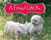 Henparty plays a prominent role in the design for Tanja Askani’s new picture book A Friend Like You (Scholastic, December 2009). It’s the font used throughout the book in bold, oversized type, and it’s also featured on the book’s cover.
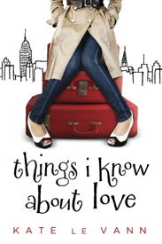
Henparty also appears as the title font on two galleys I just received: Things I Know About Love by Kate Le Vann (Egmont, June 2010) and Sunshine Picklelime by Pamela Ellen Ferguson (Random House, June 2010).
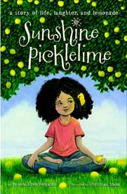
Have you spotted Henparty in other places? The fact that I’ve seen three sightings in such close pub date proximity makes me suspect that there will be more. Please report them here if you see them!
In the meantime I’ll be drooling over a newer Tart Workshop creation, Nelly Script…

and falling for everything printed with Milk Script from Sudtipos and…
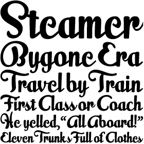
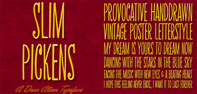
loving Slim Pickens from Alison Argento. (To name just a few!)

Thanks for this delightful blog on fonts! I can’t tell you how many hours I’ve poured over notebooks to select just the right font for a project. I’ll check out Tart Workshop and recommend it to friends.
Love it! I’m a font junkie too! 🙂 e
Love, love, love Milk Script. Makes me want to write a book with that font in mind! And, nothing could be more appropriate for my books about chickens than the “Hen Party” font. These fonts are yet another reason why I still want my books on paper!
Hooray! More font fanatics! It’s good to know I’m in such excellent company.
As a publisher and designer I am constantly irked by people who comment or criticize book cover designs. All design including book covers are subjective to ones taste. Though it is a nice font, true book cover designers often are required to use juvenile friendly fonts, which Henparty is NOT. It may work fine in the trade market but for SLJ readers??? First there is no Uppercase. And when have you seen a 6 or 7 year old child learn to write an “a” like in Henparty? Fun is one thing, Education is another so lets not run to judge.
craig – yeah, it’s real smart to dumb everything down so kids never learn…
I personally don’t care for Henparty but remembering this is a children’s bookseller’s blog, feel it fits perfectly with some of the subject matter. It’s whimsical and young, and matches perfectly with a title like “Sunshine Picklelime”. Using it on the chick-lit Le Vann book seems less successful – even if the name Henparty is trying to point towards a ladies-who-lunch aesthetic. The kerning on Nelly Script could be cleaned up, but otherwise, a perfectly serviceable script face. Like the extra curl on the capital S. Milk Script looks a bit like a knockoff Alejandro Paul. If you like it, you should check out more of Paul’s work. And last – I was the 7 year old writing my a’s like those in Henparty, and that’s why I went on to a career in book publishing. I like type.
After reading this blog yesterday, I actually had a dream about Henparty. Not the font itself, but the idea of the font. Someone showed me a pair of shoes in the dream, and I immediately identified the whimsical pair as “Henparty Shoes.” I’ll leave it to the experts to decide what that means (most likely, that I should stop reading blogs and shopping for shoes online), but I thought I’d let you know that this post stuck with me.
I love fonts! Fontbros.com is my favorite source for unusual, distinctive, playful fonts. They do fonts from retro to wacky that are just delicious, and have great names like Pink Broccoli and Carrotflower Makes Invitations. I’ve gotten way too many font packages from them over the years. They have some free fonts available, too. FontDiner.com was started by the other FontBros brother, and it also has some great retro fonts. Chowderhead is one of my favorites to use in ads. (I’m sounding like a commercial here. I have no connection to these guys except an unreasonable fondness for their fonts.)
Alison, I think we should digitize your handwriting and turn that into a font! 🙂
Way back, when friends and I worked in the now-extinct typesetting business (remember archaic terms like “kerning” and “leading”?) we used to play Name That Font while reading our menus in a restaurant, or watching credits roll in the theater. Now everyone is a typesetter, and the number of fonts available is mind boggling.