One of the laws of bookselling physics is that if a book by an established author has the material to reach beyond their usual audience, it needs a cover which will both lure the perspective and reassure the established audiences. The case of Jay Kristoff’s new epic dark fantasy, Empire of the Vampire, is a peculiar one in that regard.
There is no question that this book has the ability to reach well beyond his core, established audience to that larger readership ceded by Patrick Rothfuss and George R.R. Martin to anyone who can actually finish writing a first-rate epic dark fantasy series. The Rothfuss reference is apropos in that Empire of the Vampire takes a leaf from the Kingkiller narrative structure in having its main protagonist agree to tell his tale to a chronicler over a period of days, each book in the series representing a single day, or in the case of Empire a night, of recounting his path to regicide.
Empire is plenty adult, but it also has YA elements unsurprising for the co-author of the successful YA Illuminae Files books. The tale of the last Silversaint, Gabriel de Leon, captured after killing the Ancien Vampire overlord the Forever King, is a dark coming of age, with appealing characters and complex friendships which includes a training academy setting that older YA readers will find extremely engaging. The story is filled with strong female characters which of course enhances both its quality and its reach.
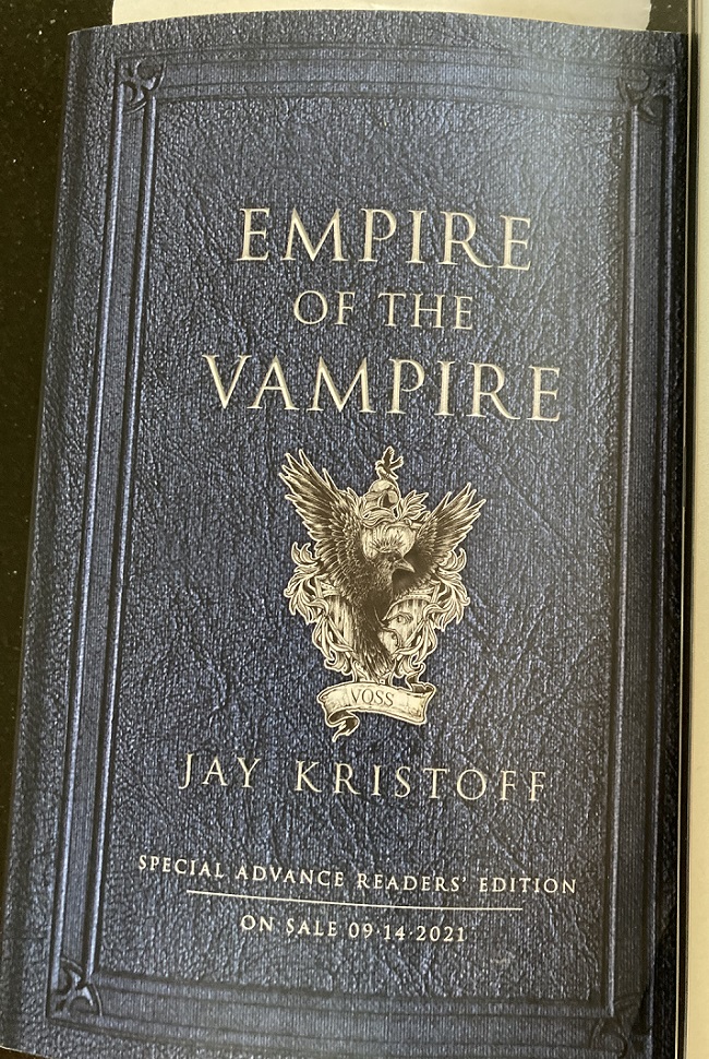
Empire of the Vampire draws from a number of broad reaching fantasy sources. Gabriel has a good dose of Elric of Melnibone in him, for example including a living, voracious sword. The shadow of Tolkien is also to be found. There is also a strong vein of Sir Thomas Mallory Arthurian questing. In short, the book has the goods to appeal to the broad fantasy audience enjoyed by the works of Rothfuss and Martin. All it needs is a cover which will draw them in. The truly odd thing here is that it had one. Here is the ARC cover.

Evocative of classic tomes, replete with history and depth, this lovely design had me feeling right away that the publisher was making an effort to argue for the book reaching beyond Kristoff’s established base of readers and I decided to give it a read even though it was a bit outside my zone. As it turned out the book absolutely delivered what the ARC cover promised.
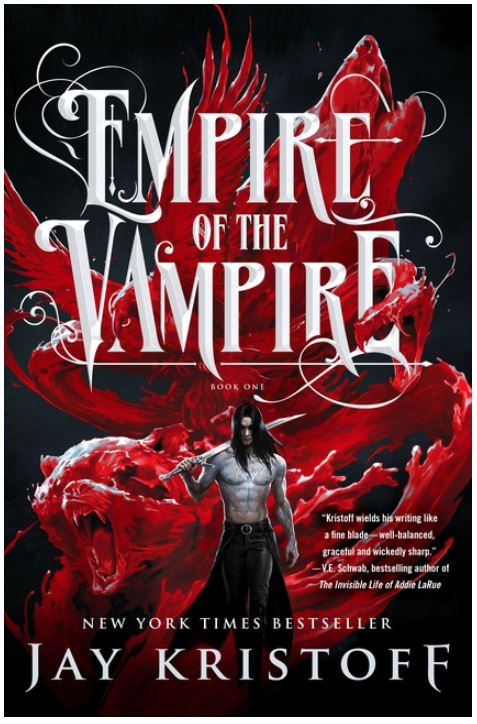
Here is the established finished release cover.
I wouldn’t pick this book up, the same one I snatched and took home as an ARC, with a 10-foot pole. The smug, smoldering, gleaming and oiled in the moonlight, escaped from medieval Scotland, bare-chested look is a non-starter for anyone outside the established Kristoff readership. Even wanting to push the book out to a broader audience, I will be defeated by this cover. The blood bear and roiling blood raven have done me in. I’m in an even worse position than Gabriel, imprisoned in the Vampire palace, is. Promoting this book is an inexplicably hopeless task, and so I ask the obvious question: Why in the world trip a book up at the finish line like this?


Hi Kenny are you interested on passing down the ARC. I’d love to read it. I can cover postage and such 🙂 please let me know 🙂
I’m afraid I already passed it on to another reader Giselle.
I couldn’t agree with you more–I’m so happy someone wrote this blog. This exact issue greatly bothered me. I read multiple chapters of a friend’s book, so I knew to disregard the cover. But under ordinary circumstances, I wouldn’t have been even a little interested. I have no idea why they did this. But man, you should have kept the arc to sell for a fortune in about 3 years.