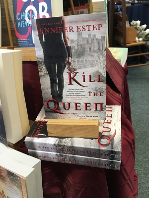
With the Nobel Prizes in science being handed out this week one might be forgiven for seeing the bookstore floor as a laboratory for assessing the interaction between a book’s cover as art and its intrinsic purpose to help induce suitable readers to purchase it.
 Suppose we have read, enjoyed and are primed to handsell a particular book. Further suppose that we have framed a hypothesis that its cover will impede sales because many suitable readers will find the cover off-putting. With the book’s on-sale date at hand the scientific method now comes fully into play out on the bookstore floor, which has been prepped for our experiment with a prominent display of its test subject.
We will take a book released on Tuesday, Kill The Queen, as a case study. I want to say up front that I have been wrong about the effect of covers many times over the years. We are interested in science here, proving or disproving a hypothesis. The role of opinion is strictly limited to establishing the hypothesis.
My opinion of Kill The Queen is that it is an excellent book with a cover that will seriously hamstring its sales to an audience broader than the author’s existing fan base, Let’s look at the matter in a little more detail.
 The book’s genre, epic fantasy, is a departure for Estep, who is a long established, commercially successful author of urban fantasy series such as Elemental Assassins and Mythos Academy. Though a departure, the book does share Estep’s narrative sweet spot. It is a true crossover book, published as adult fiction but working just as well in Young Adult. Written more in the epic fantasy vein of G.R.R. Martin than J.R.R. Tolkien, the book still possesses many elements of more traditional epic fantasy. It is not crude, follows a single narrative plot line, and depends more on adventure, character and world building than shock value.
The lead character Evie, a distant, belittled heir to the Andvarian throne, has an unusual ability. In a realm where the aristocracy are both magic wielders and skilled gladiators, Evie is immune to magic and can dampen it in others. This is a skill she keeps hidden.
A number of things make the book fun. First, Evie’s is a charming voice, and her long quest to Kill the Queen, which begins at a power-grabbing royal massacre which she barely escapes, follows her through gladiatorial training and many captivating twists and turns. The book treats gender as an afterthought, with no bearing on fighting skill, magic wielding, or political power. This allows a plethora of strong female protagonists without that being an overt focal point. The villains in the book are enormously and entertainingly nasty. It also has great fight scenes, and extended narrative tension on offer. In short this is a fun, engaging and satisfying read.
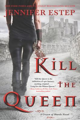
 The goal here was to expand Estep’s audience to mainstream adult fiction readers, and to literary minded young adults. I tested my theory that the cover would be off-putting to its own intended audience by sharing it with one of our best customers, an inveterate, omnivorous reader. The second I held the book up she visibly recoiled. I announced that the book I was holding was in fact a great book with a bad cover. She continued to grimace and cringe while looking at the cover. The whole time I talked up the book she had trouble engaging with the conversation much as though she were in the room with a foul-smelling poltergeist. How would you describe the cover, I asked at length? “The book indicates that an identifiable contemporary model, with a prominent rear end, has killed a Queen for reasons I have no intention of ever finding out. I have no doubt it doesn’t represent the book, but it would have to be unbelievably good for me to even think about carrying this thing around. I followed that up by showing in it to one of our best Young Adult readers. “Yuck,” she said, “a butt shot.”
This highlighted my darkest fear. The cover is I don’t want to be seen holding this book bad. Sigh. The truth is that a book that appears to be YA fodder will never commend itself to a well deserved, broader audience from a display. Reaching its new audience will require a herculean, gladiatorial effort by a bookseller. I mean they would have to take the time to write it up in ShelfTalker or something crazy like that to encourage colleagues to overcome their initial impulse and bring the book in, read it, and push it out into the world.

I am afraid you are correct; that cover yells out to me a YA fantasy that I would have absolutely no interest in reading.
Book covers are way more important than people think; this one looks like an erotic dark fantasy that’s found it’s way onto the wrong shelf. And, although readers like to fantasize themselves in the heroic mode of whoever’s doing the exciting stuff, you don’t want to overdo it so they flash on the mean girl who pushed them in the mud in front of the football team. The flip side of this was a brilliant book from a couple years back called KILL THE BOY BAND by…Damn, forgot her name-anyway, this book had a great cover, etc., but didn’t quite hit the heights because (I strongly theorize) the girls carrying the plot were so Instagrammed up and plugged in to every digital angle they made ordinary smartphone girls look dull and unhip by comparison. Still should’ve been a movie though…
Our mileages certainly vary! I focussed on the castle, which seems to be the person’s destination, where a queen might be killed, or crowned, or both, or the crown renounced. The crown is near the center of the image, and resembles a crown of thorns. It may be interesting to see how many readers do indeed judge this book by its cover, and what their judgment is.
… but this wonderful article about cover design and reactions convinced me to buy this book. So good work!