One of the ways publishers can breathe new life into older titles is to redesign their covers. This can be a boon, especially if the cover images are seriously outdated, unappealing, or inaccurately represent their contents—or even if a series has just seen a diminished audience and needs a kicky introduction to a new crowd.
Some recent redesigns that seem promising include Candlewick’s relaunch of the Judy Moody jackets; the older ones are perfectly delightful and kid-appealing, and the new ones are snazzy and even likelier to draw kids’ eyes:
Original cover of the first Judy Moody title:

New cover:

One of the secrets here is that everything Peter H. Reynolds does is guaranteed to be visually appealing. Even though my adult eyes prefer the original cover a bit, I completely get the desire to jazz up the series with a redesign that will entice a new generation of young readers, and think the tiger stripes and punched-up colors of the whole series could do the trick.
I also noticed that Tundra Books is bringing back some of L.M. Montgomery’s less well-known books. While I confess I can’t picture the original covers of The Story Girl and The Golden Road, I do find these new luminous ones pretty:


Sometimes, however, when jackets are redesigned, their new coats don’t serve their contents well. This can be true even when the art itself is appealing, if the new image doesn’t convey what lies at the heart of a book’s appeal. For instance, the wonderful thing about Gerald Morris’s sparkling Squire’s Tales series is their irresistible great humor; they bring Arthurian legends alive without sacrificing literary faithfulness. That’s a huge feat. I’ve never met a family that took a chance on the first book who didn’t devour and absolutely LOVE the whole series, often as a whole family read-aloud. These books are fantastic and should have a huge readership. We were always able to handsell boatloads of the first title when it looked like this:

That cover not only captured the Arthurian ethos, but it was funny. Bing bang boom. Somewhere along the line, however, the publisher decided to go in a different direction, going full-on Arthurian and losing all of the suggestion of humor: 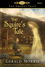
This book, and therefore the series, is a much harder handsell now. It’s not that the cover art and design aren’t attractive, but they are a mismatch for the delightful mischievous brightness inside the covers. This jacket sadly turns away the very readers who would adore these books.
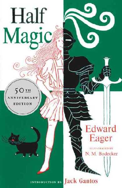
One of the most heartbreaking redesigns of recent years—and I apologize for hurting some feelings by saying it—was the decision to replace the covers of Edward Eager’s seven timeless magic books. Half Magic had long been one of the easiest handsells in the history of bookselling, both with the N.M. Bodecker cover art:
and with the Quentin Blake reboot:

But the new cover tanked our sales. We used to sell 20 copies of this book a year without even trying, which isn’t bad for a decades-old backlist title in a small store in a town of 5,000. Then the new cover happened, and we are lucky to sell five:
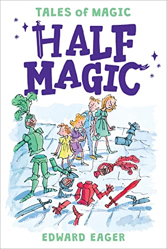
You would not believe the machinations I now have to resort to in order to move copies of this book. I have to hide the cover while I booktalk it, EVEN WITH GROWNUPS. Even when potential readers love the booktalk, once they see the cover, they balk. I have to flip through the pages to show the (stiill-intact inside) Bodecker illustrations’ whimsy and child appeal. I encourage them to just read the first few pages, knowing that if they do, they’ll be hooked, but I often can’t get them that far. It’s not that the cover art couldn’t do justice to another book—it’s not badly designed, though the characters’ expressions are rather alarming and the color scheme (across the whole series) is awfully brown-orange—honestly, I could see readers gravitating toward this book if the story inside matched the cover: brawling knights in disarray. But it doesn’t. The readers for this cover are not the same readers as the ones who want Half Magic, and I think every bookseller I know would have been able to warn the publisher that this would be the case.
By the way, I have no idea if the sales of the series have changed dramatically since the redesign, but I have strong suspicions that if they have, the direction is not up. I hope the publisher will correct me here in the comments if I’m wrong. I just know what has happened in my own store. But I did check in with some booksellers across the country to see if they, too, struggled with these new Edward Eager covers, and found my own frustrations echoed.
It seems to me that publishers could avoid some disappointments and expense if they ran some of their cover designs by seasoned children’s booksellers. After all, we have spent eight hours a day, every day over the course of years, observing children’s and parents’ reactions to book covers. We notice their changing tastes and preferences, and we have first-hand knowledge of the books they flock to and those they wouldn’t pick up if you bribed them. Because customers are spending their hard-earned money on books, they are picky about them. And they are really picky about the cover art. I’ve had customers buy books *solely* because of a beautiful jacket design (cf: The Hazel Wood, which happily also happens to be a fantastic read), and I’ve had customers refuse books they actually believe they would like just because of a poor cover.
For years, I’ve been hoping publishers would engage a panel of half a dozen or so seasoned booksellers with a mix of regional and cultural diversity who would be willing to give a thumbs-up or down to their book covers. I understand why they haven’t done it; doing anything that involves feedback by committee adds an extra step and a layer of hassle. But if you heard six experienced booksellers from all areas of the country tell you, “I won’t be able to sell this book with that cover,” it might be worth listening to.
Readers, are there any recent book jacket reboots you love? Hate? Want to marry?

Kathleen Larkin
4 mins ·
Oh do I hate the new or newish cover to “Half Magic”. If I were still selling children’s books my scream at seeing it would have taken off a roof. Of course I am prejudiced as I’m a great fan of N.M. Bodecker.
This particular redesign of the Alanna books was one of the worst. It was when Twilight was influencing everything, around 2010. http://78.media.tumblr.com/c379e7fb51e93a063c804275ccf4be36/tumblr_inline_ni1ecmjUwR1t8roph.jpg
OMG.
Wow, that is really bad…
Ha! Somehow, happily, I missed that iteration.
It occurs to me that one of my sideline vendors, NY Puzzle Company, periodically sends out short surveys by email asking for feedback on designs they’re considering adding. Just a check next to your favorite three of several proffered designs, for instance. Seems rather sensible and useful. Especially in the case of redesigns for covers of classic back list, it seems like something that would be worthwhile for publishers to consider.
Valuable observations, Elizabeth. Thank you for this. ((The new Half Magic cover is so chaotic, which doesn’t reflect Edward Eager’s prose in the least. And the predominant red looks angry, which the book is NOT. Sigh.) (Ditto for The Squire’s Tale and that entire series … the books are funny but the new covers would never allow a new reader to believe that.)
I’m heartbroken over the paperback cover for Gertie’s Leap to Greatness. It was an easy leap with that wonderful hardcover cover art. The paperback misses the book entirely. Sigh!
Though it’s not a recent change, my “favorite” story about a book ruined by a cover change is Brothers Lionheart by Astrid Lindgren. My mother gave me a copy when I was a kid and I loved the story, which was enclosed in a cover that showed the titular brothers looking out over a gorge where two fire-breathing dragons fought. You can’t get more awesome than that! I was horrified when I was a new librarian and wanted to add the book to my library’s collection, because the new cover is about the worst I’ve ever seen: https://www.amazon.com/Brothers-Lionheart-Astrid-Lindgren/dp/0192729047. There is NO WAY I would ever be able to convince a kid to check that book out! What a waste!
Did you talk to Megan McDonald about her original choice of cover. On visiting Australia she told us that the first book was specifically designed to be wrapped in a brown paper type cover to contrast with the large amount of brightly coloured fiction on the booksellers shelves. She was keen to get the book recognized. I still had the original brown paper covers in my public library last year and always located them quickly because they stood out. I told the families to look out for them as well. My other comment is that for children that have colour blindness the dark reds and greens on the Half Magic cover would be all browns , even more unattractive! Finally what about the spines , with shelves stuffed with books in the library and now in the bookshop where I work it is the spine that needs to capture the attention.
I do love the original covers! And kids loved them, too — a perfect example of how sometimes what is considered an adult aesthetic actually can translate really well for children. I don’t have a problem with the reboot – it carries the appeal of the original while making a little bit of a splash to reach a new generation of readers. And it’s still the incomparable Peter Reynolds’ art. I can’t remember what the spines of the reboot look like but will be checking those out, too. : )
Fascinating–and as someone who has redesigned the cover on a pair of books three times, I can totally relate. I am happiest with the 3rd iteration, so that is the win!
I’m glad we have the original cover for Half Magic in our library. I can sell it with that cover, and then give them the most horrible recent cover if they want it in paperback.
I’d love someone to redesign a GOOD cover for Howl’s Moving Castle though. I don’t think it’s EVER had one that enticed kids who didn’t already know DWJ. There was the silhouette one, which was the best they could do, but I could never get a copy of it for the library. The original is particularly bad…I have to hide it from the kids when I’m trying to booktalk it.