
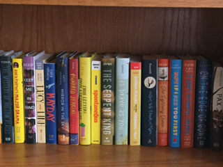
While the design of book spines occupies interesting and unique territory in the world of books, perhaps no one is as invested in them as booksellers and librarians, who look at thousands of them every day and use them as vital tools for locating mis-shelved books. Some spines we admire aesthetically are pragmatically confounding.
Recently, I was looking for It Ain’t So Awful, Falafel on my bookshelf. People generally scan items to sort first by color, then by other information like text (unless the title is giant and bold and thick and highly contrasted on the spine, in which case it can catch our eye before color). Remembering that the cover is yellow, and the book is thick-ish, I scanned in vain for a medium-thick yellow YA spine.

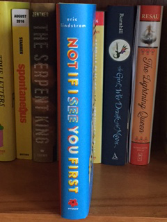
Couldn’t find it by yellow, so I switched to a scan by title — and discovered it hiding behind a tomato-red spine. (Forgive the following photo that appears sideways; I couldn’t get it to load right-side-up, and the blog tool doesn’t support rotation. But you’ll get the idea.)
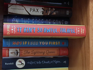
I really like the contrasting colors visually, but as a bookseller, I admit that searching the shelves for a misplaced needle in a haystack is made exponentially more challenging when the spine is a completely different color from the cover.
Here’s one with a two-tone split, but the designer carried the front cover color around to the spine before cutting it off:

Much easier to find again by that mental image of the cover we carry in our searching brains.
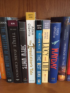
Sometimes, a bold font choice can overcome a split color. For Snow White, I’d be searching for a red spine given my memory of the cover:
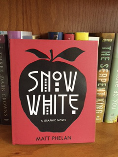
Instead, the spine is black, but the unusual, cool, beautiful bold type makes it easy to spot:
I’m not asking for designers to change anything about the way they create book covers. I’m in awe of the variety and beauty of so many of the books that come through the door. I will say that the spine is more important than designers and publishers might be aware of for sales. A book that disappears on the shelf is less likely to be selected, for one thing, and it is much harder to sell a book if we can’t find it when it’s been mis-shelved by a well-intentioned (but alphabetically challenged) customer. I do wonder if designers wander into bookstores and scan the spines, looking at what pops off the shelf to a customer’s eye. I know I would.
That’s my Friday morning musing. Have a wonderful weekend!
P.S. One more thought about spines: they offer a real-estate challenge for libraries, which have to affix labels over some key information on the bottom 1′-2″ of those spines. We don’t have to worry about that problem, but we do share librarians’ frustrations when series books are not numbered on their spines, or have numbers that are so fancy or small or subtle that they’re hard to see. It’s such an easy choice to add a clear, easy-to-read series number onto the spine of a book. It’s a choice that respects the end users, the buyers, the readers, and most importantly, the readers’ middle-aged-eyesight parents who are buying their kids the books.
Yes! Number your series, please!! I’m talking to you Captain Underpants.
And, if you can, make the type on the spine vertical instead of horizontal, so that if the book is shelved spine-out, the customer doesn’t have to crane her neck at a 90-degree angle to read it.
Amen, Sister! Every book jacket designer should work in a bookstore or library for 90 days minimum.
Yup! Or, books where the author is prominently displayed on the spine or cover, to the detriment of the title. Especially, when the title is also a person’s name!