
Sometimes when publishers want to re-energize a book or (more often) a series from the past, they do a cover redesign. Often this is warranted — nothing scares away young readers faster than dated or ugly covers. Remember how the Quentin Blake covers re-energized and united all of the Roald Dahl books? Even though I still mourn the loss of William Pène du Bois’ art for The Magic Finger and Nancy Ekholm Burkert’s James and the Giant Peach, there’s no denying the effect those new covers had on book sales. And they breathed new life into the timeless Edward Eager titles for young readers, as well.*

1995-to-now cover for ‘The Enchanted Castle.’
There are a number of books I have a hard time handing to kids, because their covers unfortunately lack child appeal. E. Nesbit’s The Enchanted Castle, a book I adored as a fourth-grader and read numerous times, once had a marvelous cover, but here’s the paperback I’ve been forced to try to get kids to look at for 20 years (not kidding; it came out in 1995).
Burnt orange is not a color kids gravitate toward, to put it kindly, and while the Harry Potter series might have given distant castle images a nudge up the popularity chart, this cover does absolutely nothing to telegraph the lively humor, magic, imagination, and adventure in this story. You should see the distaste in kids’ eyes when we try to hand them this book – they don’t even want to consider it. For the love of all things magical, PLEASE update this cover!

This is the edition of T’he Enchanted Castle’ that I had as a kid. (Note: It was a Cricket book! I had forgotten that.)
 In fact, all of the Nesbits deserve new covers. The best Nesbit cover in recent years for grabbing kids’ interest is a Random House U.K. cover that somehow ended up in American distributor warehouses, but it doesn’t look as though this version is readily available anymore.
I also wouldn’t mind seeing new covers on Elizabeth Enright’s Gone-Away Lake and its sequel, Return to Gone-Away. Those books are so fabulous, and their covers are okay but not huge kid-grabbers.
And wouldn’t it be wonderful if the paperback covers of Gerald Morris’s King Arthur retellings matched the sparkling wit and depth of the stories themselves? We sold tons of this hardcover version of The Squire’s Tale:

but have a much harder time with the paperback:
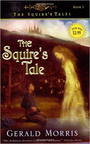
The hardcover did a better job of conveying the book’s great good humor than the newer paperback version, which suddenly made this very funny, wonderfully rich, earthy story seem solemn, ethereal, and remote.
One telling litmus test of a cover is, Will families want to give this book as a birthday gift to another child? We just could not get people to buy the paperback version of A Squire’s Tale as a gift. And often, we sold the paperback to families for their own reading ONLY after — seeing their hesitation — we showed them the hardcover and explained that it was the same book.
I actually like many of the other covers in the redesigned Gerald Morris series, even though I think they tend to turn away readers who would be drawn in by a more joyful artistic interpretation. The art is often lovely, but the darkness (especially on the first few covers) makes these a tough handsell to kids who aren’t yet acquainted with the series.
Another cover I would LOVE to see re-done is Understood Betsy by Dorothy Canfield Fisher. This is one of our tried-and-true staples — at least during the years where the cover art is good. Here’s what’s available now. Which of these copies would YOU pick up if you were a contemporary child?
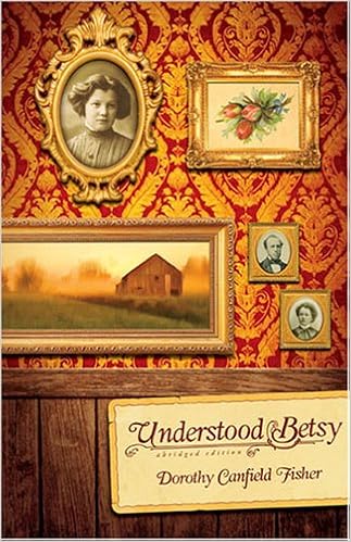

Right. Neither. However, Henry Holt brought out a sweet hardcover some years back that sold nicely for us and would be delightful in paperback. Hint, hint, Macmillan.

(Apologies for the poor image quality. I couldn’t find a better version.)
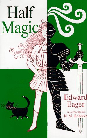
The flip side of my plea for a redesign of some books is a plea not to mess with the good ones. *In the middle of my writing this post, we had a sales meeting and learned that the cover of Eager’s Half Magic has been revised. This is a case of fixing what wasn’t broke. Take a look at these and tell me what you think:
Original cover:
I loved this one and kids did, too. (Please excuse the slightly cut-off right side; this was the truest image I could find online.)
Then came the 1999 redesign with Quentin Blake art:

Also a winner of a jacket, and perhaps even more so than the original. I never had a single child hesitate to grab this book — or any in the series. SUCH an easy handsell. The covers are fun, clean, suit the stories, and appeal to children.
And now, the 2016 reboot:
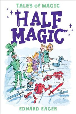
To me, this looks more scary than funny. A misstep, I think; this may not be a world I suspect all kids will want to enter, the way they do with Quentin Blake and N.M. Bodecker’s interpretations.
It turns out that all seven of the Eager jackets have been redesigned, and they all have this tomato-based color palette, many with a nod to Hieronymus Bosch chaos. The armor up there looks like worms. Why, oh why?? Let’s hope I am wrong and girls and boys just scoop up these books like crazy. I am mourning the Quentin Blake covers, though, I have to say. (Apologies to the artist of these new covers. You’re clearly a terrific artist. I just wish I liked the style better for this series.)
At least there’s plenty of action on the Eager covers. Often, reboots engender curiously static art.
Which brings me to an overall frustration with redesigned classics, especially those in the public domain. They don’t seem to be treated by publishing art departments like other books, with an eye to customer appeal. It’s as though the very term “classic” consigns it to a special realm where it’s okay to create boring covers. Books aren’t classics because only teachers make you read them. Classics are books that have stood the test of time and continue to astonish, enrich, delight, and enlighten readers across decades. They deserve inviting, fresh covers. If a new cover doesn’t make kids want to pick up a book, what’s the point of even doing a re-design?
Sometimes, those dollars might be much more effectively spent doing some clever marketing around the books they want to remind families and schools about, or creating displays to feature a series. Imagine a Summer Magic June display featuring all seven Quentin Blake Edward Eager titles.
Booksellers, teachers, parents, and librarians — which books you love are crying out for new covers? What great titles are kids missing out on because they don’t like the jacket art?
I think its time for Where The Red Fern Grows to get a new cover. The current cover is not only getting dated, but it just doesn’t convey the tone or power of the narrative. Keeping with Wilson Rawls, Summer of the Monkeys, which currently has two options, the 1998 movie tie in cover and the very dated regular edition, needs a re-jacketing as well
Where the Red Fern Grows is about to have a new hardcover special edition with a gorgeous new cover on May 3rd! I’m sure the new cover will make its way to the paperback edition eventually too.
Thanks, Emily! Tracked down the new art in Edelweiss. Not sure if the link will work here, but: http://images.abovethetreeline.com/ea/RH/images/jacket_covers/original/9780399551239_56230.jpg?width=1000
Bravo to you, Elizabeth, for this much-needed essay! I’m so happy I have the Bodecker cover for Half Magic, which portrays the story well. I would not buy the book with the new cover–it looks violent. And my hardcovers of Gerald Morris’ books … well, they’ve always needed more understanding art because his stories are SO replete with humor and adventure. I wish the All-of-a-Kind Family books could have snappier covers. They’re still charming to read.
What an interesting class project it would make at some fine School of Design to create new covers for classic titles, with a schedule and a budget and a marketing plan. Possibly with a visit from a real live art director, and people playing the roles of Demanding Sales Director and Cranky Editor, just to thin out the ranks of wannabees.
In many cases, the public domain material is just slapped with a cheap stock photo or illustration. They’re inexpensive and, since the publisher doesn’t have to put any real work into it, any money made off sales on it is pure gravy to their bottom line.
I understand the desire for them to save money, but they’d get so many more sales (from bookstores, at least) with great covers.
Oh, no argument on that point from me. I’m just pointing out what they do (and Puffin is notoriously bad about this).
Any version of Heidi that does not have Heidi depicted with short, black, curly hair should be corrected immediately. She has black, curly hair, dark eyes and red cheeks because she is Swiss. Swiss, not Swedish. Swiss.
So many book covers have been designed, redesigned, and outright trashed that I long for the return of leather bindings, tooled and dyed to bring out the romance of magic in the interior works. Now, we have so-called “graphic artists” who want to cover adult horror books with child book designs to make the stories “palatable” to the average reader. It used to be that artists were encouraged to create covers which matched the interiors. Now it’s all “modern” art, abstracts and non sequitors. This happened in the 60s, too, with the result being a fall off of sales. PFFFT. I’m sick of it. That’s why I design my own covers and make changes when I need to, but you can be sure they reflect what is inside each book I write and publish.
This post brought back fond memories of the Edward Eager books – I adored those Quentin Blake covers! I redesigned Edith Nesbit’s The Book of Dragons for a class in my publishing program (the assignment was to redesign a book in the public domain). You can take a look at it here if you’d like: http://erikaschnatz.com/portfolio/the-book-of-dragons/
Cheers!
Wonderful discussion of cover art. I’m sitting here at a conference for teachers of gifted and talented and only have wonderful new books in front of me. No wonder kids won’t pick up dated or boring covers when new books have such wonderful covers. But then sometimes you can’t beat the older art. I think I still like the older covers on the Boxcar series and no one should mess with Garth Williams on the Little House books!!
It is so much harder hand-selling a title-even a classic, when the cover art is poor. People still judge a book by its cover whether they are aware of it or not. In my store Pax by Sara Pennypacker is selling like hot cakes. Part of the reason is the glorious cover art created by Jon Klassen. It practically screams Buy Me! Publishers need to take notice and either reissue favorite cover art or hire today’s best cover artists. It will make a huge difference in sales.
I never realized THAT for a kid’s books. Your preffered bright Enchanted Castle cover from years of old would not appeal to today’s kid. The burnt orange replacement doesn’t get tbere either. A light smoke grey over the castle would work.
Glad u brought cover art to my attention. I have a couple of ebooks coming out this year by Christmas.
Oh, definitely, the Enchanted Castle cover art I loved as a child wouldn’t work today, but at least it’s bright and happy and suggests some kind of adventure! 🙂
This is a great post that gives some insight on how a cover affects the sales of a book. I and many other cover artists would love to have a chance at designing some bright, fresh, eye-catching covers for these books!