
When we ran a post in ShelfTalker recently about young-adult book covers—The Season of Windblown Hair — Or, the Zeitgeist of Book Covers—author Nancy Werlin wrote us a note. She said, “Elizabeth’s recent cover post sparked me to write something about covers from an author’s POV. ” Attached to her note was the article that follows this introduction; it’s a revealing, behind-the-scenes look at the kind of conversations established authors have with their editors (and agents, and others) during the cover design process. We are delighted to add her voice to the conversation about how book jackets are designed and changed and edited until they are approved and ready for the bookshelves.
[Note: Not all authors are invited into the cover design process; perhaps even the majority are not. Publishing houses have varying policies about author participation in book cover and art discussions, and newer authors generally have less input than well-known authors with more experience in the industry, like Nancy.]
And now, without further ado, here is:
Anatomy of a Cover: Extraordinary by Nancy Werlin
Part 1. Thrifty R Us
So, I was having breakfast with my editor, Lauri Hornik at Dial/Penguin, at the ALA convention in June, and suddenly Lauri lowers her voice and says, “Did you see that story in Publishers Weekly about the YA cover shoot?!”
“You bet I did,” I say. “Ack!”
“They spent over $20,000!”
“$28,000!” [Note: It was actually $26,000. I have a tendency to exaggerate for the sake of the story.]
“In fairness, it was for four covers. But still! Can you imagine?”
“No!”
This explains why, in talking about the cover of Extraordinary, I will be discussing stock art, PhotoShop, and the genius of in-house cover designers – in this case, Natalie Sousa at Penguin. I also have to mention interior designer Jasmin Rubero, because Extraordinary has a lovely page design too.
Part 2. Cover Design Mission
There was a mission: To match the cover of Extraordinary to the cover of the paperback Impossible,  which was commercially successful. Consider the outdoor natural setting, the single girl in motion with her hair blowing, and the cursive font used for the title; both covers have these in common.
Conceptually, though, the “same but different” mission was tricky for the designer. You couldn’t have the cover of Extraordinary suggest to readers that they’d be getting the continuing adventures of Lucy Scarborough from Impossible, only that they are likely to get a similar reading experience.
Then there’s the mission of any cover: to represent the book’s contents authentically enough while appealing to the tastes of those most likely to want to buy it and read it.
“Authentically enough.” What do I mean by this? Well, I’m a veteran of YA book covers (just take a look at my website’s Cover Gallery, in which you’ll find my sometimes trenchant comments on the covers of my books over time). I used to want covers that represented the book’s contents very closely, and were also pretty. Many folks automatically believe that this is what makes a good cover.
But I’ve changed my mind about this. While the cover should not lie (by implication or outright), its job is simply to say: “Pick me up!” to someone who might like the book. That is all. And you have more moving parts than the art: you also have the title and author’s name.
Part 3. The Right Stock Photo
I can only guess how long it took Natalie to find the right stock photo. I imagine she typed “young girl” (and maybe some other keywords) into many different stock photo sites and scanned and scanned and scanned through the results. In the end, she found it at Agenja Free/Alamy.
If you click on the stock photo website link, you can perform the search. Enter “young woman forest” (don’t use the quotes). You’ll see a selection of photos that includes the green forest glade from the Extraordinary cover. (Or you can just look at the picture of the search results.)
On the second page, you’ll find the photo that Natalie used, and you’ll see a few others of that same blonde girl in a red dress frolicking in the forest. There’s one of the girl running toward (rather than away from) the camera; one of her holding her dress out; a few of her sitting in the grass; one of her dancing in sort of a demented way. Maybe Natalie considered some of those as well.
In any event, she created a mock-up (one of many, no doubt) which was the one that Lauri first sent to me.
Part 4. Actual E-Mail: Cover Mock-Up #1 … and #2 … and #3 … and the Final Decision
Here’s the actual email dialogue that followed.
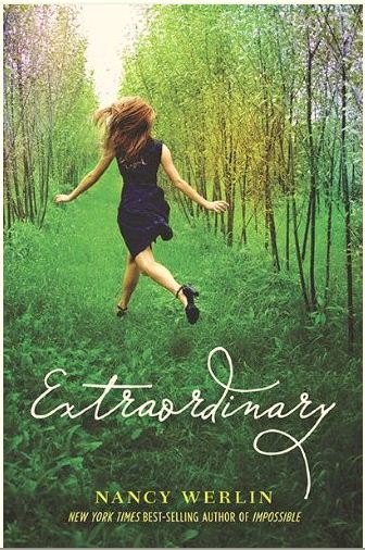
Mock-Up #1 for Extraordinary jacket
LAURI (to Nancy): Here’s a jacket-in-progress (#1).
I’m not liking the hot pink color of the dress and shoes, and I’m thinking that we’ll want some shimmer effect for punch and to hint at the otherworldly setting. What do you think? Could this girl fairly represent Mallory? And do you like the general look of this? We are, of course, trying very specifically to give the novel a companion look to the IMPOSSIBLE paperback.
NANCY: Hm. Interesting! Yes to giving it a companion look to IMPOSSIBLE. And I think this “pops.” But it’s also a little too running-girl-Gothic for me. (Remember those old ’70s romance paperbacks? They always showed a girl in peril, running in a dress.)
I like the green landscape and the high heels. I agree with you about not liking the hot pink color in the dress.
Yes, that could be Mallory, who’s described as having straw-colored hair. But is there a way to make the cover indicate *two* girls? I don’t actually like having Mallory only on the cover; she’s not the main character. If only one girl is shown, it should be Phoebe.
GINGER KNOWLTON (agent): My favorite part is the title font. I immediately thought that I would want a handwriting expert to interpret it.
15-YEAR OLD TEEN: It doesn’t fit the description of Phoebe. And… the girl looks obnoxious… as do the colors. Buuuuuut that’s just me. I would rather see an image of a girl standing in the garden with Phoebe’s description – short with wild red-brown hair or even Mallory with a pair of wings… but yeah… that’s just my snobby opinion. 😛
NANCY: The most salient detail, to me, is that our teen expects to see Phoebe, not Mallory. And she’d rather see a garden than a forest.
LAURI: Thanks, Nancy. This is helpful. We’re limited, in terms of setting and girls, by what we can find as a stock image. But I do think Natalie can work some magic with PhotoShop. Stay tuned.
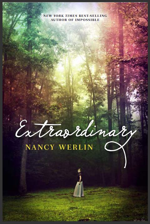
Mock-Up #2 for Extraordinary jacket
LAURI (to Nancy): Here’s the other jacket comp that we’ve been thinking about recently. Would love to hear your thoughts.
NANCY: [Answer lost in the bowels of email, but it was something on the order of, “Dear God, no.”]
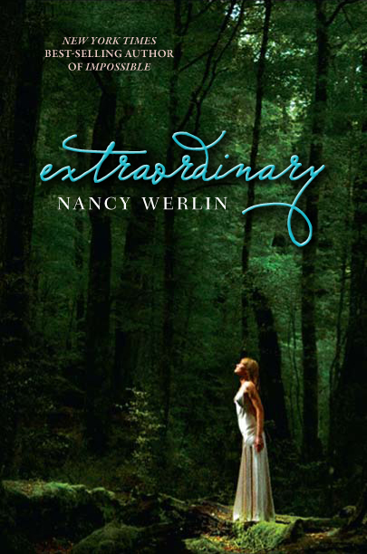
Potential jacket #3 for Extraordinary
LAURI: Here’s a third cover option — one that I love. What do you think?
NANCY: I like everything about it except the girl. The forest atmosphere is terrific. Would it be possible to swap in a different girl or change her clothes?
LAURI: I know — it’s nothing that Phoebe would wear. I’ll ask Natalie if there’s any way to change the outfit. But can we get away from having Phoebe in all black? Any other options? [Note: In the novel, Phoebe wears nothing but black. But it turns out that this is not the best visual choice if you want your cover girl to be striking.]
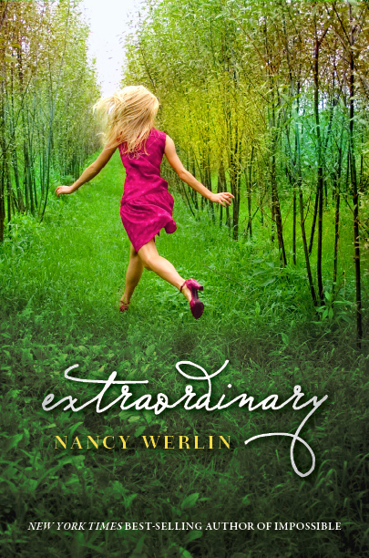
LAURI (presenting final cover, showing original girl who now has reddish hair and is wearing black): After much discussion, we’ve decided that the attached comp is the strongest:
Potential Extraordinary jacket #4 (the winner!)
We did look at inserting other girls into the photo that had the grand trees and the pinks in the sky, but it looked awkward, and Sales found that photo too introspective/quiet to have shelf impact. This one was forcefully preferred by the group, and with the outfit a different color and her hair more Phoebe-ish, I feel very good about this one. Some questions: Do YOU feel good about this one? Does this girl look enough like Phoebe? And how do you feel about the new title type? The previous version, as gorgeous as it is, was too difficult to read.
NANCY: Well, “forcefully preferred by the group” is a strong argument for me. This #1 had been growing on me since I first saw it, and I suspect it will grow on me even more over time, as did the IMPOSSIBLE cover. Yes, I do think this could be Phoebe now — and that’s quite important. And I love how this cover matches with the IMPOSSIBLE cover.
(And I adore the shoes. This cover asks the important and perhaps irresistible question: Why is she running through a glade in THOSE SHOES????)
The original title font was so lovely, I mourn it, but I can live with this. It gives the same feel, almost, and it IS easy to read.
In short: I am on board, too.
LAURI: The color of the outfit makes a BIG difference in the tone of the whole. I feel it gives the book the solidity, the gravitas that it deserves, and that it doesn’t any longer look like popcorn. The group at the meeting this week all agreed, and they seemed whole-hearted.
NANCY: One question: can we have a line or two about the plot on the back cover? I just read an article that explained that many kids don’t know to read the flap copy. They look on the back and then put the book back on the shelf if it doesn’t contain some hint of what the book is about.
LAURI: Absolutely!
Part 5. Cover as Magic
I now look over the above exchange with bemusement. Why didn’t I immediately see that the first cover composite was on the right track? That it was going to be gorgeous, and fitting?
Maybe I was scared. Writers put a lot of weight on their book covers. I couldn’t see clearly through the haze of my emotional investment in Extraordinary. Did this cover express everything that I felt about my book? About Phoebe Rothschild, her friend Mallory, and everything that happens between them?
Well, how could it? Extraordinary is an original fairy tale, a contemporary story. But like a traditional fairy tale, it heads quickly into frightening, bloody territory. I am afraid for my book, as it goes out alone into the world, just as I was frightened for Phoebe as I wrote and rewrote her story.
No matter how beautiful and loved a cover may be, the jury on it remains uncommitted until the book has been in the world for a while. Perhaps bookstore buyers will be indifferent. Perhaps it will be lost on store shelves. Perhaps there’s another book or two out there using the same or a similar photo. Perhaps its concept or color scheme is part of a trend that’s suddenly over. Perhaps ShelfTalker at Publishers Weekly or the anonymous designer at “Jacket Whys” or other bloggers will rip it to shreds for a reason never imagined during the design process.
And then there is the inside of the book.
A book cover says “open me.” The opening of a particular book will be magic for some readers; but for others, it will not. And about these others the author must learn to say, “My book, my beautiful book, was not written for them. They will find their magic elsewhere, and that’s just as it should be.”
It’s ever so slightly hard, however, to get to this place of acceptance. And so the author hopes that the cover will itself be magical, attracting all the right readers, and as few as possible of the wrong ones, to what really matters: what’s inside the cover.
***
Loved your article. It’s wonderful to hear that some authors get it. Yes, a cover’s job is to get people to pick up the book and look inside. Yes, designers (the good ones) really do put a lot of thought (not to mention work) into the selection of images and the typography and composition. Your designer did a smashing job.
Kudos from another book designer. And thanks for noticing. We so often go unnamed, and under appreciated.
Kudos to you Elizabeth – this is a fabulous look at the topic from the otherside of the table.
…and Nancy I love your humor and honesty – great piece.
I hope publishers take note of this exchange:
NANCY: One question: can we have a line or two about the plot on the back cover? I just read an article that explained that many kids don’t know to read the flap copy. They look on the back and then put the book back on the shelf if it doesn’t contain some hint of what the book is about.
LAURI: Absolutely!
***
As for the cover, I remember when I first saw this cover a few months ago, I immediately e-mailed a couple of friends and said, isn’t this a GORGEOUS cover!? It’s fascinating to me how much changing the colors of the girls’ hair and clothes changed the feel. I like the second one so much better!
THis is fantastic–thank you Elizabeth and Nancy!
Fascinating. It was interesting to compare this to my experience with the cover of my upcoming (first) novel–I had a lot more say in the process than I expected to, and I tried to respect that my role as author was advisory in this situation. Not always easy, because I also do graphic design work myself, but it was a good experience all around, I think. I feel very lucky. It sounds like Nancy Werlin is able to have a lot of involvement, which is great. Getting to hear the types of conversations and decisions that need to be made was very educational. Thanks!
Sue – Yes. Agree. A book cover’s job is to ask a question that the onlooker can answer only by picking up the book. It’s easy for non-designers to fail to understand the parameters involved. I’ve learned better over time, but it has taken me that time, too.
Roby, Erin, aqua – thanks. I hope it was also clear that there was much going on that did not involve me, and that my input was deftly mediated and, uh, “boundaried.” Notice how kindly but firmly Lauri told me, at the end, that a decision had been made.
Lisa – It was a revelation when I read (wish I remembered where it was) that young, casual bookstore browsers who are used to paperbacks *expect* some kind of book synopsis on the back and often won’t know flap copy exists.
FINALLY – Anyone interested in YA covers should check out author Melissa Walker (http://www.melissacwalker.com). Melissa curates a regular blog feature of authors talking about book covers which is also fed to the terrific Readergirlz blog (http://readergirlz.blogspot.com/). It’s on my own RSS feed and is reliably fascinating.
Nancy, this was a fascinating article and the final result is just gorgeous.
Mar
Thank you, Mar!
Loved this journey down book cover lane. But, what about the back cover? I love book design almost as much as I love reading. On Sundays at my blog the Boomer Muse, I post photos of everything thing I read splayed open to show both front and back covers. The best designs have a cohesive flow from front to back.
Some of us authors do get it. As a reader I choose to pick up a book by color and design. I want to be able to reader the title and then I read the blurb. If the cover design conflicts with the blurb, sometimes that is enough to stop me. I know how important book cover designers are and I sincerely appreciate you all.
Eliza
And an addendum, with thanks to Jackey Whys for the link:
Will book cover art go away altogether::
http://www.google.com/webhp?tab=mw
Kudos to you Nancy for understanding the job of a book cover. I am a book designer that has worked with custom photography for a cover all the way down to pulling off Photoshop miracles with no imagery budget. It’s always interesting to see the process. The projects I’ve had where the author had input, more often then not became problematic. I think the authors are a little too close to the book. They want to tell the story on the cover, which isn’t always the best approach. As you stated the only purpose of the cover is to grab some one’s attention and get them to pick it up and read the flap or back cover copy. At that point the job of the cover is done. The positive experiences I’ve had with author’s are when they respect what I do and what I bring to the process. They don’t attempt to micro manage the cover design. They can be very helpful though when helping to dictate the tone or overall feel of the cover. Thanks for this article. If you are interested in the creative process of book design, check out our website http://www.faceoutbooks.com. We feature book designers from all around the world sharing their processes.
Nancy and Elizabeth,
This was fascinating! I’m going to post the link to this exchange on my blog. Covers are always a topic dear to my heart and those of all writers I know. I can’t wait to see mine some day soon (I hope).
And I love the final cover! I’ll be honest, when I saw the first version with the pink dress, I still loved it. I thougth the pink wasn’t so bad. It had punch and the forest is just magical and luscious. Also, I thought the visual had movement and a kind of impact that the others did not. I used to work in the advertising agency biz, so I’m used to deciding between visuals. Anyway, your final cover really goes great with the IMPOSSIBLE cover. Magic!
I like the final cover reasonably well, though that row of young trees in grass is not a forest. An orchard, perhaps? Definitely a human-created place, not a natural one. And maybe that goes better with the story. Now I am curious to read the book, so I guess the cover works!
My question is, why photos? YA covers nowadays are almost exclusively done with photos, and the young women in the photos are pretty obviously models. I find this jarring, as a photographed real person almost never looks the way I imagine the character to look, and the characters in most books usually don’t look like models. I would much prefer some kind of art to a photo. Is it cheaper to use photos? Are they preferred by readers? Why are they what’s done now, and why the change from the past, when art was more common?
I’m also struggling with Nancy’s statement that being pretty and representing what happens in the book are not actually the goals of the cover. They’re not? Gosh. I do find this troubling.
But what a terrific post — I learned a lot! Thanks to all.
Thanks, all, for your comments.
Layla, good question about the back cover and “cohesive flow” between front and back. It’s obvious you are a cover geek, eh? I was not consulted on and did not even see the full jacket until recently. It does not have the flow between front and back you mention; there were other priorities, including making a striking spine. Let’s not even get started on the importance of a striking spine — that’s a whole different challenge for the designer and one I hardly dare think about! To marry the right cover to your cohesive flow and also get a book spine that “pops….” Yikes. But a good spine is needed; the book will most often NOT be face-out. How do you entice people to pick it up based on its spine? A spine that also has to have the necessary text on it?
Eliza, yes, the cover must “match” the type of book and its description. The reader must not feel deceived by a mismatch.
Charles, I’ll keep an eye on your site. Yes, to authors sometimes giving more pain than help when they are consulted. It took me years to get educated and even now Lauri is wise to keep me firmly in check. She and the Penguin art director, Deborah Kaplan, are in charge.
Marina, you have a good eye. And if careful viewers check out the original photo on the Stock Photo site, you’ll see the changes that the designer, Natalie, made, adding sparkle to the trees, nipping in Phoebe’s waist a bit, and more. It’s clear to me that designers have to imagine what they can make out of a photo rather than simply seeing it as it is. It takes imagination.
Praxilla, if that is really your name, I’m jealous! Your question is “why photos? why not art?” Perhaps Elizabeth will gather someone better equipped than me to answer this question and that person will continue the discussion at ShelfTalker. Elizabeth and Josie, what do you say? A post from an art director or a designer on cover fashion in YA through history? Can we find a volunteer to write about it, with pictorial examples? It would be fascinating.
I’ll say only that art used to be used more often; photos have been the fashion of late. I imagine technology and PhotoShop have had something to do with this change; they make it possible for art departments to bring more control in-house and yes, that control probably includes costs (though photos can be quite expensive too). As to what is preferred by readers, that’s a question designed to drive people mad. We can only guess. Opinions always differ. And nobody deliberately puts out a book in a cover they think readers won’t like. That said … right now, teens *seem* to prefer photo covers.
“I’m also struggling with Nancy’s statement that being pretty and representing what happens in the book are not actually the goals of the cover. They’re not? Gosh. I do find this troubling.”
Sorry to shock you. The truth can hurt, eh? But think about it like this: a pretty object can be admired and left on the shelf. That pretty object must do more than be pretty; it must say, “You need to look at me more closely.” As I said to Sue below, “A book cover’s job is to ask a question that the onlooker can answer only by picking up the book.” Go to a bookstore and walk along and see if you can pick out some pretty ones that don’t impel you to pick up them up. Then try to find some more urgent ones that make you pick them up.
I will now restrain myself from segueing into a discussion of book display, which is a whole ‘nother topic and one that Elizabeth and Josie are far more equipped to discuss than I am.
I’ve often thought that a cover needs to give a feel more than it needs to tell a story. That is what hooks me.
My favorite covers are the ones that ask a question more than tell a story (I count on the book for that), or ones that spark my curiosity, or make me want to live in thir world for a while. I’m also a sucker visually for a great graphic. (I loved Carl Hiaasen’s HOOT cover, for example. So simple, so wonderful.)