I haven’t done a book jacket trends post in a long time, in part because photos of partial faces and girls in gown continue to not go away, and it would be silly to point out such obvious things. But there are other trends emerging—some intriguing, some irritating—so I’ve gathered covers. This blog post isn’t just aiming to find look-alikes; there are some amazing cover designs below, and it’s fascinating to see how different designers treat similar themes. While I might poke gentle fun at some recurring elements, I am truly in awe of what designers create. Cover design is an incredibly challenging art—it’s art on a deadline with a budget, which has to be carried out multiple times a season. I really don’t know how they do it.
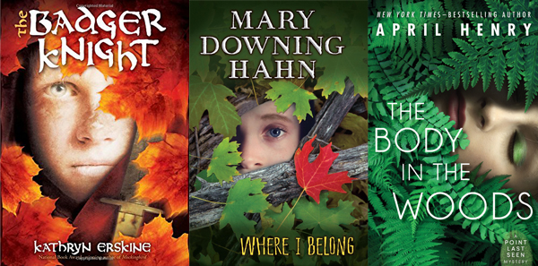
I’ll start with a micro-trend that alert Flying Pig staffers Sandy and Laura noticed: books with partial faces surrounded by leaves. First, there was last August’s The Badger Knight by Kathryn Erskine (Scholastic Press). Then came September’s Where I Belong by Mary Downing Hahn (Clarion). And now, fresh on the shelves, is April Henry’s The Body in the Woods (Henry Holt). Faces in leaves are in the zeitgeist.
 Remember all the shoes and (usually stripy) socks on covers the last couple of years? Now feet are out, hands are in:


“The symbol” (a la Hunger Games, then Divergent, Legend, etc.) is still around:


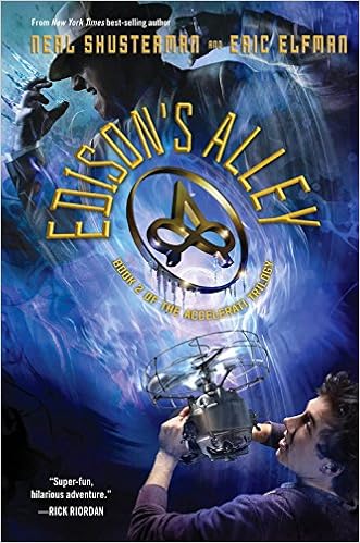


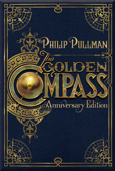
as are medallions (Hunger Games-inspired again) and steampunkish gizmos (possibly inspired originally by Lyra’s alethiometer in The Golden Compass). Even though there are scads of these, I sort of don’t mind them because I always really want to hold the medallions and play with the gizmos:


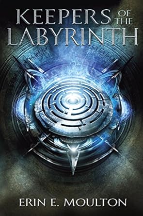


And are you noticing how many of these covers are organized around a central (or central-ish) round design element (origin Matched?)? Even though this design device makes too many covers look similar, I understand why the circle is such an appealing shape for cover design. So many of these covers are great:


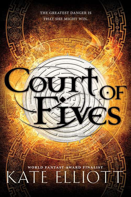


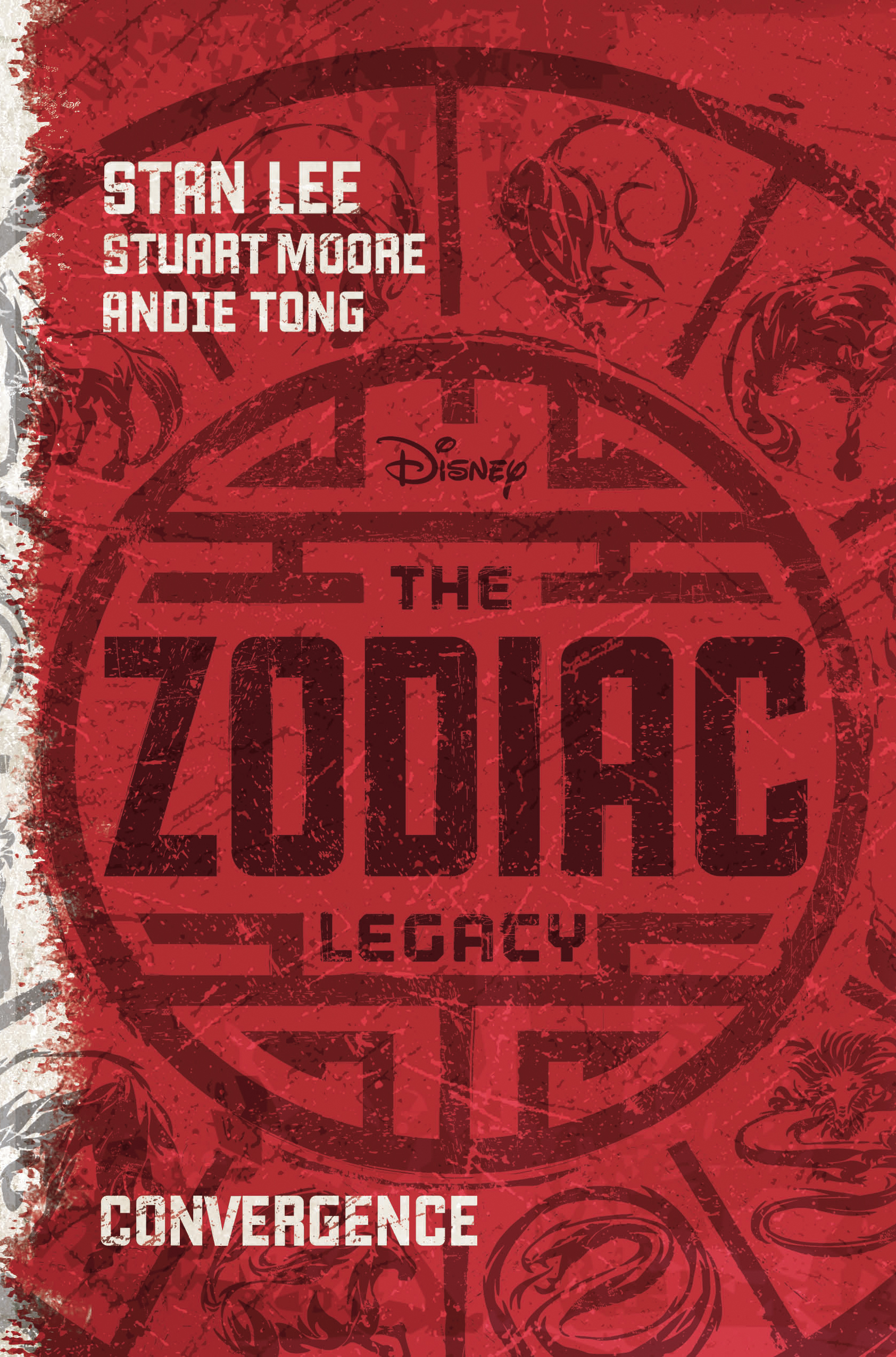


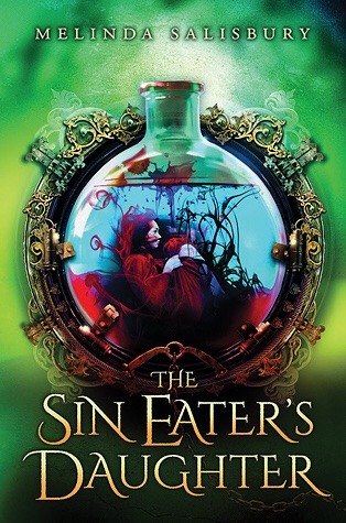



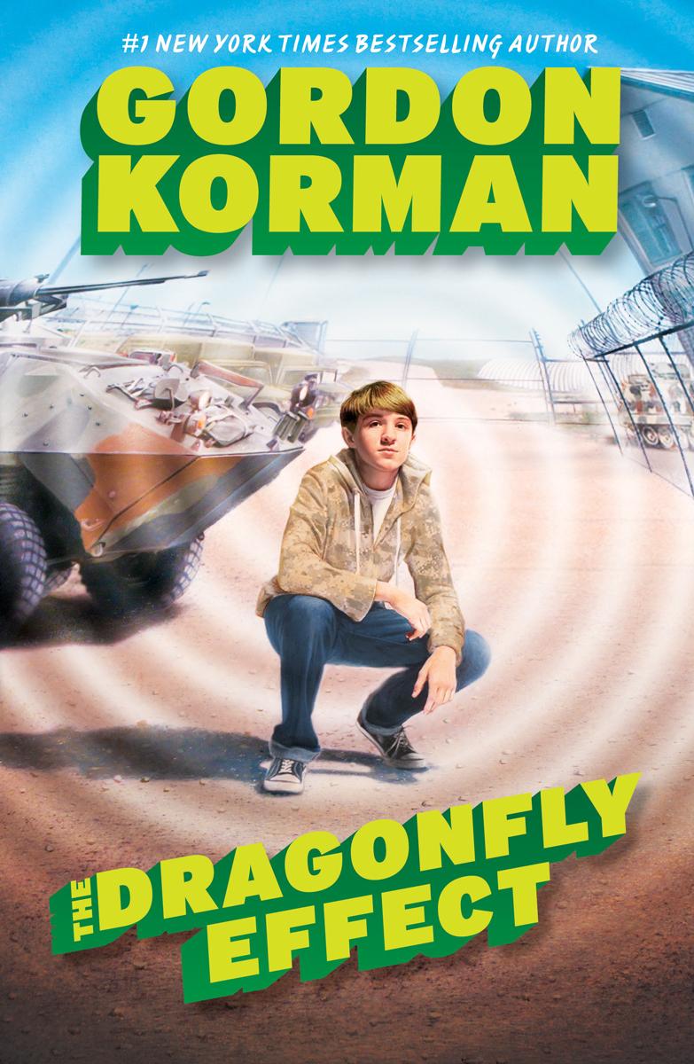


And leading off from the last several jackets, here are more figures in a burst of light. I included only a fraction of these; there are dozens:





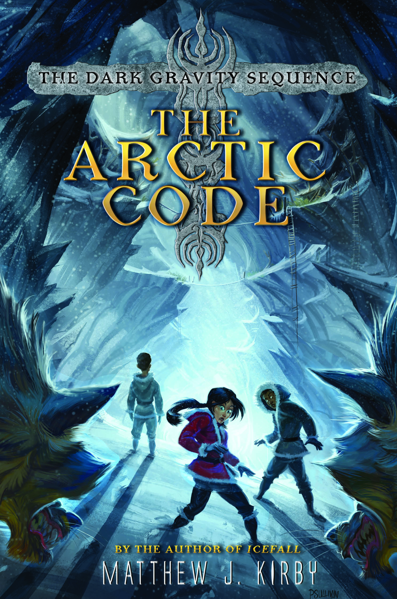
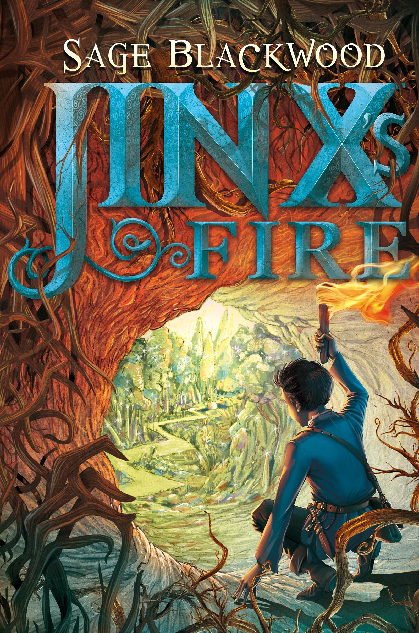

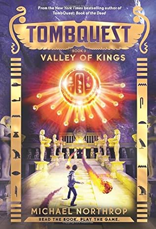


Metal letters are currently a thing:


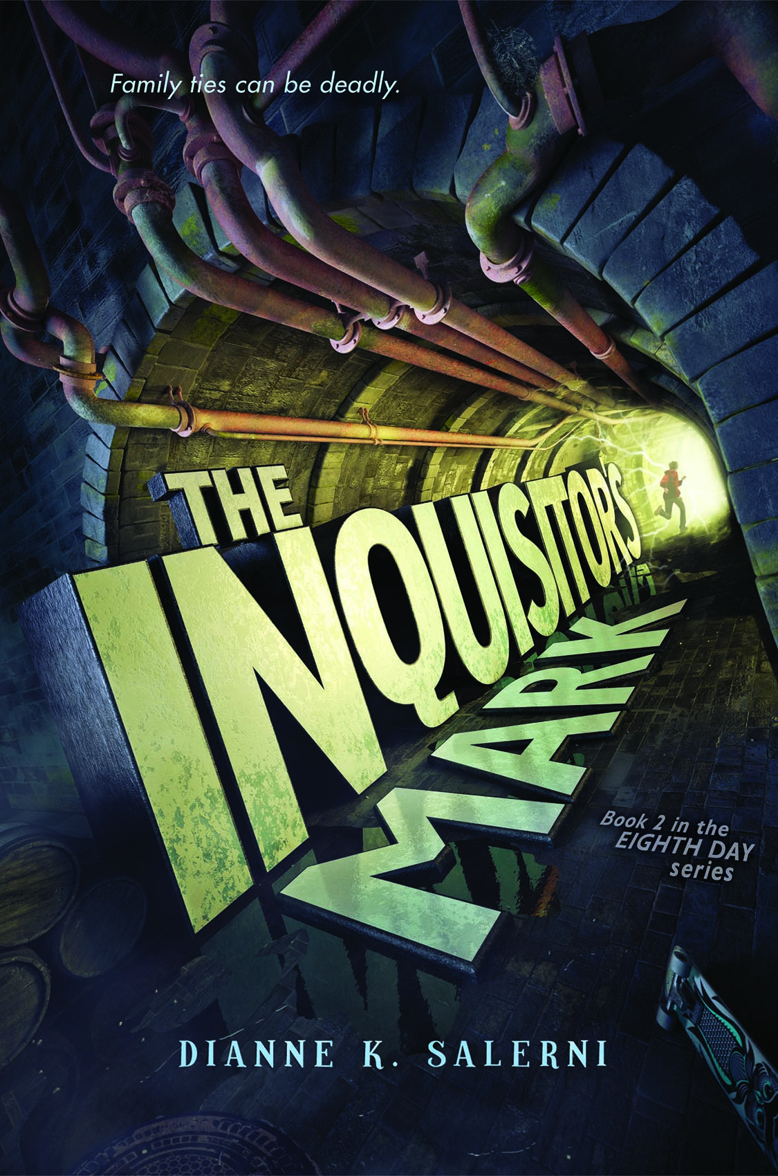

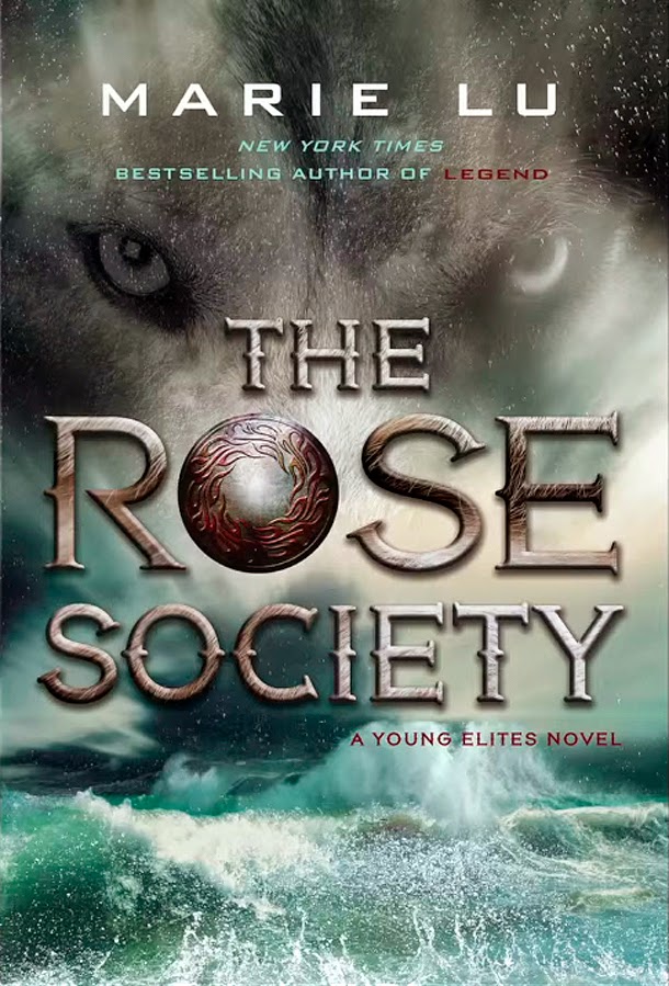
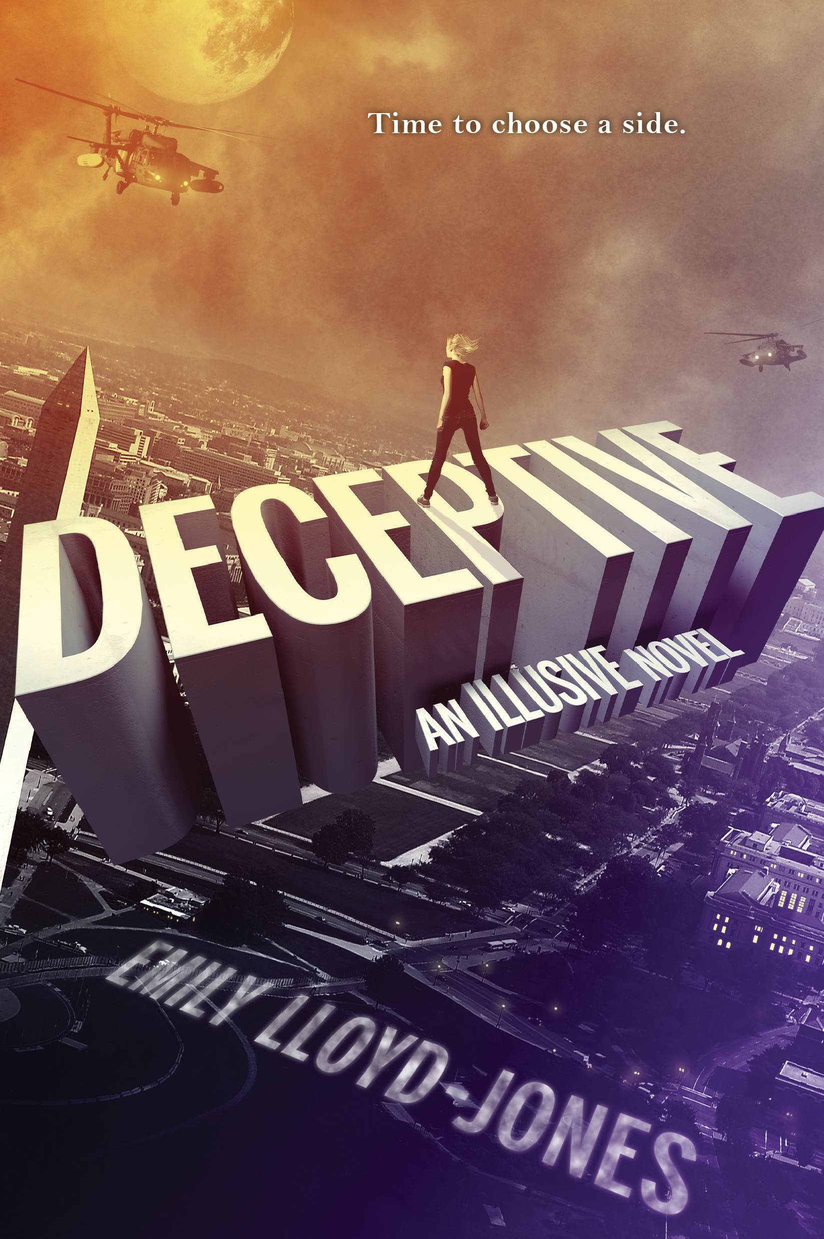
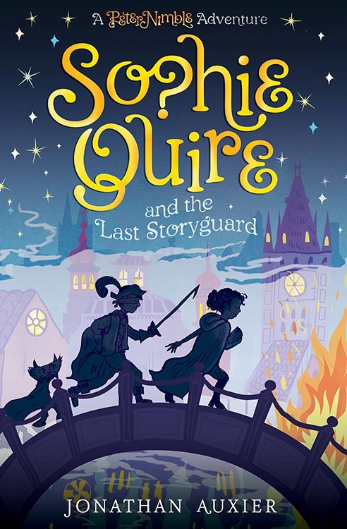
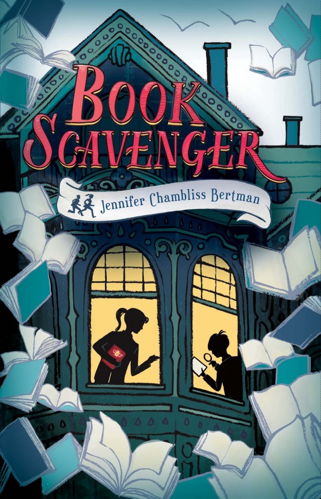
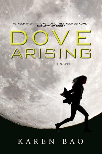
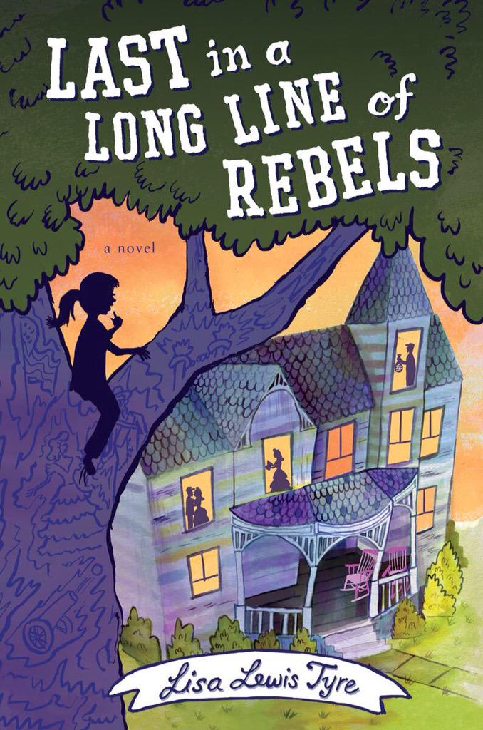
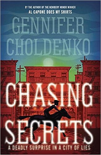
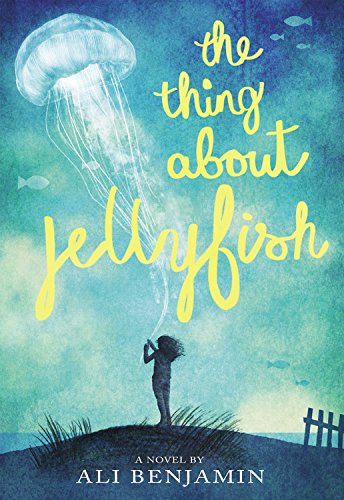
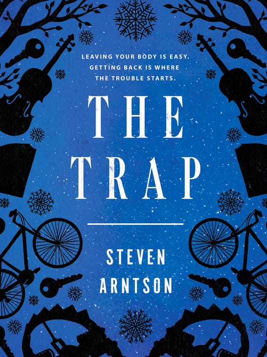
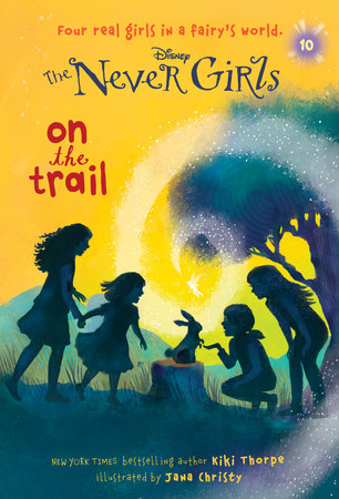
Shadowy or two-dimensional silhouettes (spawned originally by The Penderwicks?) are cavorting all over book covers:





Crows are doing well this year. There aren’t loads of these (there are more if you count ravens), but I love both of these covers so I declare crows a cool trend:


Who doesn’t love a world-within-a-world?


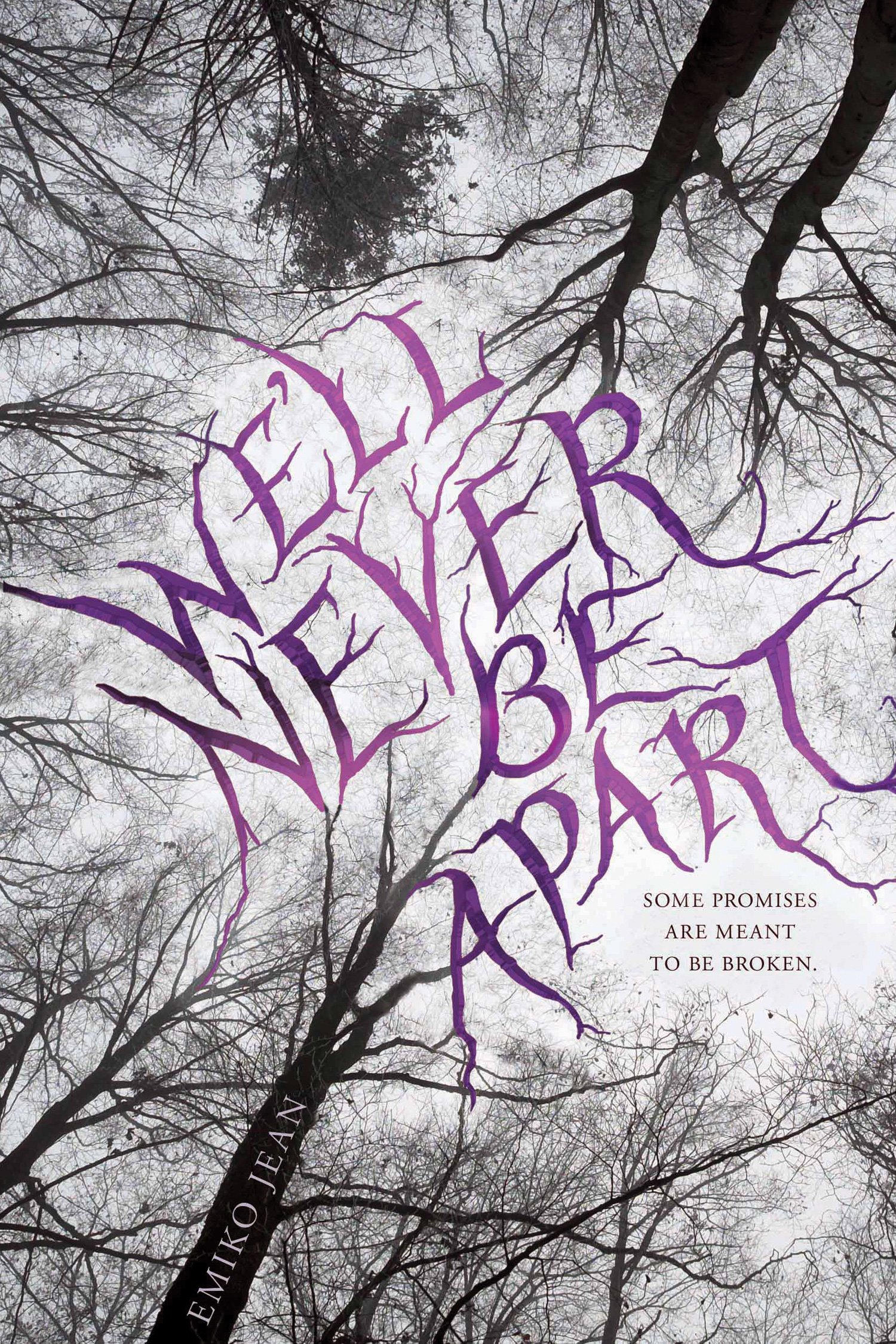
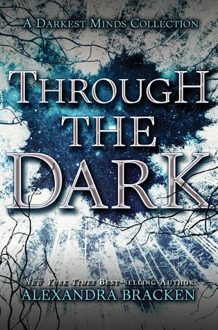
I also thought I’d been seeing a lot of up-through-trees shots, but could only find these two from 2015. Am I missing some?
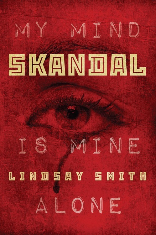
Anyone for eyeballs? This isn’t a new one, but it persists:


I want these three books to meet:


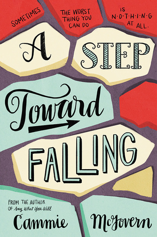
Covers with arresting font choices abound. The rule here seems to be that if font is the main design element, the color red must be involved:






Oh, wait. Green and yellow also work:
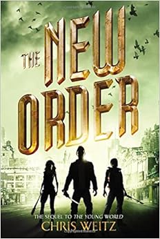


These books are eye-catching because they don’t look like other books currently on the shelves:




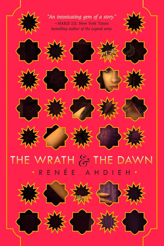


Speaking of that last one, I’m a sucker for a great graphic image. Here are some more:


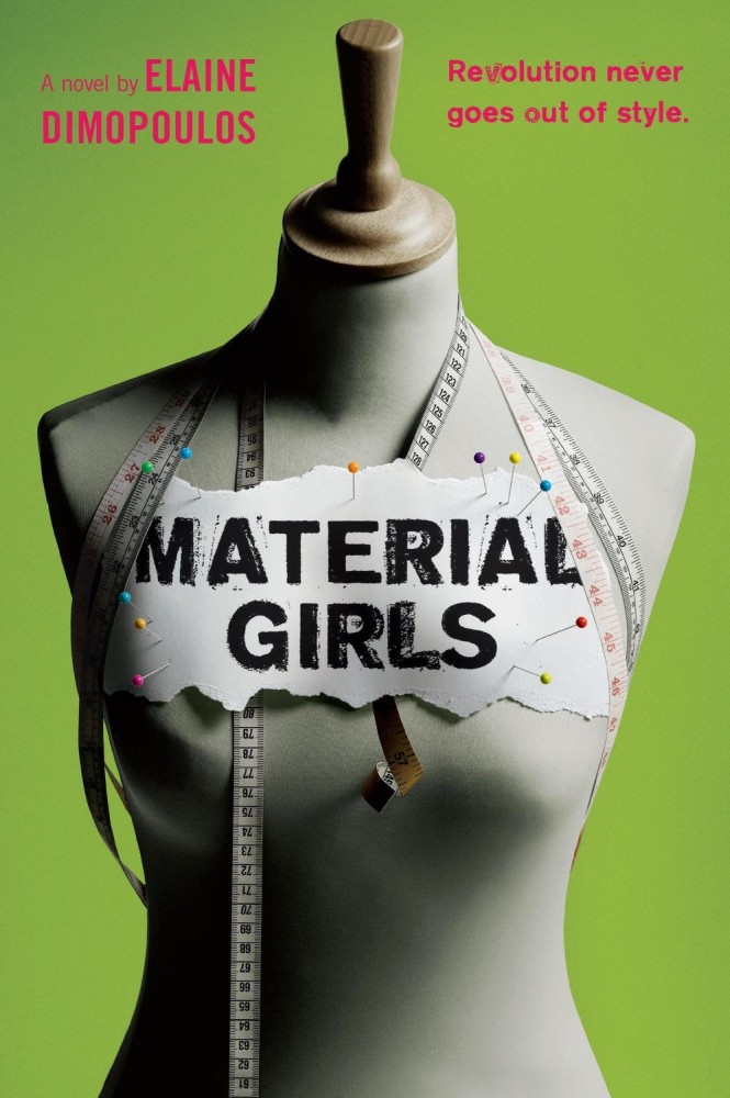
What am I forgetting? Oh! Swords! I forgot swords. There are a lot of those, as well. And groups of kids running to or from danger with a high-contrast light and dark setting around them.
All right. Before I catalog every book cover published this year, it’s time to sign off. Readers, what are your favorite book covers so far this year? What trends don’t you mind, and which ones would you really like to see go?


I blog about look-alike covers at http://aprilhenry.livejournal.com/tag/dueling%20covers. It’s a strange twist to see my own cover here!
Oh my gosh, April! What a great blog. Now I will be addicted. (And, that must have been a shock about your cover. But it’s a cool cover.)
Fascinating. A feast for the eyes, sort of.
The Circus Mirandus cover really is lovely- it does stand out in a crowd of books, absolutely! Jessica Day George’s Silver in the Blood book cover is very pretty, and Becky Albertalli’s Simon vs. The Homo Sapiens is standout in terms of colour and clean, bold design. I also like the retro cozy-mystery feel of Robin Stevens’ Wells & Wong mysteries.
I think I’ve seen enough of the eye, symbol/medallion type covers! The dystopian-adventure books start to blur together and look same-y (even if they’re not!).
Fascinating. These two novels use the same stock photo on the cover:
http://www.kelleyarmstrong.com/no-humans-involved/
http://www.indiebound.org/book/9781606841549
(probably because of the conflict, the paperback version of the Armstrong book now shows a different cover on Indiebound. http://www.indiebound.org/book/9780553588378 )