 For the love of all things typographical, this is a plea to the folks who design book jackets: PLEASE choose font sizes visible to the naked middle-aged eye for your series numbers, prices, ISBNs, and any other text necessary for retailers. This goes double for the marketing info you include on ARCs — what is the use of them if we can’t actually read the intended audience, age range, price, and promotional plan jammed into that skinny strip? And series numbers on spines that are nearly invisible (either because of font size or muddy colors that blend with the rest of the spine) don’t actually serve booksellers OR readers.
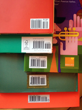
As you may not be aware—living as you do amid the clear-eyed, 20-something population that comprises Manhattan’s publishing and design elite—the average age of the indie bookseller is something like 173. We cannot see 6- and 7-point ISBNs even with our reading glasses on, or while using one of those humiliating wallet magnifying cards. This makes for some comical fun when our scanner is on the fritz and customers are waiting for us to hand-enter information. Likewise, forcing booksellers to peer helplessly at a spine to figure out which book is number 6 in the Em Square Saga does not help the cause of any publisher.
HarperCollins, I love you and your books deeply, but you were the first to go down to the 4-point ISBN, and the rest of your colleagues are falling like dominoes. I hate the ugliness of bar codes as much as anyone, maybe more than most, but my job is to sell your books, and you are making it harder. I’d much rather you move the bar code inside the back jacket than decrease the font size.
Take a look at the differences in font size on these picture books: Quest; Tiny Creatures; Little Eliot, Big City; Draw!; Elizabeth, Queen of the Seas; The Lion and the Bird; Flashlight. Some are perfect; some are too small for eyes over the age of 45 to read.
I’m not asking for 10-point type, here. Even 8 or 9 points would be heaven.
So here’s what you might do: take those ARCs and book jackets home to your parents and grandparents, and ask them to read the small-print information on the back cover. Adjust accordingly. It’s a very easy way to make several thousand people happy.
Thanks for reading!

AMEN!
Thank you! I thought is was just me and my eyesight getting worse! Why on earth would they do such a thing? Let’s hope someone in the publishing business really “sees” this.
And, while we’re on this subject, Publishers Weekly print magazine could do with bigger print.
Wired magazine. I swear they want everyone over the age of 30 to cancel their subscription.