 Last week I was vacationing in beautiful Sandwich, Mass., with my family, where I managed to sneak in enough reading time to get me through three books, which I’ll review here only in abbreviated fashion, as my blogging time has been cut VERY short this weekend. (Blame my need to unpack, do laundry, clean house, and, oh… help run an event for 650 people! Thank you, Rick Riordan!!) Sometime in the next couple weeks I’ll post photos of my visits to Titcomb’s Bookshop in Sandwich and Eight Cousins in Falmouth. Stay tuned for those.
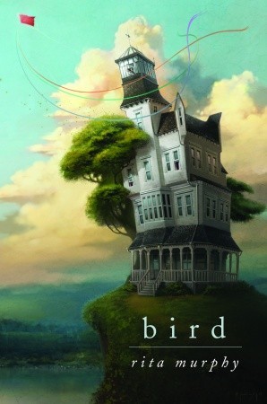
Rita Murphy’s short, sweet novel Bird (Delacorte Books for Young Readers, October 2008) was the perfect accompaniment to the gray, rainy weather that began my beachside vacation. As is the case in Rita’s previous novels (and I’ve read and enjoyed all of them), this magical story has a beautiful, airy quality that’s tempered by a slightly sinister edge. I loved floating along with the main character, Miranda, a girl who’s been living in a towering old house ever since the wind blew her to its doorstep and its owner outfitted her with steel-weighted boots to keep her from being swept away again. I thoroughly enjoyed watching the secrets in this book unravel and, try as I did, I didn’t manage to solve the final mystery on its pages before its solution was revealed to me. (I love it when that happens.)
One further note of praise for Bird: I LOVE the jacket design for this book. I loved it before I read it (it was part of the reason I moved the galley to the top of my pile), and I love it even more having finished the book. I wish all covers could be this enticing and this well-suited to their material.
 WHICH brings me to the second book of my vacation week: The Hunger Games by Suzanne Collins (Scholastic, October 2008). I read it. I LOVED it. But… it wasn’t quite what I was expecting, and I’ll explain why, in case some of you have the same wrong preconceived notions that I did. The reactions to this book that I’m reading and hearing from other folks had me believing this book would be older and more sophisticated than it actually is. It doesn’t help that the subject matter alone suggested an upper YA audience to me (kids in a cruelly governed society are forced to fight one another to the death in an event broadcast live on television — think Survivor meets Lord of the Flies). The first-person voice of Katniss Everdeen, the star of The Hunger Games, though, is much younger than the how i live now-type voice I was anticipating. I found myself thinking often of The House of the Scorpion while reading this book, not because the two are especially similar (they’re not), but because I think the audience for the two books (roughly ages 12 and up) might well be one and the same.
To some extent this meant I was a bit *less* riveted than I had expected to be (I WAS able to put the book down every now and again), but once I readjusted my expectations I found I was no less entertained than I’d hoped to be (just because I could put the book down doesn’t mean I wanted to). Ultimately, YES, I loved this book and I believe kids will devour it whole. But I don’t anticipate it having the adult cross-over appeal of, say, The Golden Compass or The Book Thief or (at the complete opposite end of the spectrum) Harry Potter.
I could go on and on about the various details up for discussion on the pages of The Hunger Games and the myriad ways that middle school teachers will find to use it with their students, but for now I’m reluctant to divulge any details, as I do feel that this is a book best experienced cold (as in, without having warmed to its secrets). I will say that I expected (and wished for) the politics of Panem (the book’s setting) to come more into play in this story than they ultimately did. I suspect, though, that that’ll happen in this trilogy’s subsequent two installments.
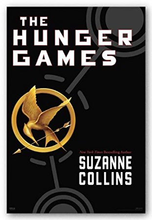
As for my thoughts on the cover, though: it does nothing for me, and it wouldn’t entice me to buy this book. I COMPLETELY UNDERSTAND that it must have been difficult to come up with a spoiler-free design that would adequately suggest the overall feeling of The Hunger Games, but I think the results here say “stock fantasy novel” not “riveting entertainment.” I also think it looks more adult and more sophisticated than what the book really is. (In other words, 12-year-olds may think this book looks boring.) I KNOW it’s the kiss of death too make a book too young, and I’m not advocating for that, but making it look too old or too uninteresting doesn’t help when the book’s primary audience is a rather punchy and very visual set. And I will also say (and not that this is sort of a spoiler here)… the cover reinforces a red herring. And I HATE that! ARGH!! Hate it!
Soooo… Sorry, Scholastic. I know I’m griping about a hard-made decision here. I think you’ve got an absolute winner of a book on your hands, and I just wish the cover design for it suggested that. As it is the current one just doesn’t look kid-friendly enough to me. (Or bookseller-friendly, for that matter.) When I enjoy a book this much I want it to scream “FABULOUS!” but this one’s just not screaming to me.
 As for my thoughts on the cover for The Battle of the Labyrinth, the fourth book in the Percy Jackson and the Olympians series? WHO CARES?? The book is going to be read by everyone who loved the first three books in Rick Riordan’s wildly popular series, and it will probably be loved by all of them too. John Rocco (who does the covers for these books now that, THANK GOODNESS, Hyperion ditched their original design for The Lightning Thief in hardcover) could have put Percy Jackson in pink tights and a tutu and readers wouldn’t have batted an eyelash. (Or would they…) One of the questions posed by a young reader at our event with Rick Riordan yesterday was whether or not Percy had gotten a haircut for some important reason, as this kid believes (as do his friends, who sat beside him, nodding their heads) that his hair looks shorter on the new book’s cover than it does on the other books. (Rick’s answer: no, the length of Percy’s hair doesn’t hint at any key clues or hidden secrets, to his hair-obsessed fans’ deep disappointment.)
But I digress. I loved The Battle of the Labyrinth. In fact, I think it might be my favorite book in the series so far. I say “so far” because there is indeed one more book coming (the fifth and final book about Percy’s adventures), hopefully about a year from now, though Rick says he’s very much still in the writing and revising stages. The news that was greeted with the most enthusiastic response from readers yesterday was Rick’s announcement that he will be writing ANOTHER series that’s set at Camp Half Blood, but focusing on a different group of demigods. We’ll see some familiar faces interacting with this new bunch, but get a whole new perspective on camp life. As one kid yelled out with unrestrained enthusiasm, almost befo
re Rick had finished his announcement yesterday, “YAY!!”

Yay, indeed. That’s great news about another series at Camp Half-Blood. Looks like you couldn’t have picked better books to read for your trip.
Actually, I like all three covers. I think they each have something different to explore. And I think that the cover for The Hunger Games is interesting–can’t wait to read it, after hearing others rave about it so!
hmm. i was watching an old japanese movie the other night at two in the morning with the same story as the hunger games. kids have to fight to the death on an island – the survivor gets tv fame. it was bloody but fascinating. was the book based on a movie? was it based on a japanese movie?
Alison, for your next “Occupation Explanation” entry, could you write about the people who design and put together book covers? Seems like an interesting job to me.
I’ve read all four of the Rick Riordan novels, and they just don’t thrill me. Don’t know why. Maybe it’s because Greek myths make me yawn. But I guess there are plenty of other people out there loving these.