
Scholastic has released the cover art for Harry Potter and the Deathly Hallows, which has all of us at the store theorizing about what the images might mean. What do YOU think we’re seeing, and what do YOU think it means for Harry’s next (and final) adventure??
Here’s how the front will appear:

Here’s the art for the entire jacket, which will obviously wrap around the book (scroll down below to see it, if the sidebars get in your way):
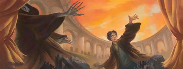
I must say, I’m a bit disappointed in the cover. I don’t dislike the illustration Mary GrandPré has created, but I do find the design rather unimaginative. I certainly don’t look at the book and think, “WOW. Now THAT is a cover!!” It seems to me that this record-setting book should, above all others, announce itself to the world. Instead it says, “I’m the next book in the Harry Potter series.” For $34.99 I expect a little more fanfare.
That said, the American cover is still vastly superior to the British cover, as — blimey! — I really don’t like the illustration:
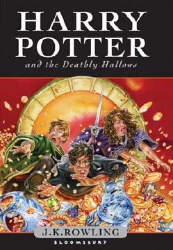
What do you think? Is either up to snuff? I’m curious to hear other people’s reactions.
The front (American) cover looks like Harry is playing tennis-serving-just threw his ball into the air! The full cover is bleak and empty. It will grow on me, I think, but for now it seems lacking. But I agree with you, the American cover is certainly better than the British-yuck. jmho! But I’m not disappointed–it’s the story I really want to read, so the cover is just there to hold the insides together.
Saipanwriter, You are SO right about the American cover! Now every time I look at I’ll be imagining that Harry has a racket in his right hand. Ay yi yi!
I was disappointed until I found the Scholastic site which has a magnifier so you can see the details. It is the details that make this cover intriguing. For example, Harry is wearing the Slyterin Locket around his neck. Has Voldemort just seen it and is surprised and appalled? You cannot really see the locket without the magnifier. There are a few other interesting details to ponder. As for the British version, it is so lackluster and cliche that I am surprised at the publisher’s low standards.
I never even thought of tennis when I saw Harry’s raised arm. My guess is that he is saying accio (fill in the blank. Broom? Horcrux?) We can guess for the next few months!
A long time ago, I read in an interview with Rawling the last line of the last book. Unless Rawling has changed it indicated that Harry survived and that something acivated the lightning shaped scar on his face. The thing that he is cringing from might be the thing that activates the scar and makes it glow. Only time will tell. 113 days and counting
What I see is that HWMNBN is holding his hand out as if he is warding off something, not as if he is attacking. And that Harry is reaching for something–he looks a little frightened by it, but determined. He needs it and he is ready to use it.
My first reaction to the American cover was similar to yours– a bit lackluster. But it is growing on me, and now I think I might say it’s subtle and understated with a sort of Apocalypse look… however, the British cover strikes me as purely awful. Crass and unsophisticated and entirely trite. Too bad.
Was the British artist thinking of casting Hugh Grant as Harry by chance? Maybe that’s his ex, Liz, by his side.
the british cover, despite its ugliness, at least gives me hope that harry, ron, and hermione will all be together in this book, instead of harry venturing off on his own as much as was indicated at the end of book 6.
I like the American version a lot (with the exception of the orange sky – why orange?). Harry looks grown-up and determined, and I like the wrap-around effect. The British version is just silly. It looks like a comic book.
Who cares, really? The book will sell a bezillion copies even if it had a white cover with no lettering…