

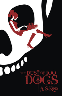
 Today I received a catalog from Flux whose website describes them as "an imprint dedicated to fiction for teens, where young adult is a point of view, not a reading level." What first jumped out at me was the cover of their catalog, which is pictured at right. (Click on it to see a larger image.) The iconic image of a girl reading a book while perched in a skull’s eye socket is… suprisingly un-creepy. And very bold. And quite hip. The color scheme of the image also calls to mind the Twilight series, which is certainly not a bad connection to make with YA readers right now.
THIS DOES NOT MEAN, THOUGH, THAT I WANT TO SEE A SPATE OF RED, BLACK AND WHITE COVERS!! All you marketing folks who just picked up your pens to write "Design all YA covers in red, black and white!" should put those pens down RIGHT now, because that is a TERRIBLE idea! Don’t do it! Okay? Okay. Thank you. Now back to the subject of my post…
The cover of the Flux catalog is a slight variation on the cover design for a forthcoming Flux novel, The Dust of 100 Dogs by A.S. King (February 2009). On the book’s cover, the socket-sitter is resting her right index finger on the top of a model ship (a reference to the novel’s pirating theme) rather than a piece of literature. I have to say, I’ve seen a lot of pirate book covers (including ones featuring girl pirates), but this might be only one I could truly refer to as "pirate chic." The title doesn’t quite stand out enough from the black background for my taste and I find that "G" rather hard to read, but that could just be because I’m seeing it reproduced so much smaller, or because the color of my monitor is slightly off, or because I’m nitpicking. Which is what I do when it comes to design. On the whole, I think this cover is a good one, and I dig it.
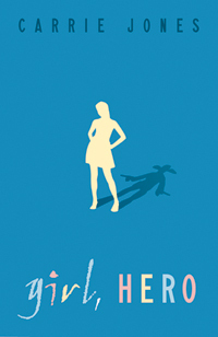 I was also impressed by some of the other cover designs I saw in Flux’s catalog and on their website. Ironically, one of the ones that caught my eye features a silhouette, which (as you loyal readers already know) can be a real turn-off for me, especially when the silhouettes are running and when they’re already featured on so many spy/action/adventure novels that no one truly stands out from the others. Unlike those I highlighted in a previous post, the silhouette on the cover of Girl, Hero by Carrie Jones (August 2008) is one that really works for me. First, the shape of the silhouette says, "girl with style," which to me says "YA appeal." Second, the pose of the silhouette says "girl with attitude" which to me says, "YA appeal." And third, the silhouette’s shadow is the shape of a gunslinger with drawn pistols, which to me says, "kickin’ ass and takin’ names" which (again) says "YA appeal." The mixed color, two-font title typography is working for me too. In short, I REALLY dig this cover.
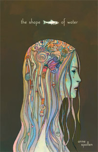
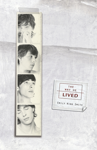
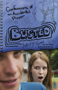
Not all of the covers Flux has produced are as iconic as these first two, which is a good thing, as I don’t think iconic images work for all books, and I’d certainly be bored with with any house who used such designs on everything. Flux’s designers certainly seem inclined to "mix it up a bit," which I appreciate. I love the odd, painterly qualities of the cover of The Shape of Water by Anne Spollen (April 2008), for example. And The Way He Lived by Emily Wing Smith (November 2008) looks artsy-smartsy, but in a very appealing way. Then there’s the cover of Antony John’s Busted (October 2008), which is more narrative than any of the others and sets you up perfectly for the book’s content. You know exactly what type of character and/or behavior you’re going to find on this book’s pages, which is like the perfect little handselling shortcut. We booksellers love it when the cover of a book does half the work of its jacket copy.
I haven’t actually read any of these books, so I can’t give Flux a gold star for quality of content and writing. (And I don’t know a single person who works there or publishes with them, scout’s honor!) And it’s true that not ALL of their book covers knocked my socks off. But on the whole I was really impressed with the number of covers they’ve created that DON’T look like the hundreds of others currently crowding our store’s shelves. I like that they’re producing some designs that are a little bit different and a lot teen-friendly. For these reasons, I’m giving them a gold star!
I so agree. Carrie Jone’s TIPS ON HAVING A GAY (EX) BOYFRIEND (also from Flux) also had a great cover with her author name carved into the wood desk of the cover. Great to see jacket designers reading the books and responding creatively to the fab content. Yay for Flux! Yay for Carrie Jones!
I think Flux covers are a great complement to the content of the books. I love the covers of Fat Girl, Snapshots, and Everything You Want (although the latter makes most sense once you’ve read (and loved!) the book).
Thanks! I get to work with amazing designers who do consistently excellent, surprising work (the DUST cover came totally out of left field). I should also mention we’ve benefited from great feedback and insight from the Teens Know Best YALSA Galley Group in St. Paul (they also review for SLJTeen: http://www.schoollibraryjournal.com/article/CA6551777.html). They’re an amazing bunch of teens with very high standards for design.
What a cool post. I laughed out loud at the *note to marketers* Flux does have awesome, innovative covers, especially the John Wayne shadow behind the teen girl. I can’t wait to read Carrie Jones’ new book!
I love the cover of Girl, Hero. It says a lot in an extremely simple way, if Girl, Hero is a hit it might end up being one of those iconic book posters you see in hanging in a library or high school English classroom, I think its that good.
Thanks for the heads-up, Dan! I have fixed the link for The Way He Lived. To Andrew Karre, I think it’s great that you’re soliciting input from design-savvy teens. Who better to ask than your books’ core audience?
Yay for Andrew and for Flux! I feel lucky to be part of such an awesome team.
Yup, loving these covers. Shape of Water reminds me of a painting and the others are very catchy.
As a high school media specialist, there are so many books I turn away from simply because I know the kids won’t like the covers. Now these books, I’d definitely purchase. They sell the books themselves.