
 I’ve got TWO gold stars to hand out this week, both for excellence in design. The first goes to a book cover.
As may have become apparent in my recent post about silhouettes and boring stock photos, I’m picky about my book covers — both because I like to see books get their just deserts, design-wise, and because a good cover makes my job INFINITELY easier. (It’s so painful to have to say to a customer, "No, really! It’s great! Ignore the terrible cover and just listen to what I’m telling you….") I am constantly, then, judging book covers and expressing my opinions on them to my poor unfortunate sales reps, for whom I frequently have less than positive cover feedback. My beloved Simon and Schuster rep, Katie McGarry, though, was no doubt pleased that I said nothing but great things about one particular cover on the S&S fall list.

Chains by Laurie Halse Anderson will be featuring this beautiful and intriguing design when it lands on bookstore and library shelves this October. I love the power of this seemingly simple image, the subtle hints it provides about the plot of this book (look closely at those birds) and the way the fonts, which appear to be hand-drawn, play beautifully with the image itself. The front of the jacket is arresting and so is the spine, making it likely that customers will pick up this book even when it isn’t turned face-out on the shelf (though in most stores in most stores it probably will be for quite some time).
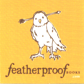 This week’s second gold star goes to a logo, though I’m a bit surprised to be giving it to such. It’s not often that a publisher or imprint logo elicits a particularly strong reaction from me, but the logo for Featherproof Books is a different matter.
To quote from their website, Featherproof Books "is a young indie publisher based in Chicago, dedicated to the small-press ideals of finding fresh, urban voices. We publish perfect-bound, full-length works of fiction and downloadable mini-books." One of these full-length works of fiction is This Will Go Down on Your Permanent Record, a young adult novel by Susannah Felts published this past March that is being distributed by PGW.
I haven’t read this book, so I can’t yet comment on its quality, but I will say that when I picked up my galley and the cuter-than-cute sticker that’s pictured here fell out of it, I sat up and took notice. To me this logo says "smart, quirky and fun" — three qualities I appreciate both in a book and in a publisher. I look forward to eventually reading some of Featherproof Books’ fare to see if the books they produce are half as appealing as the drawing they’re using to promote them.
Have you seen any gold-star-worthy designs of late (covers, logos, or otherwise)? If so, why not rave about them here, with the hopes that their designers’ might catch wind and whip up more of that same fabulousness.
The covers of the Twilight Saga are beyond belief. They’re simple, powerful and distinct. All you have to do is glance at the bookshelf and you’ll immediately know you’re looking at a Twilight book. And not only that the covers intrigues, making many people buy the books that wouldn’t have otherwise. In short the Twilight Saga covers do everything that a book cover is supposed to, but few actually do.
Hmm. I think that the Inkheart/Inkheart covers are very good, particularly Inkheart’s “burned” bottom on the paperback edition which reveals portions of one of the book’s most climactic scenes. Harry potter’s are OK, I suppose, but that’s the American edition. Sorry to any Brits out there, but the U.K. covers are just ghastly. Artemis Fowl: The Arctic Incident took an imaginative apporach with the heavy, icicle laden door as the cover. None of these are particularly recent, though, so maybe the gold star awarding period has expired.
Oops- I meant Inkheart/Inkspell. Sorry.
I LOVE the cover art for Wildwood Dancing – all the story elements are there without given the story away. It is also a magical and intriguing design. Also the cover art for The Swan Kingdom is beautiful and mystical.
The Girlwood cover is gorgeous. As is Wicked Lovely, of course.
I’m a HS librarian and totally can relate to trying to sell a book with a bad cover. In fact, while trying to whittle down my list, I sometimes resort to cover comparison! And what’s up with the title at the bottom of the spine? I know it doesn’t matter to anyone else but librarians but where are we supposed to put the spine label????