Monthly Archives: September 2008

Nom de Plume or Non?


Alison Morris - September 9, 2008

My nonfiction-work-in-progress is still a long way from seeing the light of day as a finished book, but even since its earliest stages I’ve intermittently pondered the question of what name I should use once I’m published. My instinct it to just use my first and last names, Alison Morris, and keep it simple. But, here’s the catch — there’s already an "Alison Morris" out there who has penned a couple of children’s books. One website had even attributed her books to me at one point, until I corrected their (understandable) mistake. The simple solution might be to go the middle initial route, but "Alison L. Morris" doesn’t exactly trip off the tongue, and I’m not sure it simplifies things enough. A very embarrassing case in point: just this week I learned, for the very first time, that Michael Rosen and Michael J. Rosen are NOT the same author! Anytime I’ve seen "Michael Rosen" with or without the "J" I have (I now realize) skipped over the step in which one reads the author’s bio. because I thought, "Yep. I know who he his and I know his books." But not so! It turns out Michael J.’s middle initial didn’t spare him 10 years of my idiocy, so perhaps "Alison L. Morris" isn’t a safe solution after all.

I could go with my full name, but "Alison Louise Morris" sounds… a bit more formal than I’d like or perhaps a bit too feminine for some of the topics I most want to write about. I’m not inclined to go either the "A. L.", "Ali" or "Al" route, so…? Hmm. This all feels a bit tricky.

Given the normalcy of being raised with a not-so-oddball name, I can’t imagine that my situation is all that unusual, but it’s not one I’ve heard authors and illustrators speak about before, so…? I’m asking. Those of you with books under your belts, how did you settle on your published name? And if you decided to shirk your workaday identity and use a pen name, why did you make that choice? How do you settle on the name you’re using?

If you haven’t got an answer to any of those questions, at least tell us what silly name you’re assigned by Professor Poopypants’ Name Change-o-Chart 2000 (thank you, Captain Underpants and Dav Pilkey, for giving the world this mindless form of entertainment). According to Professor Poopypants (and who wouldn’t trust a man with that name?) I could consider publishing as Stinky Bananafanny, which would CERTAINLY stand out on my book’s cover, I should think. Though perhaps not quite as much as Crescent Dragonwagon.
The Amazing Art of the Totoro Forest Project


Alison Morris - September 8, 2008

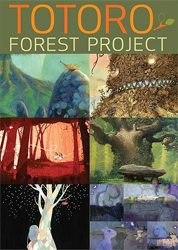
Where did you spend your Saturday night? Lucky you if you got to spend it at Pixar’s studios, as that’s where I’d like to have been! Last Saturday evening the place was home to the Totoro Forest Project, a fundraising exhibit and art auction to benefit the Totoro Forest Foundation, a non-profit has been greatly supported by filmmaker Hayao Miyazaki over the years.
 The motivation for last weekend’s fun is explained this way on the Project’s official website:

"Hayao Miyazaki has been actively supporting the preservation effort of Sayama Forest for more than ten years. This 8750 acre park in the outskirts of Tokyo is also known as Totoro Forest. It’s in these woods in fact that the concept for the film My Neighbor Totoro was born.

In the past few decades, the forest has been subject to urban development. Only continued support to the Totoro Trust Fund can help preserve this much needed island of green in the midst of Tokyo’s urban sprawl. We intend to donate the entire proceeds of the project to this worthy cause."

I found out about this event last Friday, thanks to an e-mail from Catia Chen, illustrator of The Sea Serpent and Me, one of my favorite picture books of the year. Catia contributed one of the 200 pieces of original art "especially created by internationally acclaimed artists in the fields of animation, comic books, illustration, and fine arts" that appeared in the auction.

I should say that I’m not using the term "art" loosely here. Looking through the gallery on the Totoro Project’s Website, I was slack-jawed. This grouping of pieces positively oozes talent, some of it from illustrators already working in children’s books and graphic novels, like Catia. For example, I was drooling over the piece by Jillian Tamaki, who illustrated the recent graphic novel Skim (Groundwood Books) and also loved the playful contribution by Greg Couch (illustrator of Nothing but Trouble: The Story of Althea Gibson by Sue Stauffacher, to name one). The majority of the contributions to the gallery, though, were made by artists and illustrators whose names have not yet graced the cover of illustrated books, but what I saw suggests that maybe they could. It seems to me that there is quite a pool of potential book illustration talent to be mined here. Art directors, grab your picks and shovels.

And speaking of talent… You don’t have to be a fan of Hayao Miyazaki’s films and/or have never seen My Neighbor Totoro to appreciate the art in The Totoro Forest Project, but you’re missing out if you don’t devote some time to both. Just like these things we call "children’s books," Miyazaki’s films are for "kids" of all ages, including yours!

Were any of you at the auction last weekend? Have any good stories to report or art to share? If so, PLEASE go ahead make the rest of us jealous by sharing all the glitzy details!

Author Photos – A Help or a Hindrance?


Alison Morris - September 4, 2008

How do you feel about seeing an author or illustrator’s photo alongside their author bio? Do you like it? Hate it? Do you think it somehow helps sales, helps build their audience, gives you a personal connection to them?

I’m generally indifferent on this matter. Seeing the face behind the fiction (or nonfiction) generally doesn’t enhance a reading experience for me, nor does it detract from it. From the perspective of working with kids, I think author photos can be truly useful — they remind kids that, yes, there are real, live people who write these books and illustrate them. (Sometimes that’s a useful lesson for adults too.)

From the standpoint of a book industry professional, I like that author photos enable me to recognize people when I see them at conventions. I would think that most authors and illustrators would like them for this reason too. It’s much easier, after all, to reach a sort of "celebrity status" when people can recognize you long before they’re close enough to read your name tag.

However, if an author uses the same exact photo in their books for YEARS and YEARS, that sends a completely different message. A confusing and rather creepy one, in fact. Imagine what it’s like for readers to show up at a public event expecting you to look a particular age and then OH. WOW. You’ve suddenly leaped forward twenty years into the future — or at least that’s how it appears to everyone who knows you by that ONE photo you’ve been using since time immemorial. I think it’s best not to put your readers through that freaky type of time shift. Just as it’s best not to take up any habits that might be acceptable now but later be considered a "bad influence" and therefore digitally removed from your images when you’re no longer around to raise an objection. (Fun to predict what those might be!)

I think about these photo issues a lot as I’m thumbing through publisher catalogs, which often include pictures alongside authors’ and illustrators’ bios. Often I like seeing their smiling faces staring back at me, but every now and again a photo comes along that is just… CREEPY! Or such a bad, blurry photo that you can’t help wondering if anyone at the publisher thought to suggest that they have a professional do the job. In such cases I sometimes feel that the presence of an author’s picture is a bad thing.

I also think it can be a bad thing when a person’s appearance looks COMPLETELY unlike the type of characters they’re creating or the genre they’re writing. For example, readers of your sleek urban novel about rap stars and gang wars might be more likely to send you letters if they don’t note your striking resemblance to, say, June Cleaver. Likewise, your arrest photo probably isn’t a good choice for that sweet little picture book about kittens. Or really for any book except Hole in My Life by Jack Gantos, which you should be reading RIGHT now if you haven’t read it already. Seriously. Skip the question bit at the end here and go pick it up.

But what do you think? Photos good or photos bad? Bad photos good? Good photos bad? Please weigh in with your thoughts, and share your photo-related stories or Photoshopping-related predictions (á la Clement Hurd).

Old Edition of Jane Eyre Should Be New Again


Alison Morris - September 3, 2008

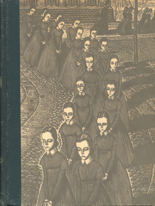
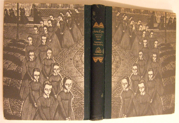
One of my favorite books in my home library is a copy of Jane Eyre I bought in an antique store for a handful of dollars. Published by Random House in 1943, this out-of-print edition was illustrated with engravings by Fritz Eichenberg and features one of the most beautiful and intriguing book covers I’ve seen, with Eichenberg’s etching of Jane and her fellow schoolgirls printed directly onto the book’s boards (no dust jacket). I think we’d sell a LOT more copies of Jane Eyre at our store if it boasted this cover!

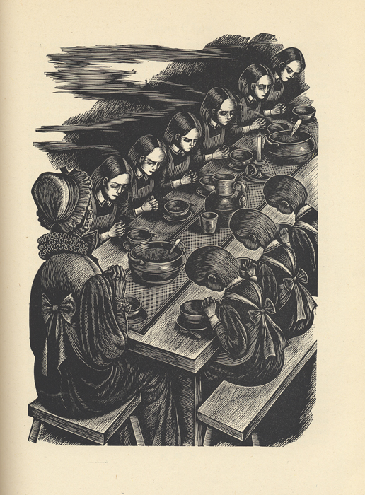
Eichenberg’s engravings throughout the book reflect the dark, moody mystery of Charlotte Brontë’s beloved story, and I dearly wish an edition sporting his shadowy images was still in print. Do you?

I’ve scanned several of the illustrations from my own copy and pasted them below. Clicking on any image will open a larger version in a new window.

Masterpiece Is As It Says


Alison Morris - September 2, 2008

My Macmillan rep, Bob Werner, was completely unguarded in the note he sent to me attached to a galley of Masterpiece by Elise Broach (Henry Holt, September 2008). "Drop everything and read this!" it said. "This is the BEST BOOK EVER!!" I couldn’t follow Bob’s advice to a T, because I was then in the middle of reading The Hunger Games and had other things immediately on tap, but I *did* move Masterpiece up to the almost-top of my to-be-read pile, where (lo and behold) it soon moved into my hands, where I’d actually have liked it to stay a bit longer. I wanted to make this book last, simply because I was enjoying it so much.

After almost ten years as a bookseller there is one quality that I look for in a book above ALL else: kid-friendliness. If a book feels kid-friendly to me as I’m reading it, if I can’t think of a single kid who WOULDN’T enjoy it, then THAT’S a book I can handsell to kids (or their parents) with absolute confidence that they’ll enjoy it and come back looking for more recommendations.

I read novels all the time that score high on the quality of writing scale but less so on the kid-friendly scale — these are the books that tend to get lukewarm receptions from all but the most "serious" of kid readers. This can be frustrating, because sometimes I LOVE those books! After all, they feel wonderfully "adult-friendly." But it’s the kid-friendly books that will eventually begin walking out the door based solely on kids’ word-of-mouth. It’s the kid-friendly books that make up the lion’s share of our backlist sales. Why? Because kids love them. Kids tell their friends and teachers about them. And kids keep reading them. It’s that simple.

The thing that struck me most about Masterpiece is that it’s kid-friendly from start to finish. It features a great, engrossing story — the kind kids dreaming of seeing take shape in their own lives. After all, what kid wouldn’t love to discover that a non-creepy critter (in this case a beetle) living in his own house has extraordinary artistic talents AND dreams of being his best friend? What kid wouldn’t want to solve the mystery of a shocking art theft with the help of this friend/critter?

I think kids are going to LOVE this book, and they’re right to do so: it’s fresh, it’s clever, it’s suspenseful, and it’s just plain fun. Teachers will love it for the insight it provides into the art world (specifically the work of Albrecht Durer). Everyone will be additionally charmed by Kelly Murphy’s wonderful pen-and-ink drawings, which make the perfect accompaniment to the story.

Other books I’ve read that have scored as high on my "kid-friendly" scale as this one include Al Capone Does My Shirts by Gennifer Choldenko, The Lightning Thief by Rick Riordan, Alabama Moon by Watt Key, and Hoot by Carl Hiaasen. I’m pleased to say that my gut reactions of "every kid is going to love this book" came true for them, as I hope it will for this one.

What’s at the top of your "most kid-friendly" list? Do tell, as those are the books we’re ALL forever seeking!